


Written by Kätrin Sibul
It’s almost Halloween, the time of year when you turn off the lights and get creative with your costumes. And you can do the same with your app! Adding a dark mode option would be a perfect feature for your digital product to fit in with this spooky season, and it will remain a welcome addition afterward. So, let’s talk about designing a dark-themed UI for your app.
Dark mode has gained a lot of popularity lately, and it is now one of the most commonly requested features. Popular everyday tools like WhatsApp, Instagram, and Facebook have all had it for quite a while already, as have many operating systems, browsers, and games. But it isn’t actually a modern concept.
Early computers had dark backgrounds by default to prevent the light from burning out the screen. Nowadays, we don’t use dark-colored backgrounds for technical reasons anymore. We can easily design apps the way we want without worrying about anything exploding in our hands.
For decades, white has been used as a primary background color in UI design. The increased time spent in front of screens caused developers to discover that in addition to saving energy, reduced luminance can also minimize eye strain and dryness. But let’s be honest – it also just looks cool and mysterious.
A dark background together with a nice color palette is usually more appealing and can even change the the tone of your website or app’s design by giving it a fresh, luxurious, and professional appearance. So, why not take advantage of it?

Here are six tips to keep in mind when designing a dark-themed UI:
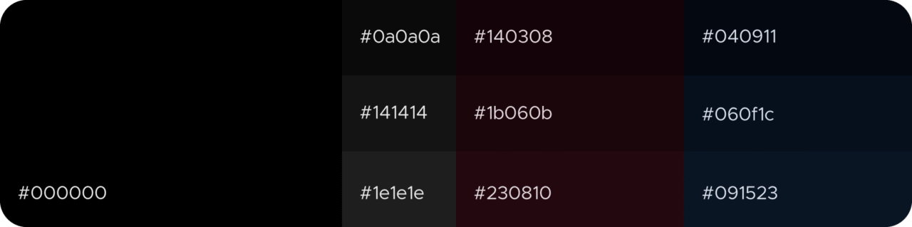
1. Dark doesn’t mean #000000.
Avoid using pure black for your design. There are various shades of grey and other colors to choose from that soften the contrast between the text and background and therefore make the information more readable. But be careful with how you use these shades, as low contrast can also feel uncomfortable in some cases. There’s a sweet spot in between high and low contrast, which brings us to the next point.
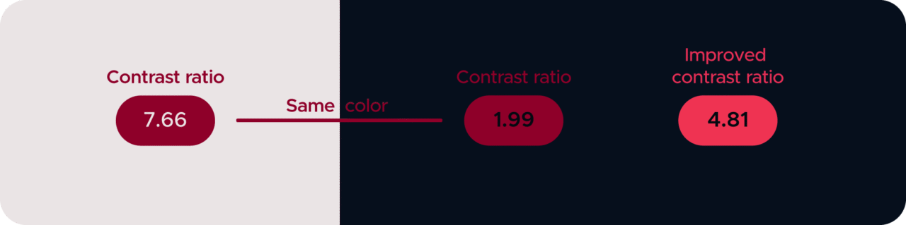
2. Check the contrast ratio.
Saturation is a great way of getting attention, but some may find the intensity of the colors disturbing when changing the background to a darker shade. So, be ready to play around with your brand identity colors because once you’ve changed the background, you’ll notice they appear different to the eye. Wine red looks awesome on white, but put it together with a dark background, and it becomes a lot less readable. Find an alternative that works for you. If you don’t feel comfortable with it, there are free color contrast tools available online to check the accessibility of your product’s dark mode. Try contrast-ratio.com or webaim.org, for example.
3. Don’t forget to add some white space.
Illustrations, buttons, and other design elements can quickly make the screen feel overcrowded. Give them some room to breathe so that your app won’t feel cluttered and overwhelm the user. This extra room is called “white space,” but don’t let the words mislead you, as dark mode also looks better with some empty room (or dark space, to sound more sci-fi). In fact, dark UIs need even more space than light themes, as they appear heavier to the eye.

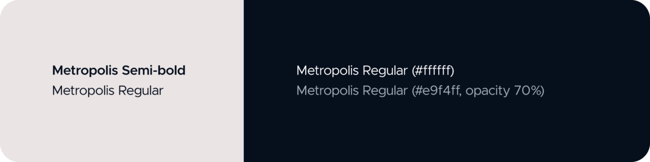
4. Instead of font weights, play with opacity.
A dark object on a bright background appears smaller to our eyes than a bright object on a dark background. That’s because of the light seemingly coming from behind and glowing like a halo around the object. This means that the same font you use for the light theme will appear heavier on dark backgrounds. So, instead of going for heavier font weights to emphasize important sentences, use a higher opacity percentage and lighter font weights instead.
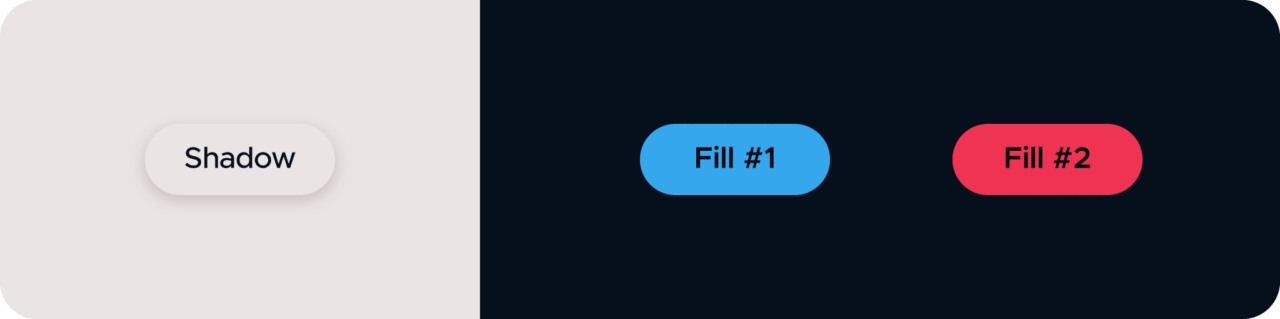
5. Create some depth.
For light themes, it’s common to use shadows behind shapes to make an object stand out. These shadows don’t work in dark mode, however, as there isn’t enough contrast between the design element and the shadow. Instead, to create depth, you can easily use a lighter fill for the objects you want to appear higher. No more drop shadows on dark backgrounds – let the color do its job.
6. Let the user decide.
Once you’ve created your app’s new appearance, make sure you allow users to toggle between the regular mode and the dark mode. Even if you love the cool new appearance, not everybody will feel the same, and light mode can simply be more accessible for some. Let the users decide which mode is best for them.
Designing a dark theme doesn’t mean changing the background only. If the contrast and spacing aren’t quite right, colors might work against your goal. Play with the shades, opacity of the text, and composition of your design elements. Go crazy, really! It’s Halloween, after all. And yes, if you want to add a pumpkin or a bat to your designs, it won’t hurt to have them for a couple of weeks.


