


Written by Souvik Biswas
Flutter, being a cross-platform app development framework, supports devices with widely varying screen sizes: It can run on a device as small as a smartwatch to devices like a large TV. It’s always a challenge to adapt your app to such a variety of screen sizes and pixel densities using the same codebase.
There is no hard-and-fast rule for designing a responsive layout in Flutter. In this article, I will show you some of the approaches that you can follow while designing such a layout.
Before moving on to building responsive layouts in Flutter, I would like to shed some light on how Android and iOS handle layouts for different screen sizes natively.
So, let’s get started, but first, let us know how many mobile app projects do you have in Git repositories?
Android approach
In order to handle different screen sizes and pixel densities, the following concepts are used in Android:
1. ConstraintLayout
One of the revolutionary tools introduced in the Android world for UI design is the ConstraintLayout. It can be used for creating flexible and responsive UI designs that adapt to different screen sizes and dimensions. ConstraintLayout allows you to specify the position and size for each view according to spatial relationships with other views in the layout.
For more information regarding
ConstraintLayout, check out this article here.
But this does not solve the issue with large devices, where just stretching or resizing the UI components is not the most elegant way of taking advantage of the screen real estate. This also applies to devices like smartwatches, which have very little screen real estate, and resizing the components to fit that screen size might result in a weird UI.
2. Alternative layouts
To solve the above issue, you can use alternative layouts for different-sized devices. For example, you can use split view in devices like tablets to provide a good user experience and use the large screen real estate wisely.
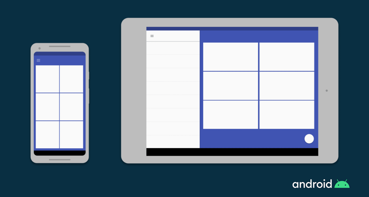
In Android, you can define separate layout files for different screen sizes, and the Android framework handles the switching between these layouts automatically as per the screen size of the device.
3. Fragments
Using Fragment, you can extract your UI logic into separate components so that while designing multi-pane layouts for large screen sizes, you do not have to define the logic separately. You can just reuse the logic that you have defined for each fragment.
4. Vector graphics
As opposed to being created using pixel bitmaps, vector graphics are images defined in XML files as paths and colors. They can scale to any size without scaling artifacts. In Android, you can use VectorDrawable for any kind of illustration, such as icons.
iOS approach
The concepts used by iOS for defining responsive layouts are as follows:
1. Auto Layout
Auto Layout can be used for constructing adaptive interfaces where you can define rules (known as constraints) that govern the content in your app. Auto Layout automatically readjusts layouts according to the specified constraints when certain environmental variations (known as traits) are detected.
2. Size classes
Size classes are traits that are automatically assigned to content areas based on their size. iOS dynamically makes layout adjustments based on the size classes of a content area. On iPad, size classes also apply when your app runs in a multitasking configuration.
3. Some UI elements
There are a few other UI elements that you can use for building responsive UIs on iOS, like UIStackView, UIViewController, and UISplitViewController.
How Flutter differs
Even if you are not an Android or iOS developer, by this point, you should have gotten an idea of how these platforms handle responsiveness natively.
In Android, to display multiple UI views on a single screen, you use Fragments, which are like reusable components that can run inside an Activity of an app.
You can run multiple Fragments inside an Activity, but you cannot run multiple Activities in a single app at the same time.
In iOS, UISplitViewController, which manages child view controllers in a hierarchical interface, is used for controlling multiple view controllers.
Now, let’s move on to Flutter.
Flutter has introduced the concept of widgets. Basically, they are the building blocks that can be connected together to build an entire app.
Remember that in Flutter, every screen and even the entire app are also widgets!
Widgets are reusable by nature, so you do not need to learn any other concepts while building responsive layouts in Flutter.
Responsiveness in Flutter
As I said earlier, I will go over the important concepts that are required for developing responsive layouts, and then, it’s your choice how exactly you want to implement them in your app.
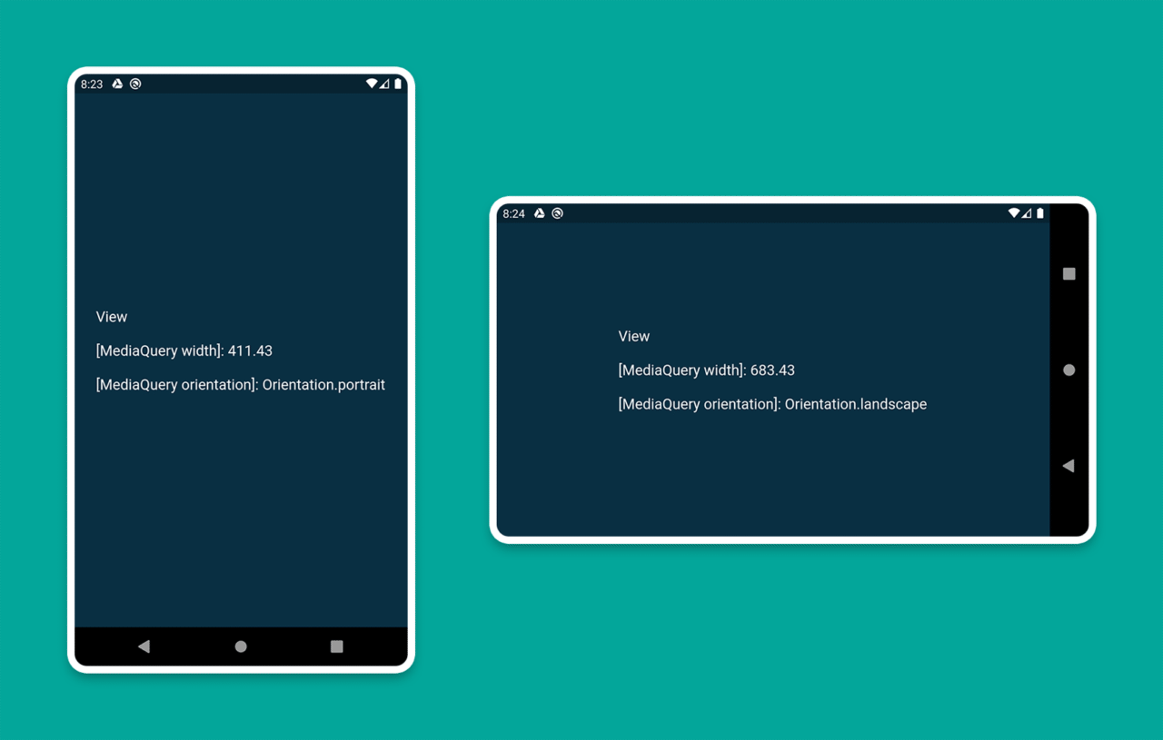
1. MediaQuery
You can use MediaQuery to retrieve the size (width/height) and orientation (portrait/landscape) of the screen.
An example of this is as follows:
class HomePage extends StatelessWidget {
  @override
  Widget build(BuildContext context) {
    Size screenSize = MediaQuery.of(context).size;
    Orientation orientation = MediaQuery.of(context).orientation;

    return Scaffold(
      body: Container(
        color: CustomColors.android,
        child: Center(
          child: Text(
            'View\n\n' +
                '[MediaQuery width]: ${screenSize.width.toStringAsFixed(2)}\n\n' +
                '[MediaQuery orientation]: $orientation',
            style: TextStyle(color: Colors.white, fontSize: 18),
          ),
        ),
      ),
    );
  }
}
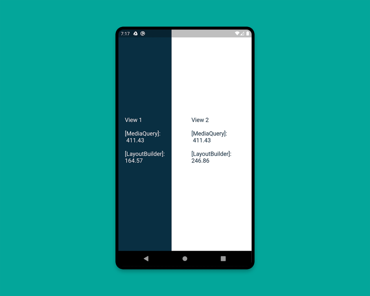
2. LayoutBuilder
Using the LayoutBuilder class, you can get the BoxConstraints object, which can be used for determining the maxWidth and maxHeight of the widget.
REMEMBER: The main difference between
MediaQueryandLayoutBuilderis that MediaQuery uses the complete context of the screen rather than just the size of your particular widget, whereas LayoutBuilder can determine the maximum width and height of a particular widget.
An example demonstrating this is as follows:
class HomePage extends StatelessWidget {
  @override
  Widget build(BuildContext context) {
    Size screenSize = MediaQuery.of(context).size;

    return Scaffold(
      body: Row(
        children: [
          Expanded(
            flex: 2,
            child: LayoutBuilder(
              builder: (context, constraints) => Container(
                color: CustomColors.android,
                child: Center(
                  child: Text(
                    'View 1\n\n' +
                        '[MediaQuery]:\n ${screenSize.width.toStringAsFixed(2)}\n\n' +
                        '[LayoutBuilder]:\n${constraints.maxWidth.toStringAsFixed(2)}',
                    style: TextStyle(color: Colors.white, fontSize: 18),
                  ),
                ),
              ),
            ),
          ),
          Expanded(
            flex: 3,
            child: LayoutBuilder(
              builder: (context, constraints) => Container(
                color: Colors.white,
                child: Center(
                  child: Text(
                    'View 2\n\n' +
                        '[MediaQuery]:\n ${screenSize.width.toStringAsFixed(2)}\n\n' +
                        '[LayoutBuilder]:\n${constraints.maxWidth.toStringAsFixed(2)}',
                    style: TextStyle(color: CustomColors.android, fontSize: 18),
                  ),
                ),
              ),
            ),
          ),
        ],
      ),
    );
  }
}
3. OrientationBuilder
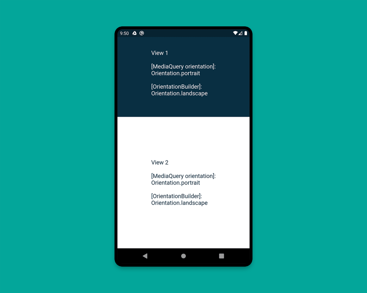
To determine a widget’s current orientation, you can use the OrientationBuilder class.
REMEMBER: This is different from the device orientation that you can retrieve by using
MediaQuery.
An example demonstrating this is as follows:
class HomePage extends StatelessWidget {
  @override
  Widget build(BuildContext context) {
    Orientation deviceOrientation = MediaQuery.of(context).orientation;

    return Scaffold(
      body: Column(
        children: [
          Expanded(
            flex: 2,
            child: Container(
              color: CustomColors.android,
              child: OrientationBuilder(
                builder: (context, orientation) => Center(
                  child: Text(
                    'View 1\n\n' +
                        '[MediaQuery orientation]:\n$deviceOrientation\n\n' +
                        '[OrientationBuilder]:\n$orientation',
                    style: TextStyle(color: Colors.white, fontSize: 18),
                  ),
                ),
              ),
            ),
          ),
          Expanded(
            flex: 3,
            child: OrientationBuilder(
              builder: (context, orientation) => Container(
                color: Colors.white,
                child: Center(
                  child: Text(
                    'View 2\n\n' +
                        '[MediaQuery orientation]:\n$deviceOrientation\n\n' +
                        '[OrientationBuilder]:\n$orientation',
                    style: TextStyle(color: CustomColors.android, fontSize: 18),
                  ),
                ),
              ),
            ),
          ),
        ],
      ),
    );
  }
}
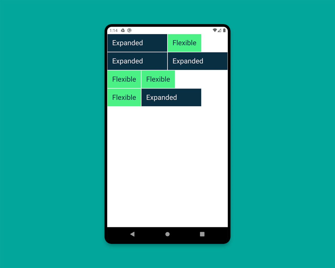
4. Expanded and Flexible
The widgets that are especially useful inside a Column or a Row are Expanded and Flexible. The Expanded widget expands a child of a Row, Column, or Flex so that the child fills the available space, whereas Flexible does not necessarily have to fill the entire available space.
An example showing various combinations of Expanded and Flexible is as follows:
class HomePage extends StatelessWidget {
  @override
  Widget build(BuildContext context) {
    return Scaffold(
      backgroundColor: Colors.white,
      body: SafeArea(
        child: Column(
          children: [
            Row(
              children: [
                ExpandedWidget(),
                FlexibleWidget(),
              ],
            ),
            Row(
              children: [
                ExpandedWidget(),
                ExpandedWidget(),
              ],
            ),
            Row(
              children: [
                FlexibleWidget(),
                FlexibleWidget(),
              ],
            ),
            Row(
              children: [
                FlexibleWidget(),
                ExpandedWidget(),
              ],
            ),
          ],
        ),
      ),
    );
  }
}

class ExpandedWidget extends StatelessWidget {
  @override
  Widget build(BuildContext context) {
    return Expanded(
      child: Container(
        decoration: BoxDecoration(
          color: CustomColors.android,
          border: Border.all(color: Colors.white),
        ),
        child: Padding(
          padding: const EdgeInsets.all(16.0),
          child: Text(
            'Expanded',
            style: TextStyle(color: Colors.white, fontSize: 24),
          ),
        ),
      ),
    );
  }
}

class FlexibleWidget extends StatelessWidget {
  @override
  Widget build(BuildContext context) {
    return Flexible(
      child: Container(
        decoration: BoxDecoration(
          color: CustomColors.androidAccent,
          border: Border.all(color: Colors.white),
        ),
        child: Padding(
          padding: const EdgeInsets.all(16.0),
          child: Text(
            'Flexible',
            style: TextStyle(color: CustomColors.android, fontSize: 24),
          ),
        ),
      ),
    );
  }
}
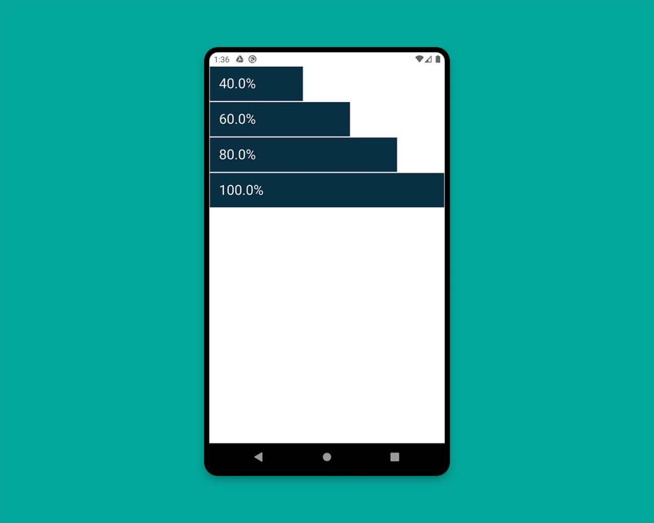
5. FractionallySizedBox
The FractionallySizedBox widget helps to size its child to a fraction of the total available space. It is especially useful inside Expanded or Flexible widgets.
An example is as follows:
class HomePage extends StatelessWidget {
  @override
  Widget build(BuildContext context) {
    return Scaffold(
      backgroundColor: Colors.white,
      body: SafeArea(
        child: Column(
          mainAxisAlignment: MainAxisAlignment.start,
          children: [
            Row(
              crossAxisAlignment: CrossAxisAlignment.start,
              children: [
                FractionallySizedWidget(widthFactor: 0.4),
              ],
            ),
            Row(
              crossAxisAlignment: CrossAxisAlignment.start,
              children: [
                FractionallySizedWidget(widthFactor: 0.6),
              ],
            ),
            Row(
              crossAxisAlignment: CrossAxisAlignment.start,
              children: [
                FractionallySizedWidget(widthFactor: 0.8),
              ],
            ),
            Row(
              crossAxisAlignment: CrossAxisAlignment.start,
              children: [
                FractionallySizedWidget(widthFactor: 1.0),
              ],
            ),
          ],
        ),
      ),
    );
  }
}

class FractionallySizedWidget extends StatelessWidget {
  final double widthFactor;
  FractionallySizedWidget({@required this.widthFactor});

  @override
  Widget build(BuildContext context) {
    return Expanded(
      child: FractionallySizedBox(
        alignment: Alignment.centerLeft,
        widthFactor: widthFactor,
        child: Container(
          decoration: BoxDecoration(
            color: CustomColors.android,
            border: Border.all(color: Colors.white),
          ),
          child: Padding(
            padding: const EdgeInsets.all(16.0),
            child: Text(
              '${widthFactor * 100}%',
              style: TextStyle(color: Colors.white, fontSize: 24),
            ),
          ),
        ),
      ),
    );
  }
}
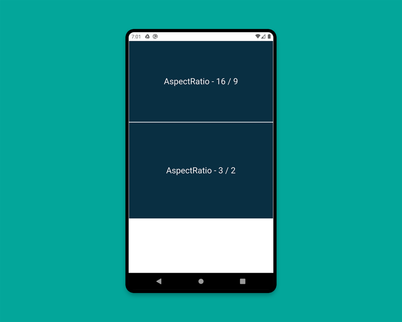
6. AspectRatio
You can use the AspectRatio widget to size the child to a specific aspect ratio. This widget first tries the largest width permitted by the layout constraints and then decides the height by applying the given aspect ratio to the width.
class HomePage extends StatelessWidget {
  @override
  Widget build(BuildContext context) {
    return Scaffold(
      backgroundColor: Colors.white,
      body: SafeArea(
        child: Column(
          children: [
            AspectRatioWidget(ratio: '16 / 9'),
            AspectRatioWidget(ratio: '3 / 2'),
          ],
        ),
      ),
    );
  }
}

class AspectRatioWidget extends StatelessWidget {
  final String ratio;

  AspectRatioWidget({@required this.ratio});

  @override
  Widget build(BuildContext context) {
    return AspectRatio(
      aspectRatio: Fraction.fromString(ratio).toDouble(),
      child: Container(
        decoration: BoxDecoration(
          color: CustomColors.android,
          border: Border.all(color: Colors.white),
        ),
        child: Padding(
          padding: const EdgeInsets.all(16.0),
          child: Center(
            child: Text(
              'AspectRatio - $ratio',
              style: TextStyle(color: Colors.white, fontSize: 24),
            ),
          ),
        ),
      ),
    );
  }
}
We have looked into most of the important concepts required for building a responsive layout in Flutter, except one.
Let’s learn the last concept while building a sample responsive app.
Building a responsive app
Now, we will be applying some of the concepts that I have described in the previous section. Along with this, you will also learn another important concept for building layouts for large screens: split view.
We will be building a sample chatting app design called Flow.
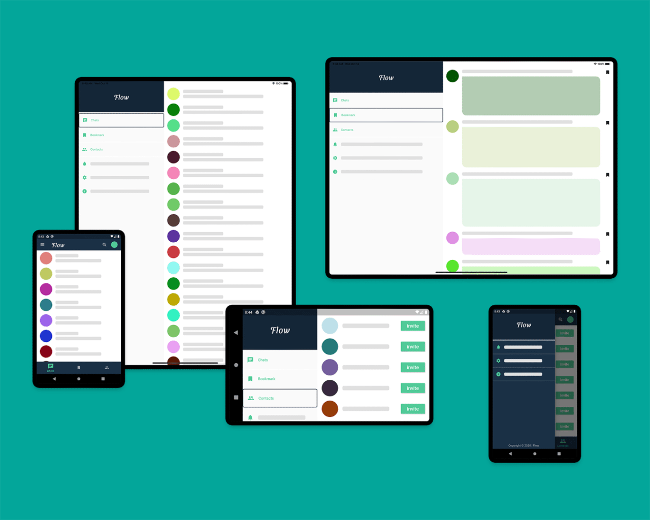
The app will mainly consist of two major screens:
- HomePage (
PeopleView,BookmarkView,ContactView) - ChatPage (
PeopleView,ChatView)
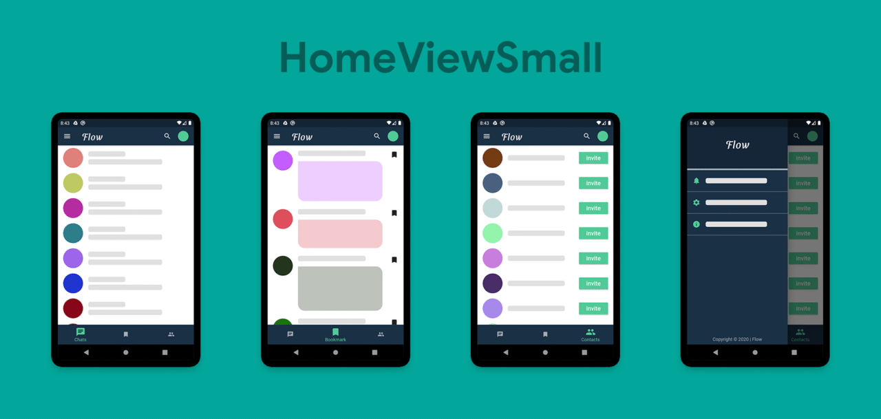
HomePage
The main screen of the app after launch will be the HomePage. It consists of two types of views:
- HomeViewSmall (consisting of
AppBar,Drawer,BottomNavigationBar, andDestinationView) - HomeViewLarge (consisting of split view,
MenuWidget, andDestinationView)
class _HomePageState extends State<HomePage> {
  int _currentIndex = 0;

  @override
  Widget build(BuildContext context) {
    return Scaffold(
      body: LayoutBuilder(
        builder: (context, constraints) {
          if (constraints.maxWidth < 600) {
            return HomeViewSmall();
          } else {
            return HomeViewLarge();
          }
        },
      ),
    );
  }
}
Here, LayoutBuilder is for determining the maxWidth and switching between the HomeViewSmall and HomeViewLarge widgets.
class _HomeViewSmallState extends State<HomeViewSmall> {
  int _currentIndex = 0;

  @override
  Widget build(BuildContext context) {
    return Scaffold(
      appBar: AppBar(
          // ...
      ),
      drawer: Drawer(
          // ...
      ),
      bottomNavigationBar: BottomNavigationBar(
          // ...
      ),
      body: IndexedStack(
        index: _currentIndex,
        children: allDestinations.map<Widget>((Destination destination) {
          return DestinationView(destination);
        }).toList(),
      ),
    );
  }
}
IndexedStack with DestinationView is used for switching between the views according to the selected item in the BottomNavigationBar.
If you want to know more, check out the GitHub repository of this sample app present at the end of this article.
class _HomeViewLargeState extends State<HomeViewLarge> {
  int _index = 0;

  @override
  Widget build(BuildContext context) {
    return Container(
      child: Row(
        crossAxisAlignment: CrossAxisAlignment.start,
        mainAxisAlignment: MainAxisAlignment.start,
        children: [
          Expanded(
            flex: 2,
            child: MenuWidget(
              selectedIndex: _index,
              onTapped: (selectedIndex) {
                setState(() {
                  _index = selectedIndex;
                });
              },
            ),
          ),
          Expanded(
            flex: 3,
            child: IndexedStack(
              index: _index,
              children: allDestinations.map<Widget>((Destination destination) {
                return DestinationView(destination);
              }).toList(),
            ),
          ),
        ],
      ),
    );
  }
}
For large screens, we will show a split view containing the MenuWidget and the DestinationView. You can see that it is really easy to create a split view in Flutter. You just have to place them side by side using a Row, and then, in order to fill up the entire space, just wrap both the views using the Expanded widget. You can also define the flex property of the Expanded widget, which will let you specify how much of the screen each widget should cover (by default, flex is set to 1).
But now, if you move to a particular screen and then switch between the views, you will lose the context of the page; that is, you will always return back to the first page, which is Chats. To solve this here, I have used multiple callback functions to return the selected page to the HomePage. Practically, you should use a state management technique to handle this scenario. As the sole purpose of this article is to teach you to build responsive layouts, I am not going into any of the complexities of state management.
Modifying HomeViewSmall:
class HomeViewSmall extends StatefulWidget {
  final int currentIndex;
  /// Callback function
  final Function(int selectedIndex) onTapped;
  HomeViewSmall(this.currentIndex, this.onTapped);

  @override
  _HomeViewSmallState createState() => _HomeViewSmallState();
}

class _HomeViewSmallState extends State<HomeViewSmall> {
  int _currentIndex = 0;

  @override
  void initState() {
    super.initState();
    _currentIndex = widget.currentIndex;
  }

  @override
  Widget build(BuildContext context) {
    return Scaffold(
      // ...
      bottomNavigationBar: BottomNavigationBar(
        // ...
        currentIndex: _currentIndex,
        onTap: (int index) {
          setState(() {
            _currentIndex = index;
            // Invoking the callback
            widget.onTapped(_currentIndex);
          });
        },
        items: allDestinations.map((Destination destination) {
          return BottomNavigationBarItem(
            icon: Icon(destination.icon),
            label: destination.title,
          );
        }).toList(),
      ),
    );
  }
}
Modifying HomeViewLarge:
class HomeViewLarge extends StatefulWidget {
  final int currentIndex;
  /// Callback function
  final Function(int selectedIndex) onTapped;
  HomeViewLarge(this.currentIndex, this.onTapped);

  @override
  _HomeViewLargeState createState() => _HomeViewLargeState();
}

class _HomeViewLargeState extends State<HomeViewLarge> {
  int _index = 0;

  @override
  void initState() {
    super.initState();
    _index = widget.currentIndex;
  }

  @override
  Widget build(BuildContext context) {
    return Container(
      child: Row(
        crossAxisAlignment: CrossAxisAlignment.start,
        mainAxisAlignment: MainAxisAlignment.start,
        children: [
          Expanded(
            flex: 2,
            child: MenuWidget(
              selectedIndex: _index,
              onTapped: (selectedIndex) {
                setState(() {
                  _index = selectedIndex;
                  // Invoking the callback
                  widget.onTapped(_index);
                });
              },
            ),
          ),
          // ...
        ],
      ),
    );
  }
}
Modifying HomePage:
class HomePage extends StatefulWidget {
  @override
  _HomePageState createState() => _HomePageState();
}

class _HomePageState extends State<HomePage> {
  int _currentIndex = 0;

  @override
  Widget build(BuildContext context) {
    return Scaffold(
      body: LayoutBuilder(
        builder: (context, constraints) {
          if (constraints.maxWidth < 600) {
            return HomeViewSmall(_currentIndex, (index) {
              setState(() {
                _currentIndex = index;
              });
            });
          } else {
            return HomeViewLarge(_currentIndex, (index) {
              setState(() {
                _currentIndex = index;
              });
            });
          }
        },
      ),
    );
  }
}
Now, your fully responsive HomePage is complete.
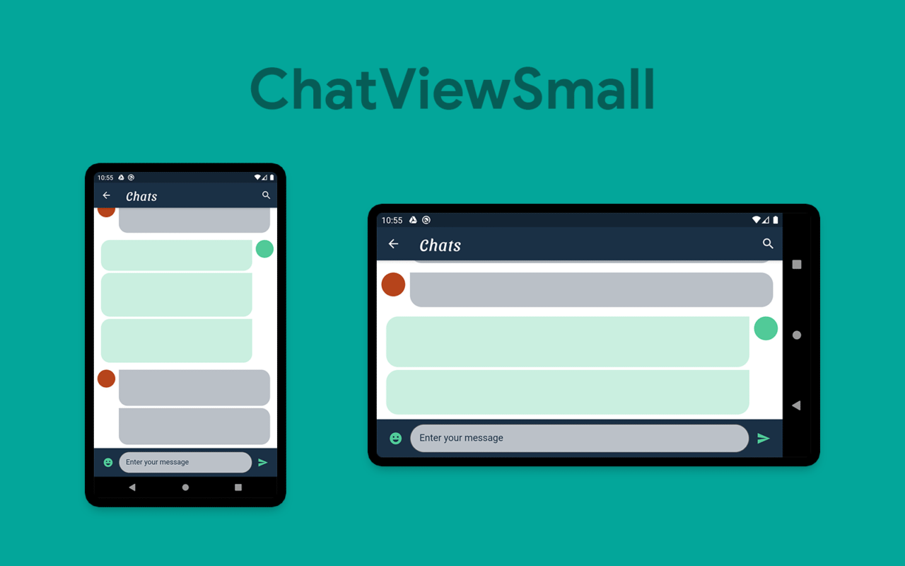
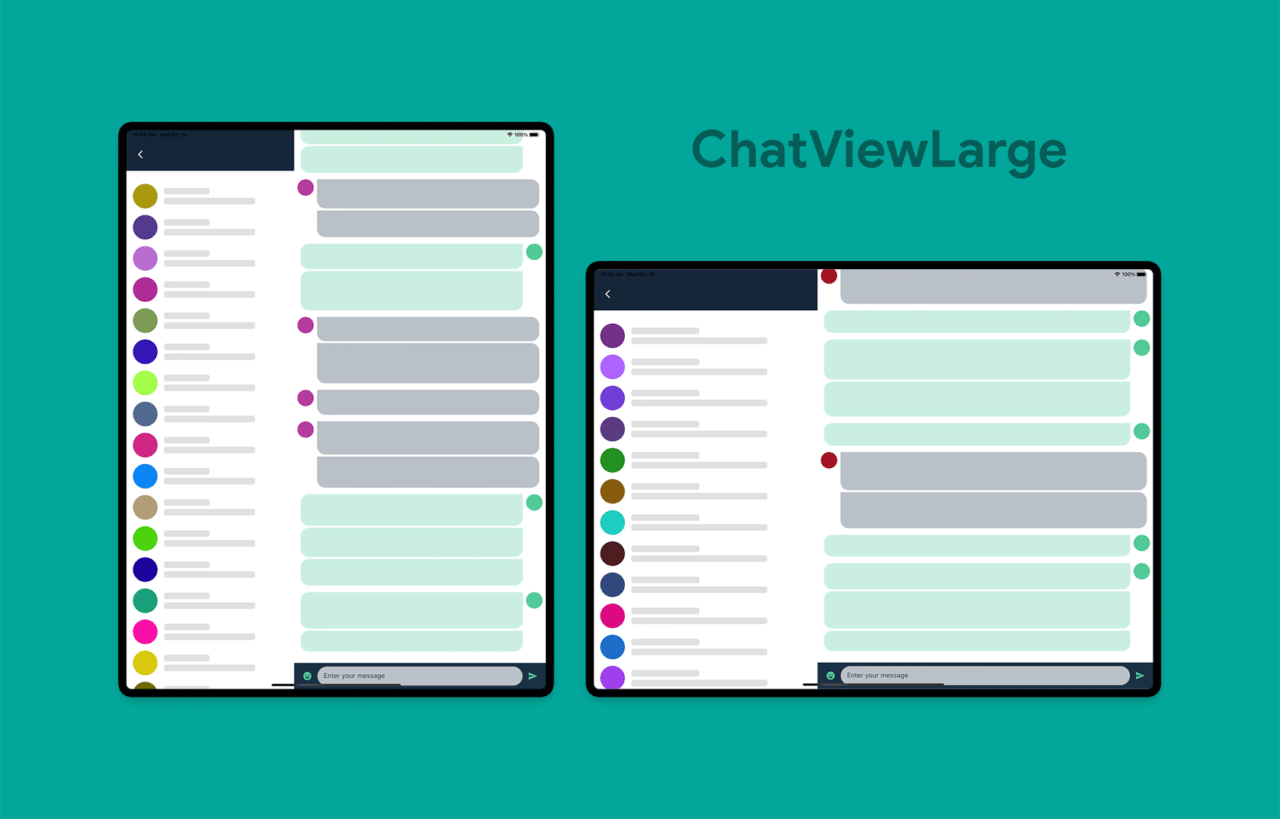
ChatPage
This will be similar to the HomePage, but it will consist of the following two views:
- ChatViewSmall (consisting of
AppBar,ChatList, andSendWidgetwidget) - ChatViewLarge (consisting of
PeopleView,ChatList, andSendWidgetwidget)
class ChatPage extends StatelessWidget {
  final Color profileIconColor;
  ChatPage(this.profileIconColor);

  @override
  Widget build(BuildContext context) {
    return Scaffold(
      body: OrientationBuilder(
        builder: (context, orientation) => LayoutBuilder(
          builder: (context, constraints) {
            double breakpointWidth = orientation == Orientation.portrait ? 600 : 800;

            if (constraints.maxWidth < breakpointWidth) {
              return ChatViewSmall(profileIconColor);
            } else {
              return ChatViewLarge(profileIconColor);
            }
          },
        ),
      ),
    );
  }
}
Here, I have used OrientationBuilder along with the LayoutBuilder to vary the breakpointWidth according to the orientation, as I do not want to display the PeopleView on a small-screen mobile while it is in landscape mode.
class ChatViewSmall extends StatelessWidget {
  final Color profileIconColor;
  ChatViewSmall(this.profileIconColor);

  @override
  Widget build(BuildContext context) {
    return Scaffold(
      appBar: AppBar(
      ),
      body: Container(
        color: Colors.white,
        child: Column(
          children: [
            Expanded(child: ChatList(profileIconColor)),
            SendWidget(),
          ],
        ),
      ),
    );
  }
}
class ChatViewLarge extends StatelessWidget {
  final Color profileIconColor;
  ChatViewLarge(this.profileIconColor);

  @override
  Widget build(BuildContext context) {
    return Container(
      child: Row(
        children: [
          Expanded(
            flex: 2,
            child: SingleChildScrollView(
              child: PeopleView(),
            ),
          ),
          Expanded(
            flex: 3,
            child: Container(
              color: Colors.white,
              child: Column(
                children: [
                  Expanded(child: ChatList(profileIconColor)),
                  SendWidget(),
                ],
              ),
            ),
          ),
        ],
      ),
    );
  }
}
Conclusion
We have successfully created a fully responsive app in Flutter. There are a number of improvements you can still make to this app, one of which could be defining the fontSize to differ according to different screen sizes.
While working with responsiveness, some of the amazing Flutter plugins that you can use are as follows:

Learn more
- GitHub repo of the sample app
- [Official guide] Creating responsive apps
- Flutter web — getting started with responsive design
Souvik Biswas is a passionate Mobile App Developer (Android and Flutter). He has worked on a number of mobile apps throughout his journey. Loves open source contribution on GitHub. He is currently pursuing a B.Tech degree in Computer Science and Engineering from Indian Institute of Information Technology Kalyani. He also writes Flutter articles on Medium - Flutter Community.


