


Written by Souvik Biswas
Creating a complex user interface design on Android with a nested view hierarchy used to be common. But with the introduction of ConstraintLayout, this has changed a lot. ConstraintLayout reduces a lot of the challenges of building complex layouts, as you can now design them using the GUI of Layout Editor by just dragging UI elements into a visual design editor instead of writing layout in an XML file by hand.
You can take full advantage of this Layout Editor while using ConstraintLayout (part of Android Jetpack libraries). It uses a flat view hierarchy and also provides some performance benefits.
If you want more information regarding the performance benefits of ConstraintLayout, check out this Android developer’s blog post.
If you need more information on getting started and developing an application with Jetpack Compose, check out this article by a Senior Mobile Engineer Salih.
So, let’s get started, but first, let us know what’s your relationship with CI/CD tools?
Overview of constraints
You must set at least two constraints, one horizontal and one vertical constraint, to position a view element properly on the screen.
If you do not have Autoconnection turned on, any view that you drop in the Layout Editor stays where you leave it without any constraints. However, when you run an app with a view element without any constraints, it is by default rendered to the position [0,0] (the top-left corner of the device screen).
Now, let’s look into the different types of constraints that you can set on a view element to position and adjust UI components.
Types of constraints
Android Studio allows you to use the following types of constraints:
Fixed constraint: A constraint that is specified using a hard-coded number.
Adaptable constraint: A constraint that defines a relationship in relative and weighted terms.
Absolute positioning: A numerical positioning, such as the position in x, y coordinates.
Relative positioning: Views are positioned by specifying relationships with other views.
Some of the useful features that you can use with ConstraintLayout are listed below:
- Chains
- Bias
- Ratios
- Guideline
- Barrier
- Baseline
- Group
- Circular positioning
- Flow
- ConstraintSet
Let’s talk about these in more detail.
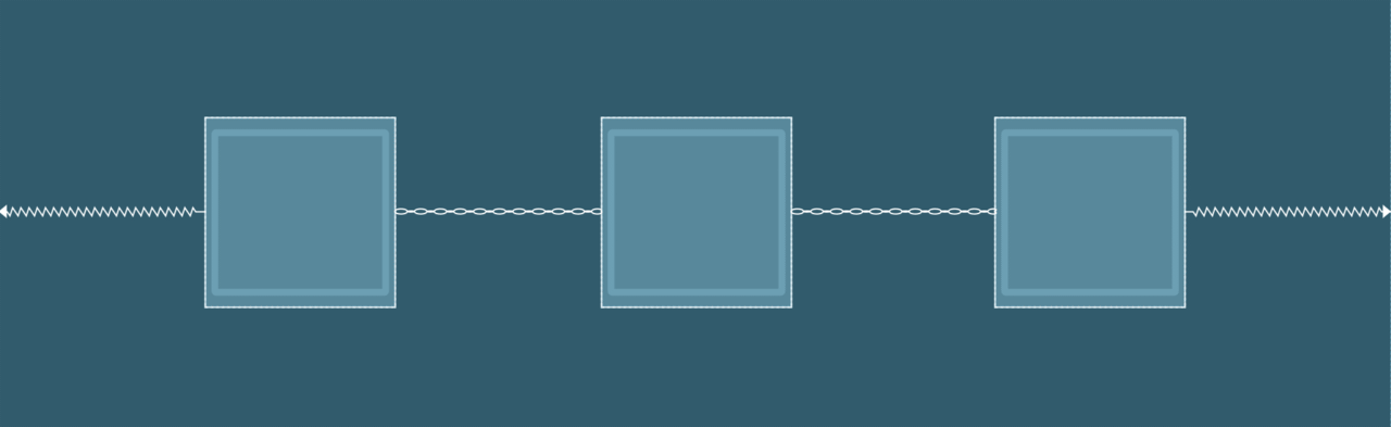
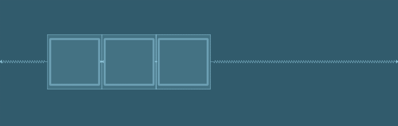
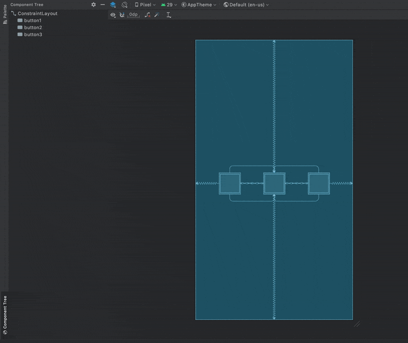
Chains
A chain is a group of views that are linked to each other with bi-directional position constraints. The views within a chain can be distributed either vertically or horizontally.
Some of the ways in which chains can be styled are shown below:
Spread: Elements are evenly distributed along the mentioned axis. This the default style for chains.
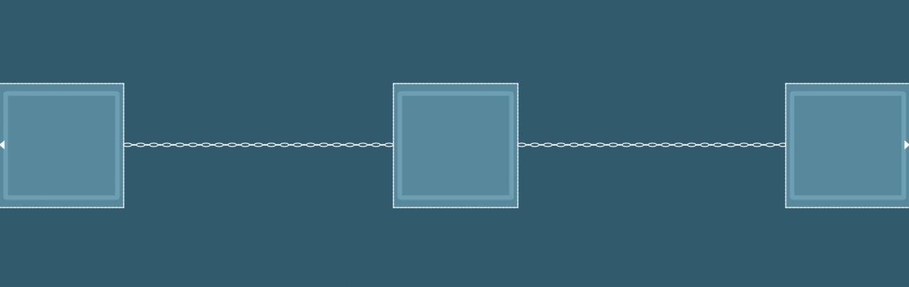
Spread inside: Elements are spread to use the available space with the head and tail attached to the parent.
Weighted: Elements are resized to use all the available space according to specified weights with the head and tail glued to the parent.
This can be achieved when the chain is set to either spread or spread inside. You can fill the remaining space by setting one or more views to
match constraint(0dp).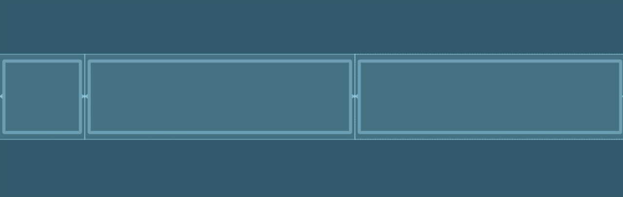
Packed: Elements are packed to use minimum space.
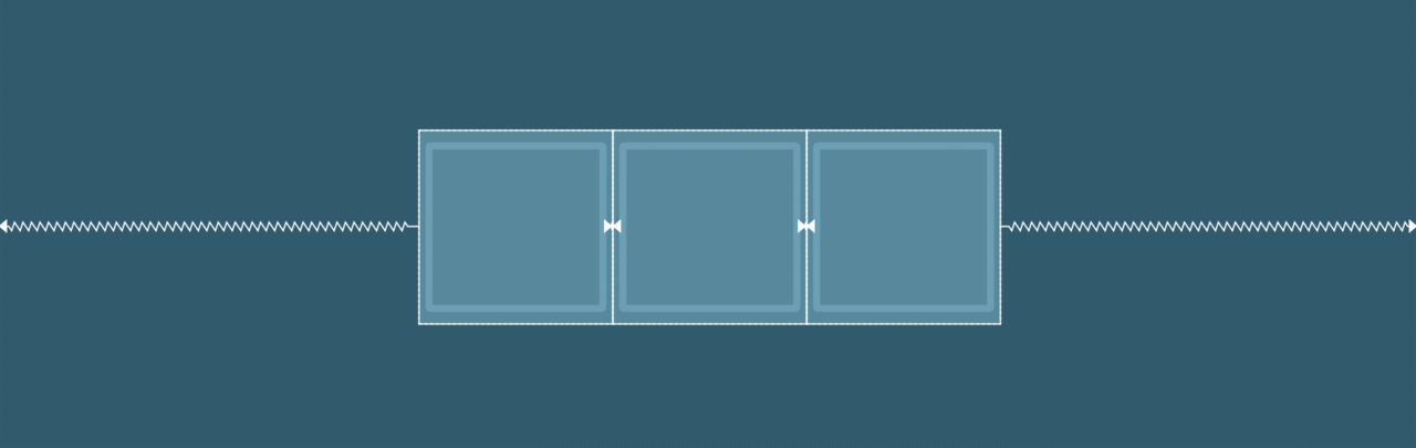
Packed with bias: Elements are packed to use minimum space and are moved on their axis depending on bias.
The XML code with the default chain style looks like below:
<Button
    android:id="@+id/button1"
    android:layout_width="56dp"
    android:layout_height="56dp"
    app:layout_constraintBottom_toBottomOf="@+id/button2"
    app:layout_constraintEnd_toStartOf="@+id/button2"
    app:layout_constraintHorizontal_bias="0.5"
    app:layout_constraintStart_toStartOf="parent"
    app:layout_constraintTop_toTopOf="@+id/button2" />

<Button
    android:id="@+id/button2"
    android:layout_width="56dp"
    android:layout_height="56dp"
    app:layout_constraintBottom_toBottomOf="parent"
    app:layout_constraintEnd_toStartOf="@+id/button3"
    app:layout_constraintHorizontal_bias="0.5"
    app:layout_constraintStart_toEndOf="@+id/button1"
    app:layout_constraintTop_toTopOf="parent"
    app:layout_constraintVertical_bias="0.514" />

<Button
    android:id="@+id/button3"
    android:layout_width="56dp"
    android:layout_height="56dp"
    app:layout_constraintBottom_toBottomOf="@+id/button2"
    app:layout_constraintEnd_toEndOf="parent"
    app:layout_constraintHorizontal_bias="0.5"
    app:layout_constraintStart_toEndOf="@+id/button2"
    app:layout_constraintTop_toTopOf="@+id/button2" />
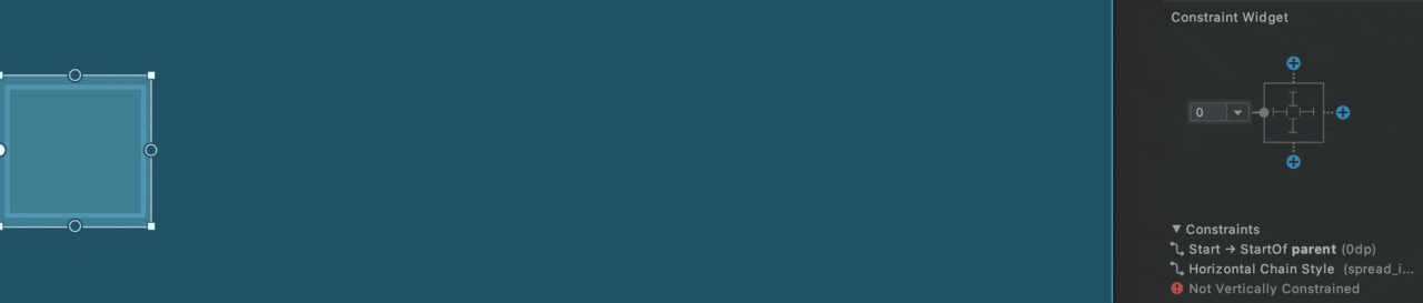
Bias
When a view is constrained to both sides on either axis, it is centered on that axis, and the bias value is set to 50%. You can adjust this bias by using the slider present in the Attributes panel under the Layout tab.
The XML code looks like below:
<Button
    android:id="@+id/button"
    android:layout_width="56dp"
    android:layout_height="56dp"
    app:layout_constraintBottom_toBottomOf="parent"
    app:layout_constraintEnd_toEndOf="parent"
    app:layout_constraintHorizontal_bias="0.2"
    app:layout_constraintStart_toStartOf="parent"
    app:layout_constraintTop_toTopOf="parent" />
Ratio
In ConstraintLayout, you can set the size of a view by defining an aspect ratio. To use ratio, set at least one of the view dimensions (i.e., either height or width, or both) to match constraint (0dp).
Then you will notice a small triangle in the top-left corner.
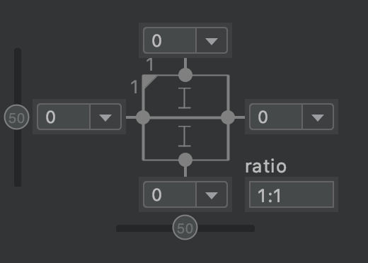
Click on it to enable ratio for that selected view. Now, you can define any aspect ratio in the format width:height. (By default, it is set to 1:1.)
If you have the height fixed to a certain dp value or wrap_content and width to match constraint, then the ratio will define the width with respect to the height and vice versa.
If you have both the width and height set to match constraint, then the ratio will define both of them with respect to the parent. In this case, you get some more options. For example, if you press the triangle a second time, it will set the ratio with respect to the height (of the parent). Pressing the triangle a third time will set the ratio with respect to the width (of the parent).
The XML code looks like below:
<Button
    android:id="@+id/button"
    android:layout_width="0dp"
    android:layout_height="56dp"
    app:layout_constraintBottom_toBottomOf="parent"
    app:layout_constraintDimensionRatio="h,1:1"
    app:layout_constraintEnd_toEndOf="parent"
    app:layout_constraintStart_toStartOf="parent"
    app:layout_constraintTop_toTopOf="parent" />
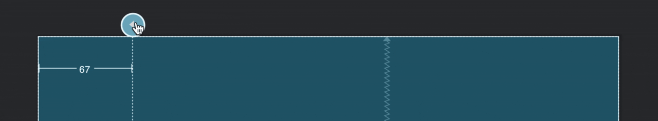
Guideline
A Guideline is a virtual helper object that allows you to create horizontal and vertical guidelines, which are positioned relative to the ConstraintLayout container. You can then constrain other view elements relative to your specified guideline.
A guideline can be created by right-clicking on the Design editor. Then under Helpers, select either Add Vertical Guideline or Add Horizontal Guideline. You can also do this by clicking the Guidelines icon in the toolbar.
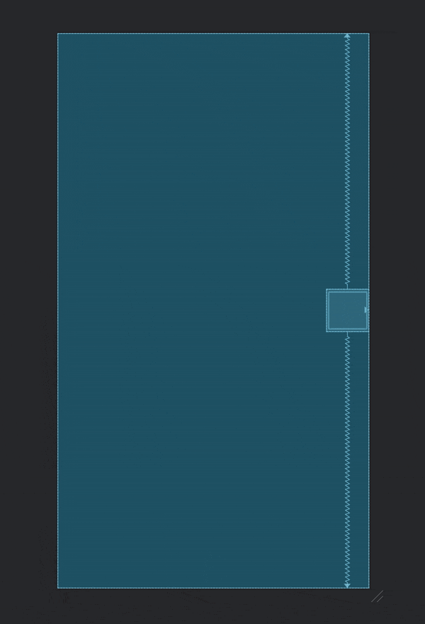
After adding the guideline, you can drag the dotted line by holding the circle to reposition it (by default, it is measured in dp from the left edge of the container).
You can click on the circle to toggle the edge from which the dp value is set, or you can set it as a percentage.
The XML code looks like below:
<androidx.constraintlayout.widget.Guideline
    android:id="@+id/guideline5"
    android:layout_width="wrap_content"
    android:layout_height="wrap_content"
    android:orientation="vertical"
    app:layout_constraintGuide_begin="68dp" />
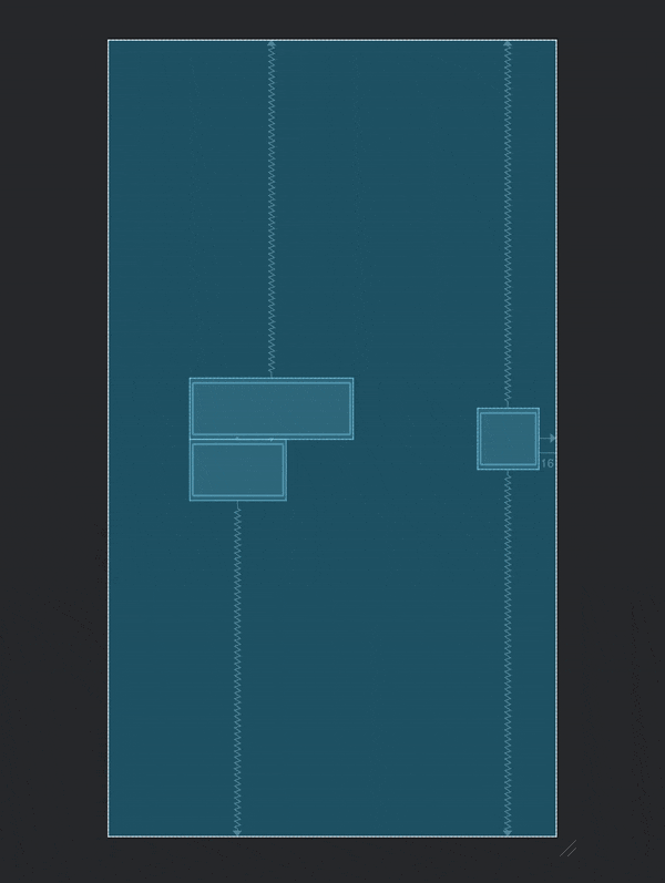
Barrier
A Barrier is similar to a guideline, but unlike a guideline, it doesn’t need to have a fixed position. It can move based on the positions of views it contains, and you can constrain other view elements to it.
Barriers are particularly useful when you’re laying out internationalized strings or displaying user-generated content with an unpredictable size that can change during runtime.
You can create a barrier by right-clicking on the Design editor, then under Helpers, selecting either Add Vertical Barrier or Add Horizontal Barrier. You can also click the Guidelines icon in the toolbar and select the option accordingly.
The XML code looks like below:
<androidx.constraintlayout.widget.Barrier
    android:id="@+id/barrier"
    android:layout_width="wrap_content"
    android:layout_height="wrap_content"
    app:barrierDirection="end"
    app:constraint_referenced_ids="button7,button6" />
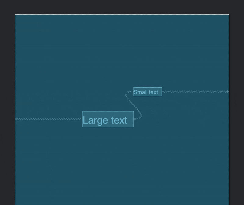
Baseline
You can align the baseline of multiple text views, regardless of their font sizes. This constraint makes it much easier to align text views.
If you are not sure what baseline is exactly, Material Design Typography states it as follows:
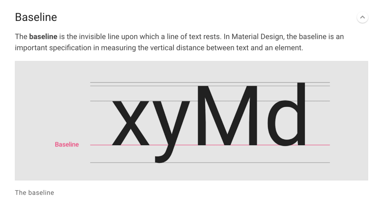
In order to create a baseline constraint, right-click on a text view and select Show Baseline. Then, you can just click on the text baseline of that view and drag it to the baseline of another to align them.
The XML code looks like below:
<TextView
    android:id="@+id/large_text"
    android:layout_width="wrap_content"
    android:layout_height="wrap_content"
    android:text="Large text"
    android:textSize="22sp"
    app:layout_constraintBaseline_toBaselineOf="@+id/small_text"
    app:layout_constraintEnd_toStartOf="@+id/small_text"
    app:layout_constraintHorizontal_bias="0.5"
    app:layout_constraintHorizontal_chainStyle="packed"
    app:layout_constraintStart_toStartOf="parent" />

<TextView
    android:id="@+id/small_text"
    android:layout_width="wrap_content"
    android:layout_height="wrap_content"
    android:text="Small text"
    android:textSize="12sp"
    app:layout_constraintBottom_toBottomOf="parent"
    app:layout_constraintEnd_toEndOf="parent"
    app:layout_constraintHorizontal_bias="0.5"
    app:layout_constraintStart_toEndOf="@+id/large_text"
    app:layout_constraintTop_toTopOf="parent" />
Group
You can use a Group to logically group together certain view elements. A group contains references to the view ids. This is pretty useful if you want to change the visibility of multiple view elements, as you just set the visibility of the whole group rather than setting it for each element.
You can create a group by selecting the view elements that you want to include in the group. Then right-click, and under Helpers, select Add Group.
The XML code looks like below:
<androidx.constraintlayout.widget.Group
    android:id="@+id/group3"
    android:layout_width="wrap_content"
    android:layout_height="wrap_content"
    app:constraint_referenced_ids="button3,button2,button1" />
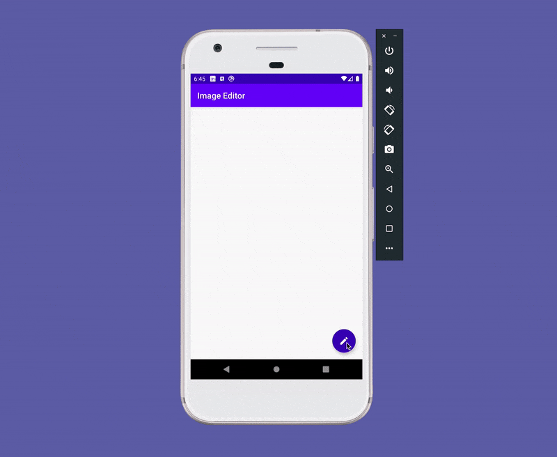
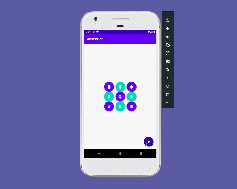
Circular positioning
Circular positioning allows you to constrain a widget center relative to another widget center at an angle and a distance. This allows you to position a view element in a circular formation around the central view.
An example of a Floating Action Button with multiple options:
The XML code for this is as follows:
<com.google.android.material.floatingactionbutton.FloatingActionButton
    android:id="@+id/edit_fab"
    style="@style/Widget.Design.FloatingActionButton"
    android:layout_width="wrap_content"
    android:layout_height="wrap_content"
    android:layout_marginEnd="16dp"
    android:layout_marginBottom="16dp"
    app:backgroundTint="@color/colorPrimaryDark"
    app:fabSize="normal"
    app:layout_constraintBottom_toBottomOf="parent"
    app:layout_constraintEnd_toEndOf="parent"
    app:srcCompat="@drawable/ic_baseline_edit_24" />

<com.google.android.material.floatingactionbutton.FloatingActionButton
    android:id="@+id/aspect_ratio_fab"
    style="@style/Widget.Design.FloatingActionButton"
    android:layout_width="wrap_content"
    android:layout_height="wrap_content"
    android:layout_marginStart="16dp"
    app:backgroundTint="@color/colorPrimary"
    app:fabSize="normal"
    app:layout_constraintCircle="@+id/edit_fab"
    app:layout_constraintCircleAngle="0"
    app:layout_constraintCircleRadius="90dp"
    app:srcCompat="@drawable/ic_baseline_aspect_ratio_24" />

<com.google.android.material.floatingactionbutton.FloatingActionButton
    android:id="@+id/crop_fab"
    style="@style/Widget.Design.FloatingActionButton"
    android:layout_width="wrap_content"
    android:layout_height="wrap_content"
    android:layout_marginBottom="16dp"
    app:backgroundTint="@color/colorPrimary"
    app:fabSize="normal"
    app:layout_constraintCircle="@+id/edit_fab"
    app:layout_constraintCircleAngle="315"
    app:layout_constraintCircleRadius="90dp"
    app:srcCompat="@drawable/ic_baseline_crop_24" />

<com.google.android.material.floatingactionbutton.FloatingActionButton
    android:id="@+id/rotate_90_fab"
    style="@style/Widget.Design.FloatingActionButton"
    android:layout_width="wrap_content"
    android:layout_height="wrap_content"
    android:layout_marginEnd="16dp"
    app:backgroundTint="@color/colorPrimary"
    app:fabSize="normal"
    app:layout_constraintCircle="@+id/edit_fab"
    app:layout_constraintCircleAngle="270"
    app:layout_constraintCircleRadius="90dp"
    app:srcCompat="@drawable/ic_baseline_rotate_90_degrees_ccw_24" />
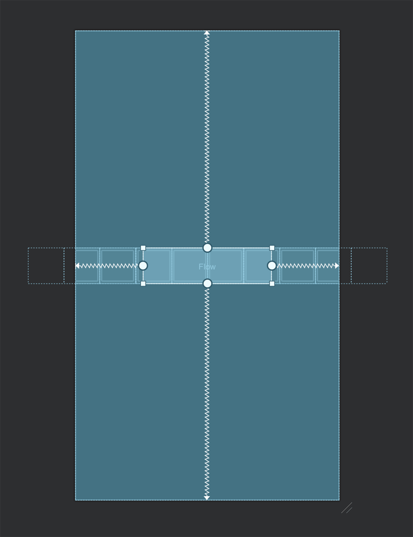
Flow
Flow is a part of ConstraintLayout 2.0. (It is currently in release candidate; the stable version will be announced soon.) It allows you to lay out a long chain of view elements and wrap them into multiple rows or columns. You can specify the flow_wrapMode property to define the wrap style.
The following are the wrap modes available for Flow:
Wrap none: This simply creates a chain out of the referenced elements. It doesn’t try to fit them within the flow dimensions.
The XML code is as follows:
<androidx.constraintlayout.helper.widget.Flow
  android:layout_width="200dp"
  android:layout_height="wrap_content"
  app:constraint_referenced_ids="button1, button2, button3, button4, button5, button6, button7, button8, button9, button10"
  app:flow_wrapMode="none"
  app:layout_constraintBottom_toBottomOf="parent"
  app:layout_constraintEnd_toEndOf="parent"
  app:layout_constraintStart_toStartOf="parent"
  app:layout_constraintTop_toTopOf="parent" />
Wrap chain: This creates multiple rows or columns if the referenced views don’t fit within the specified dimension.
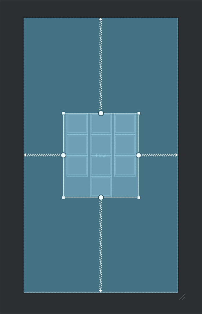
The XML code is as follows:
<androidx.constraintlayout.helper.widget.Flow
  android:layout_width="200dp"
  android:layout_height="wrap_content"
  app:constraint_referenced_ids="button1, button2, button3, button4, button5, button6, button7, button8, button9, button10"
  app:flow_wrapMode="chain"
  app:layout_constraintBottom_toBottomOf="parent"
  app:layout_constraintEnd_toEndOf="parent"
  app:layout_constraintStart_toStartOf="parent"
  app:layout_constraintTop_toTopOf="parent" />
Wrap aligned: This is similar to the wrap chain style, but it will align the view elements along the row or column.
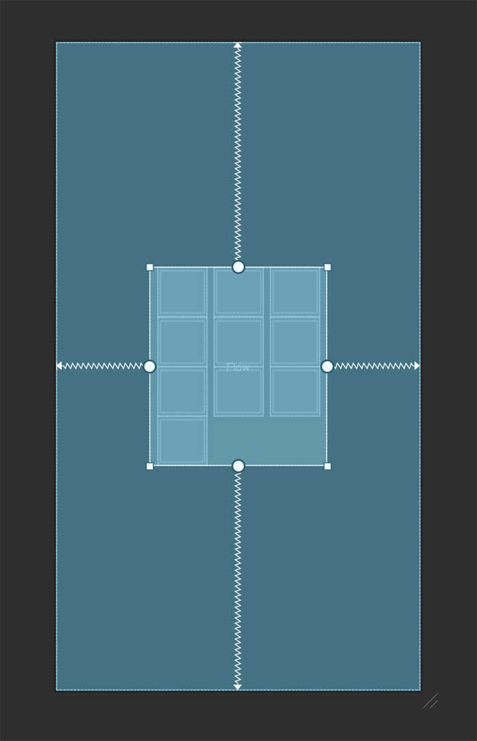
The XML code is as follows:
<androidx.constraintlayout.helper.widget.Flow
  android:layout_width="200dp"
  android:layout_height="wrap_content"
  app:constraint_referenced_ids="button1, button2, button3, button4, button5, button6, button7, button8, button9, button10"
  app:flow_wrapMode="aligned"
  app:layout_constraintBottom_toBottomOf="parent"
  app:layout_constraintEnd_toEndOf="parent"
  app:layout_constraintStart_toStartOf="parent"
  app:layout_constraintTop_toTopOf="parent" />

ConstraintSet
ConstraintSet allows you to create and save constraints defined using a ConstraintLayout. It also allows you to apply them to an existing ConstraintLayout. This can be used for creating animations very easily by defining a starting layout and final layout, and the rest is handled automatically by this class.
The following is a simple animation created using ConstraintSet:
First of all, you have to define the two ConstraintLayouts, i.e., the starting and the final layouts.
Starting layout XML code:
<!--activity_main.xml-->

<layout xmlns:android="http://schemas.android.com/apk/res/android"
    xmlns:app="http://schemas.android.com/apk/res-auto"
    xmlns:tools="http://schemas.android.com/tools"
    tools:context=".MainActivity">

    <androidx.constraintlayout.widget.ConstraintLayout
        android:id="@+id/root"
        android:layout_width="match_parent"
        android:layout_height="match_parent">

        <com.google.android.material.floatingactionbutton.FloatingActionButton
            android:id="@+id/fab1"
            style="@style/Widget.Design.FloatingActionButton"
            android:layout_width="wrap_content"
            android:layout_height="wrap_content"
            android:layout_marginStart="16dp"
            app:backgroundTint="@color/colorPrimary"
            app:fabSize="normal"
            app:srcCompat="@drawable/ic_baseline_adb_24" />

        <!-- Other FAB buttons can be defined similarly... -->

        <com.google.android.material.floatingactionbutton.FloatingActionButton
            android:id="@+id/filter_fab"
            style="@style/Widget.Design.FloatingActionButton"
            android:layout_width="wrap_content"
            android:layout_height="wrap_content"
            android:layout_marginEnd="16dp"
            android:layout_marginBottom="16dp"
            app:backgroundTint="@color/colorPrimaryDark"
            app:fabSize="normal"
            app:layout_constraintBottom_toBottomOf="parent"
            app:layout_constraintEnd_toEndOf="parent"
            app:srcCompat="@drawable/ic_baseline_filter_list_24" />

        <androidx.constraintlayout.helper.widget.Flow
            android:id="@+id/flow"
            android:layout_width="200dp"
            android:layout_height="wrap_content"
            app:constraint_referenced_ids="fab1, fab2, fab3, fab4, fab5, fab6, fab7, fab8, fab9"
            app:flow_maxElementsWrap="3"
            app:flow_wrapMode="aligned"
            app:layout_constraintBottom_toBottomOf="parent"
            app:layout_constraintEnd_toEndOf="parent"
            app:layout_constraintStart_toStartOf="parent"
            app:layout_constraintTop_toTopOf="parent" />

    </androidx.constraintlayout.widget.ConstraintLayout>

</layout>
Final layout XML code (with changed dimension of the Flow layout):
<!--final_view.xml-->

<androidx.constraintlayout.widget.ConstraintLayout xmlns:android="http://schemas.android.com/apk/res/android"
    xmlns:app="http://schemas.android.com/apk/res-auto"
    android:id="@+id/root"
    android:layout_width="match_parent"
    android:layout_height="match_parent">

    <com.google.android.material.floatingactionbutton.FloatingActionButton
        android:id="@+id/fab1"
        style="@style/Widget.Design.FloatingActionButton"
        android:layout_width="wrap_content"
        android:layout_height="wrap_content"
        android:layout_marginStart="16dp"
        app:backgroundTint="@color/colorPrimary"
        app:fabSize="normal"
        app:srcCompat="@drawable/ic_baseline_adb_24" />

    <!-- Other FAB buttons can be defined similarly... -->

    <com.google.android.material.floatingactionbutton.FloatingActionButton
        android:id="@+id/filter_fab"
        style="@style/Widget.Design.FloatingActionButton"
        android:layout_width="wrap_content"
        android:layout_height="wrap_content"
        android:layout_marginEnd="16dp"
        android:layout_marginBottom="16dp"
        app:backgroundTint="@color/colorAccent"
        app:fabSize="normal"
        app:layout_constraintBottom_toBottomOf="parent"
        app:layout_constraintEnd_toEndOf="parent"
        app:srcCompat="@drawable/ic_baseline_filter_list_24" />

    <androidx.constraintlayout.helper.widget.Flow
        android:id="@+id/flow"
        android:layout_width="match_parent"
        android:layout_height="match_parent"
        app:constraint_referenced_ids="fab1, fab2, fab3, fab4, fab5, fab6, fab7, fab8, fab9"
        app:flow_horizontalStyle="spread_inside"
        app:flow_maxElementsWrap="3"
        app:flow_wrapMode="aligned"
        app:layout_constraintBottom_toBottomOf="parent"
        app:layout_constraintEnd_toEndOf="parent"
        app:layout_constraintStart_toStartOf="parent"
        app:layout_constraintTop_toTopOf="parent" />

</androidx.constraintlayout.widget.ConstraintLayout>
The Kotlin code for the animation is given below:
import androidx.appcompat.app.AppCompatActivity
import android.os.Bundle
import android.view.View
import androidx.constraintlayout.widget.ConstraintSet
import androidx.transition.TransitionManager
import kotlinx.android.synthetic.main.activity_main.*

class MainActivity : AppCompatActivity() {

    private lateinit var filterFAB: View

    override fun onCreate(savedInstanceState: Bundle?) {
        super.onCreate(savedInstanceState)
        setContentView(R.layout.activity_main)

        addConstraintSetAnimation()
    }

    private fun addConstraintSetAnimation() {
        filterFAB = filter_fab

        var filteredList = false
        val constraint1 = ConstraintSet()
        constraint1.clone(root)

        val constraint2 = ConstraintSet()
        constraint2.clone(this, R.layout.final_view)

        filterFAB.setOnClickListener {
            TransitionManager.beginDelayedTransition(root)
            val constraint = if (filteredList) constraint1 else constraint2
            constraint.applyTo(root)
            filteredList = !filteredList
        }
    }
}
Now, let’s apply the concepts that you have learned above to build a sample app using ConstraintLayout with some simple animations.
Building an app using ConstraintLayout
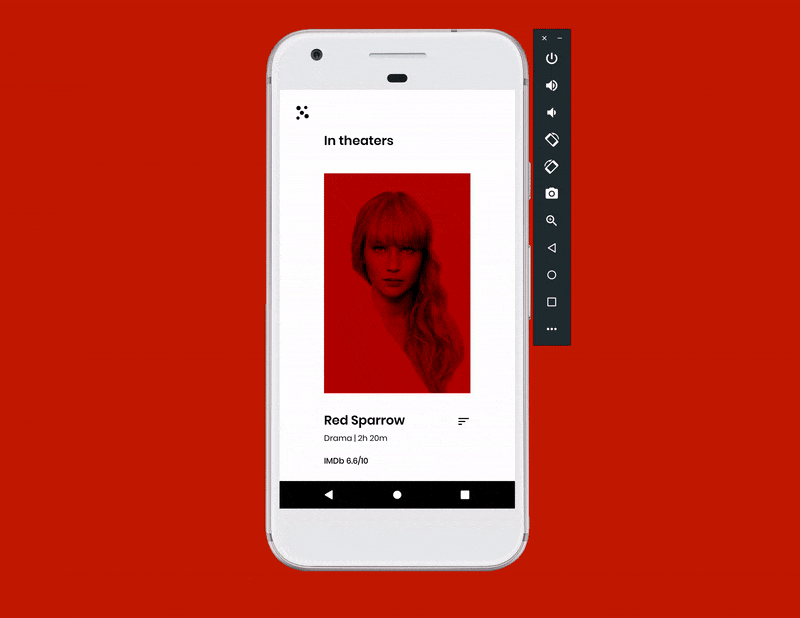
We will be creating the following user interface design of a movie ticket booking app:
The app will contain three layout designs, which we will be creating using ConstraintLayout. Then we will use ConstraintSet to perform the animations while transitioning between these layouts.
Getting started
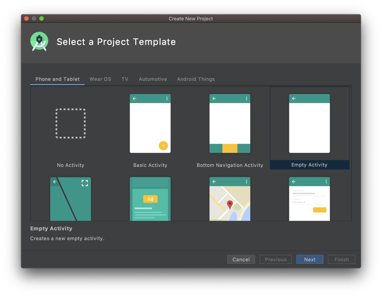
Create a new project using Android Studio.
Select Empty Activity and click Next.
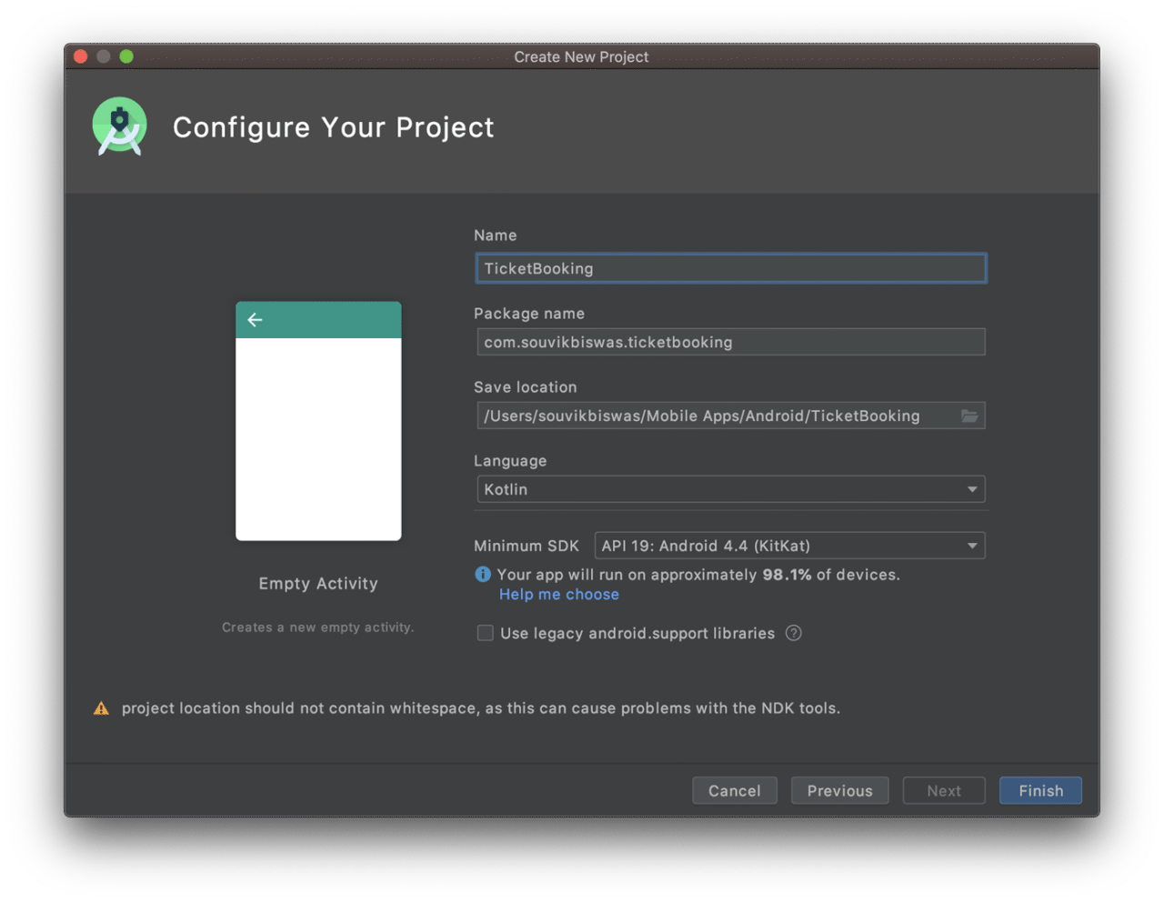
Enter the name of the project and location. Select the language as Kotlin, and set the minimum SDK version to API 19. Click Finish.
This will create a new Android project for you. Wait for the build indexing to complete.
Main layout
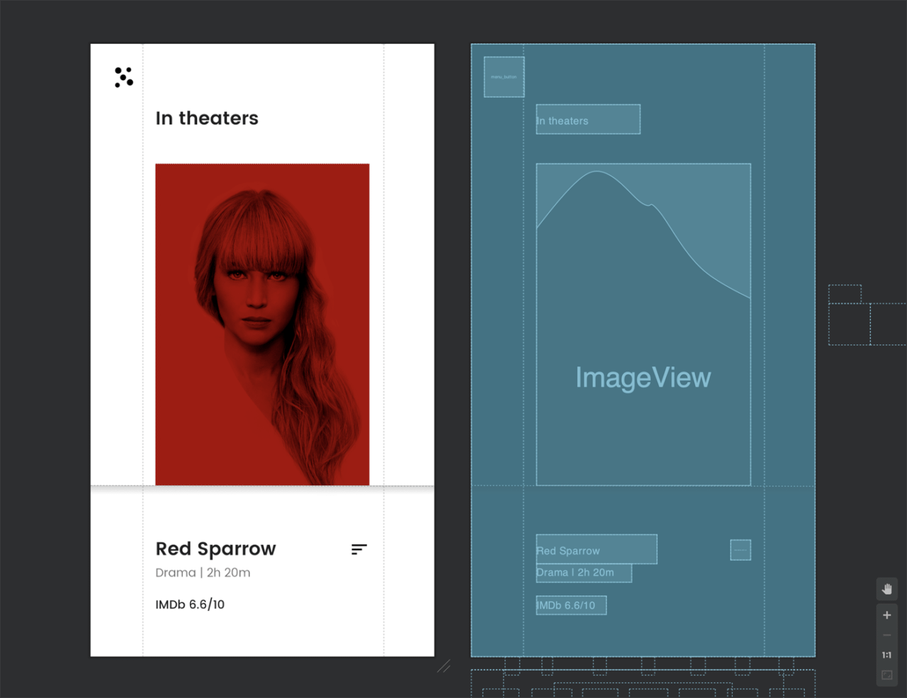
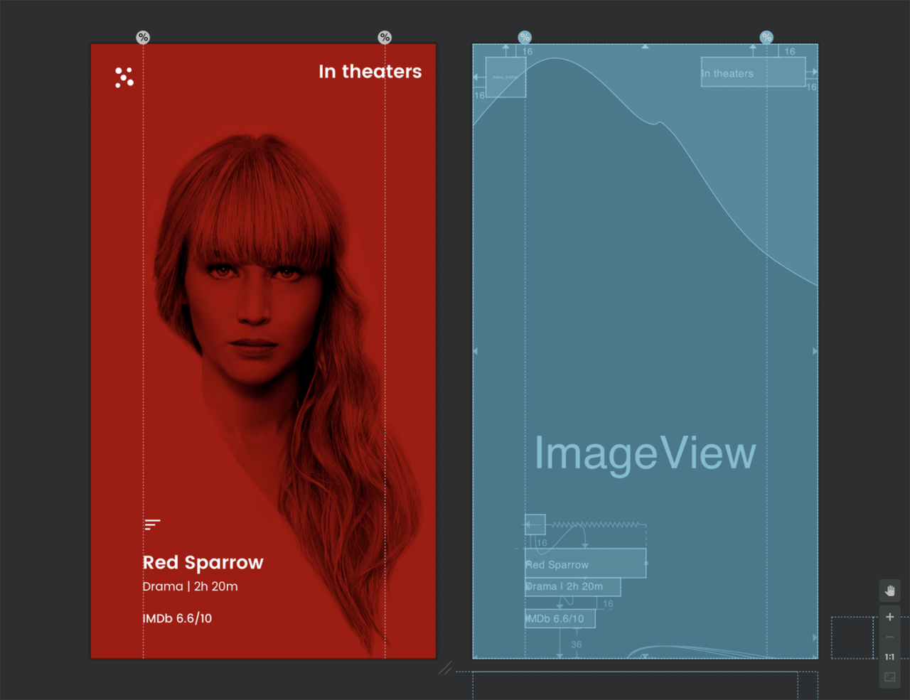
The main layout will consist of a menu button (top-left corner), a cover image of the movie, and its description.
Start by placing the menu button by dragging an ImageButton from the Palette onto the Design Editor, and constrain it to the top-left corner of the layout with a margin of 16dp from the edges.
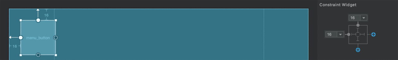
<ImageButton
    android:id="@+id/menu_button"
    android:layout_width="48dp"
    android:layout_height="48dp"
    android:layout_marginStart="16dp"
    android:layout_marginTop="16dp"
    android:background="@null"
    android:contentDescription="@string/menu_button"
    app:layout_constraintStart_toStartOf="parent"
    app:layout_constraintTop_toTopOf="parent"
    app:srcCompat="@drawable/ic_scatter" />
You can get the assets used in this project from my GitHub repository. (The link is at the end of this article.)
Now, add two guidelines, which will help in placing the cover image and other view elements on the screen. Place one at 15% and another at 85% from the left edge.
<androidx.constraintlayout.widget.Guideline
    android:id="@+id/left_guideline"
    android:layout_width="wrap_content"
    android:layout_height="wrap_content"
    android:orientation="vertical"
    app:layout_constraintGuide_percent="0.15" />

<androidx.constraintlayout.widget.Guideline
    android:id="@+id/right_guideline"
    android:layout_width="wrap_content"
    android:layout_height="wrap_content"
    android:orientation="vertical"
    app:layout_constraintGuide_percent="0.85" />
Add a TextView to show the movie status. Constrain it to the bottom of the menu button and to the left guideline.
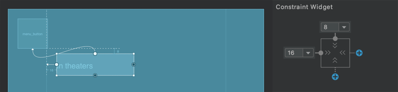
<TextView
    android:id="@+id/status"
    android:layout_width="wrap_content"
    android:layout_height="wrap_content"
    android:layout_marginStart="16dp"
    android:layout_marginTop="8dp"
    android:fontFamily="@font/poppins_semibold"
    android:src="@drawable/transition"
    android:text="@string/movie_status"
    android:textAppearance="@style/TextAppearance.AppCompat.Large"
    app:layout_constraintStart_toStartOf="@+id/left_guideline"
    app:layout_constraintTop_toBottomOf="@+id/menu_button" />
Add an ImageView with the cover image. Constrain it to the guidelines that we added earlier, and set the ratio to 2:3.
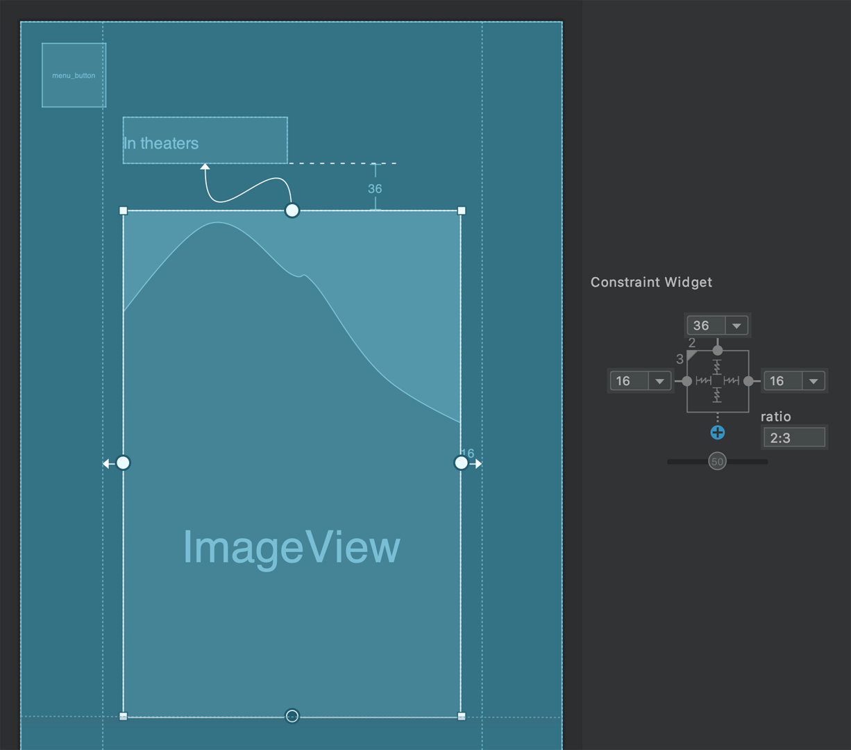
<ImageView
    android:id="@+id/cover"
    android:layout_width="0dp"
    android:layout_height="0dp"
    android:layout_marginStart="16dp"
    android:layout_marginTop="36dp"
    android:layout_marginEnd="16dp"
    android:contentDescription="@string/cover_image"
    android:scaleType="centerCrop"
    app:layout_constraintDimensionRatio="2:3"
    app:layout_constraintEnd_toStartOf="@+id/right_guideline"
    app:layout_constraintStart_toStartOf="@+id/left_guideline"
    app:layout_constraintTop_toBottomOf="@+id/status"
    app:srcCompat="@drawable/red_sparrow" />
We will use a vertical chain with the style set to packed to constrain the description TextView.
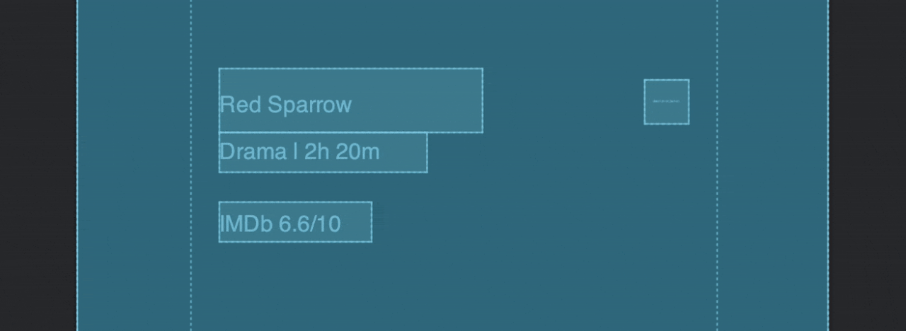
<TextView
    android:id="@+id/movie_title"
    android:layout_width="wrap_content"
    android:layout_height="wrap_content"
    android:layout_marginStart="16dp"
    android:layout_marginTop="24dp"
    android:fontFamily="@font/poppins_semibold"
    android:text="@string/movie_title"
    android:textAppearance="@style/TextAppearance.AppCompat.Large"
    app:layout_constraintBottom_toTopOf="@+id/desc"
    app:layout_constraintStart_toStartOf="@+id/left_guideline"
    app:layout_constraintTop_toBottomOf="@+id/cover"
    app:layout_constraintVertical_chainStyle="packed" />

<TextView
    android:id="@+id/desc"
    android:layout_width="wrap_content"
    android:layout_height="wrap_content"
    android:layout_marginStart="16dp"
    android:layout_marginBottom="16dp"
    android:fontFamily="@font/poppins"
    android:text="@string/movie_desc"
    app:layout_constraintBottom_toTopOf="@+id/rating"
    app:layout_constraintStart_toStartOf="@+id/left_guideline"
    app:layout_constraintTop_toBottomOf="@+id/movie_title" />

<TextView
    android:id="@+id/rating"
    android:layout_width="wrap_content"
    android:layout_height="wrap_content"
    android:layout_marginStart="16dp"
    android:layout_marginBottom="16dp"
    android:fontFamily="@font/poppins_medium"
    android:text="@string/movie_rating"
    android:textAppearance="@style/TextAppearance.AppCompat.Body1"
    app:layout_constraintBottom_toBottomOf="parent"
    app:layout_constraintStart_toStartOf="@+id/left_guideline"
    app:layout_constraintTop_toBottomOf="@+id/desc" />
The full XML code of the main layout is available here.
Now, we will add two more layouts, which we will be using for transitioning to and fro.
Cover layout
The UI design of the cover layout is as follows:
This layout will contain the same elements as defined in the main layout. So, just copy-paste the XML code from the activity_main.xml file to the cover_view.xml file, and then redefine some of the constraints to achieve the desired UI.
The full XML code of the cover layout is available here.
Description layout
The description layout will look like this:
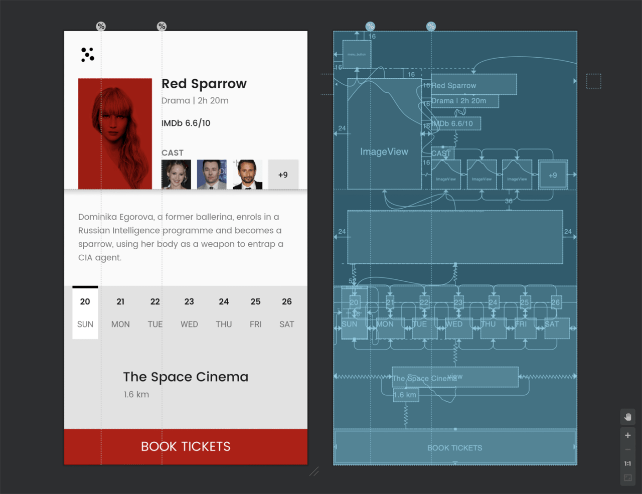
This layout is a bit complex, but it can be easily achieved using ConstraintLayout.
First of all, copy-paste the same code from the activity_main.xml file to the description_view.xml file, and modify the constraints as necessary. As you can see, this layout has some extra elements that have to be added.
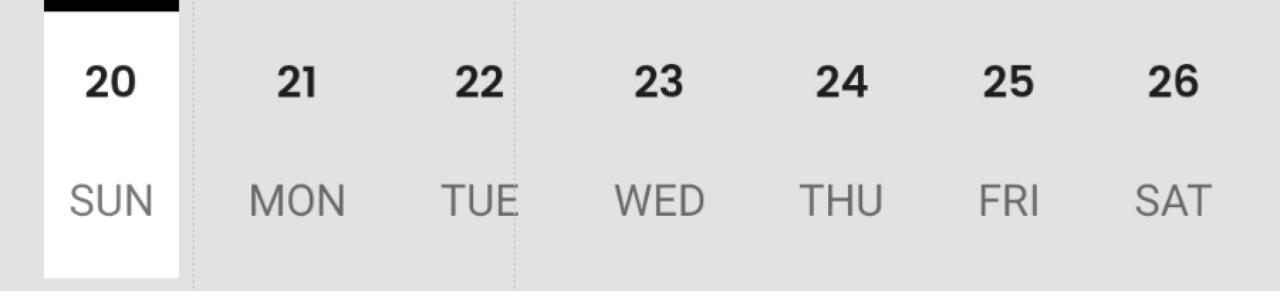
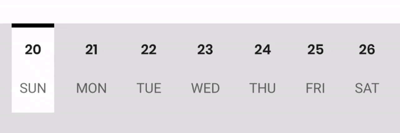
The date selector can be created by chaining (horizontally) together the views containing date and day.
To center a view element vertically with respect to another, you can constrain the left and right side of the view to another.
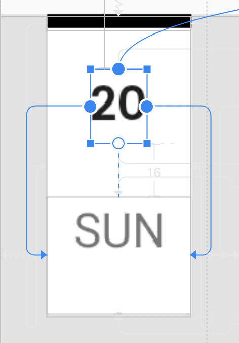
The date view can be created by adding a simple view element with the background color set to white. The bar on top is also created in a similar manner by adding a view with a black background color. Then constrain the start and end of the view with respect to the start and end of the day text view.
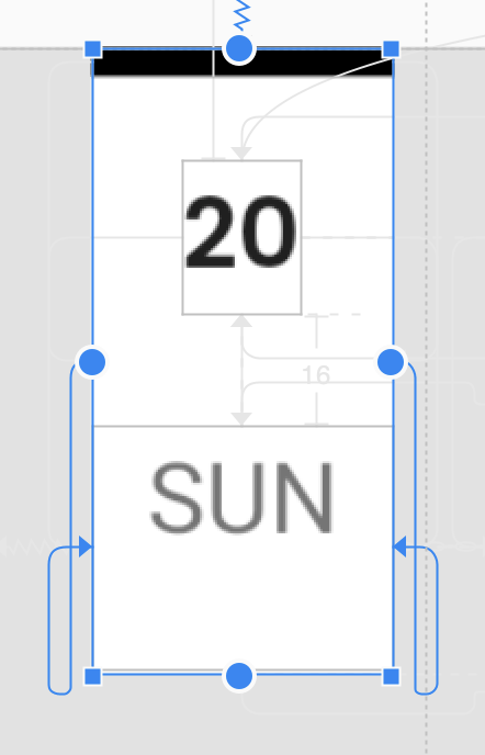
<View
    android:id="@+id/date_selector"
    android:layout_width="0dp"
    android:layout_height="0dp"
    android:layout_marginTop="36dp"
    android:background="@android:color/white"
    android:paddingLeft="@dimen/selector_side_padding"
    android:paddingEnd="@dimen/selector_side_padding"
    android:paddingRight="@dimen/selector_side_padding"
    app:layout_constraintBottom_toBottomOf="@+id/day_1"
    app:layout_constraintEnd_toEndOf="@+id/day_1"
    app:layout_constraintStart_toStartOf="@+id/day_1"
    app:layout_constraintTop_toBottomOf="@+id/movie_info" />
Before moving on to the layout animations, you will need to define the position of the new view elements added in this layout in the other two layouts as well. As they should not be visible in those layouts, constrain them such that they are outside of the root view area.
NOTE: If you do not define the appropriate position of the new elements in the main layout, then they will not get loaded in other layouts as well.
The full XML code of the description layout is present here.
Adding animations
You can animate the transition between the layouts using ConstraintSet.
The following is the code for transitioning from the main layout to the cover layout:
// Defining initial ConstraintSet
val initialConstraint = ConstraintSet()
// Here, "root" is the id of the main ConstraintLayout
initialConstraint.clone(root)

// Defining cover ConstraintSet
val coverConstraint = ConstraintSet()
coverConstraint.clone(this, R.layout.cover_view)

// Initiate the transition from the main layout
// to the cover layout as coverImage is clicked
coverImage.setOnClickListener {
    TransitionManager.beginDelayedTransition(root)
    coverConstraint.applyTo(root)
}
If you look carefully, you will notice that the text and the icon buttons also change color from black to white during this layout animation.
You can achieve the same result using this:
val anim = ValueAnimator()
anim.setIntValues(Color.BLACK, Color.WHITE)
anim.setEvaluator(ArgbEvaluator())
anim.addUpdateListener {
    menuButton.setColorFilter(it.animatedValue as Int)
    movieStatus.setTextColor(it.animatedValue as Int)
    movieTitle.setTextColor(it.animatedValue as Int)
    movieDescription.setTextColor(it.animatedValue as Int)
    movieRating.setTextColor(it.animatedValue as Int)
    descriptionButton.setColorFilter(it.animatedValue as Int)
}

anim.duration = 300
anim.start()
In order to animate the date selector, we will be modifying the constraints set on the date view element as a specific day/date is clicked.
Define a list of day
TextViewand a map of day to dateTextView:val days: List<TextView> = listOf(day_1, day_2, day_3, day_4, day_5, day_6, day_7) val mapOfDays: Map<TextView, TextView> = mapOf( day_1 to date_1, day_2 to date_2, day_3 to date_3, day_4 to date_4, day_5 to date_5, day_6 to date_6, day_7 to date_7 )Set click listeners to these text views:
for (day in days) {
    day.setOnClickListener { selectDate(it as TextView, descriptionConstraint) }
}

for (day in mapOfDays) {
    day.value.setOnClickListener { selectDate(day.key, descriptionConstraint) }
}
Define the method
selectDate, and re-connect the constraints to the appropriateTextViewas they are clicked on.private fun selectDate(day: TextView, destinationConstraint: ConstraintSet) { // re-defining the constraints destinationConstraint.connect( date_selector.id, ConstraintSet.START, day.id, ConstraintSet.START ) destinationConstraint.connect( date_selector.id, ConstraintSet.END, day.id, ConstraintSet.END ) // for animating the effect TransitionManager.beginDelayedTransition(root) // applying the constraints destinationConstraint.applyTo(root) }
You have successfully completed building the sample ticket booking app.
Conclusion
ConstraintLayout makes it really simple for Android developers to build complex UI designs. ConstraintSet helps to animate between these layouts with minimal lines of code. There are a lot more functionalities to explore in ConstraintLayout, we’ve covered only the basics in this post. If you want to apply more complex animations, there is a subclass of ConstraintLayout called MotionLayout. This allows you to define a whole new level of animation for your Android apps.
Learn more
- GitHub repository of the sample app
- [Article] Building interfaces with ConstraintLayout
- [Article] Introducing Constraint Layout 1.1
- [[Article] Getting started and developing an application with Jetpack Compose
- [Article] How to set up an Android project on Codemagic CI/CD?
- Automate the whole build, test and release pipeline of your Android apps to get to the market 20% faster
Souvik Biswas is a passionate Mobile App Developer (Android and Flutter). He has worked on a number of mobile apps throughout his journey. Loves open source contribution on GitHub. He is currently pursuing a B.Tech degree in Computer Science and Engineering from Indian Institute of Information Technology Kalyani. He also writes Flutter articles on Medium - Flutter Community.


