Flutter 102: The Next Logical Step by Scott Stoll
If you haven’t already read it, the first Flutter tutorial by Codemagic tutorial covers important basics, such as:
- Installation
- The Package Manager
- The Hello World App
- The Default Directory Structure
- Writing Your First Test
- Setting Up for Continuous Integration
Do you still need that one? Well, you can find it right here.
Now, if you think of that as a “Flutter 101” for University, then this is “Flutter Tutorial 102”. Here we’ll be going over layout basics. But before we get to it, there is one thing that’s important to keep in mind.
Flutter SDK: Don’t Try To Make Flutter Something It Was Never Supposed To Be
More and more, I see people complaining on Reddit and Twitter about Flutter, basically saying it sucks, because it doesn’t directly access the camera, GPS, Bluetooth, and other hardware. Let me show you how this looks to people who do know Flutter
What if I told you that Android isn’t ready for prime time and it totally sucks because it can’t even fold my laundry. I mean, seriously? What is Android even doing out of Alpha if it can’t do something as basic, rudimentary, as simple as folding my laundry! Stupid!
Yes, that really is how it looks. You have to remember what Flutter is meant to be, and what it was never meant to be.
As Tim Sneath said during the 1.0 launch at Flutter Live, Flutter is a UI Toolkit. It is not an operating system. No one ever said it was an operating system, it’s not supposed to be an operating system, yet people complain and bash it because it doesn’t do what an operating system is supposed to do.
This means dealing with things like Bluetooth, camera and what-not isn’t Flutter’s job. That kind of thing is the operating system’s problem.
So, when you see people complaining that Flutter needs plugins and platform channels to access the hardware, you’ll know they clearly have no idea what Flutter is, what it’s supposed to be or what they’re talking about.
That said, let’s get to it!
The Flutter Layout System
There are several points to know when working with Flutter’s Layout System.
Constrain Yourself
Box Constraints may not make the world go around, but they sure make Flutter go around. Constraints is basically just a fancy sounding term for Size Limits. There are maximum sizes, minimum sizes and sometimes there are no sizes specified so your app has to figure it out for itself at runtime.
- Examples of maxes include Center, Listview and if you don’t tell a Container what size to be, it will try to be as big as it can, too.
- Minimum seekers include Opacity and Transform.
- Some try to be a particular size, such as Image and Text.
And then there are the fun ones. Yes, that was sarcasm, good catch on your part. Anyone who has ever dealt with the Boogeyman of all Flutter errors, “Renderflex children have non-zero flex but incoming Constraints are unbounded”, can tell you there are times when trying to deal with Constraints can make you want to tear your hair out. More on that later…
Flutter Layout: One Pass to Layout Them All and on the Screen, Render Them
One of the best things about Flutter is that, unlike some other frameworks, Flutter does its layout in only one pass; down and back up. Flutter is able to do this because of the way it lays the elements out in relation to each other, instead of in relation to the physical screen or window size.
The trip down the tree for widgets with only one child each looks something like this:
- On the way down, the parent of each Widget tells it the maximum amount of space it has to work with in the X and Y axis. This is called the Widget’s “Constraints”.
- If that Widget is a parent, it will then calculate how much space it needs for things like borders, padding, etc., subtract that from its Constraints and then pass the resulting dimensions on to its child. Those will be its child’s Constraints.
- If the Widget is not a parent, it first figures out how much space it needs and then passes that information back up the tree.
- Now that child’s parent knows something more important than how large its child could be. It knows exactly how big the child is going to be.
- Armed with that knowledge, it can align the child within itself.
- That completed, it can now figure out how large it’s going to be and pass that information up the tree to its parent.
- Rinse and repeat…
In reality, it looks something like this with a fullscreen app on a 1920x1080 screen (code below):
-
The highest level Container is going to be 1920x1080. It has padding of 30 and 10 on each axis.
-
The paddings have eaten 40 in each axis, so there is 1880x1040 remaining. This is what’s sent to the child as the child’s Constraints. So 1880x1040 is the largest the child could be.
-
The child has no children of its own. It calculates its size to be 400x200, and reports that back to its parent. “I’m actually going to be 400x200”.
-
Now the parent knows it has 1720x880 worth of empty space to work with and the child only needs 400x200. So, if the child isn’t going to take up all of the available space, then where do we put the child? Top? Left? Right? Center? 22% Left and 9% Down? How do we figure this out?
-
This is where alignment comes in. You’ll see that one of many ways to align something is to use the alignment property of the Container class. If we’re using Alignment.topLeft, then our child will be placed, you guessed it, in the top left corner of the highest level Container.
Side note:
Sizes in Flutter are not marked as being dp, sp or px. This is because everything in Flutter is in dp, which makes life a whole lot easier. It also helps when it comes time to have the app adapt to different screen sizes, too!
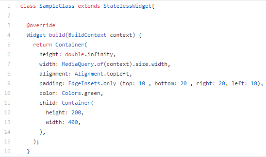
That’s the basic idea. Things get a lot more complicated when you start dealing with the Multi-Child Layout Algorithm, used for things like Rows and Columns; but since this is only Flutter 102, we’ll keep it simple for now.
In the above, I show two ways to set a size programmatically. MediaQuery does many things, including tell you the height and width of the physical screen. It can be used if you have a MaterialApp Widget higher up in the tree. The MaterialApp is often placed at the root of an app in order to make life easier. In the above example, we’re setting the top-level Container’s width to match the device’s screen size.
The other method is “double.infinty”, which is roughly the same thing as “match_parent” in Android. It basically means, “be as big as you can while still staying within the Constraints you were given”.
"…while still staying within the Constraints you were given". Oh boy, now we put our foot in a big hole. What if you weren’t given any Constraints? Yes, it can happen…
“Incoming Constraints are Unbounded” and Other Nightmares
Try holding 10,000 liters of water without using anything to contain it. No can, no bottle, no tank… Not even a coffee cup. Go ahead, I’ll wait…
Didn’t work out so well, did it? Well, now you know what trying to hold onto something really big is like if you haven’t set any boundaries to contain it. Congratulations! You now understand what happens if you try to set your Widget size to double.infinity when it hasn’t been passed any Constraints.
One situation in which you might not have any Constraints is when you use a Row or Column. That’s because each child of the Row or Column could potentially be a different size, and the Row or Column has no idea how big those children are going to need to be. There are other things you can do in order to fix this, of course. But in general, a Row or Column is waiting to hear from its children; then it adds their reported sized together to determine its own size.
But what if one of those children wants to be infinitely large? Then you end up standing in a mud puddle with water, water, everywhere.
Going Out of Bounds
Sometimes you try to put ten pounds of stuff into a five pound bag, and that doesn’t work any better than trying to hold all that water in your hands. In this case, I’m referring to times when your Widget is trying to use more real estate than its Constraints offered it. In Flutter we call this an Overflow, and when that happens the framework gives you a great big warning with lots of black and yellow bars on the exact spot where you overflowed the screen. It even tells you how much you overflowed by, so you know how much to adjust for!
Now that you know a few ways you can go wrong, let’s take a look at some ways you can go right.
Flutter resources you do not want to miss
A friend of mine once said, “If you’re writing code on one screen and you don’t have the documentation open in another, you’re doing it wrong."
This is just as true with Flutter as it is with anything else. However, in Flutter’s case we have a lot more available to us than just the API docs. The Flutter and Dart teams have put together an incredible array of documentation that includes examples, tutorials, a cookbook and even several video series on Youtube. You’re definitely going to want to add these to your reference library
When your first go to the Flutter docs page you might be tempted to skip straight to what you think you’re looking for and ignore the rest. This would be a huge mistake!
The docs section of Flutter.dev is actually a portal to almost everything you could ever want to know about Flutter and I’m not talking even about the API.
- Guides, guides and more guides for lots of things, from Staggered Animations to handling Interactivity.
- The latest (it keeps changing) information in State Management in Flutter.
- Packages, Plugins and even Platform Integration.
- Using assets, images, fonts, as well as handling gestures and touches.
- Tutorials, Codelabs, mini-courses and more!
There’s even a guide to Layouts in Flutter … but don’t tell the nice people who asked me to write this article or I might be out of a job!
By the way, I haven’t even mentioned the courses yet.
- Coding with Flutter, by Andrea Bizzotto
- The Flutter Crash Course, by Nick Manning
- Flutter From Scratch video series, by Codemagic
- The London AppBrewery’s Flutter Bootcamp was designed with input from the Flutter team, and the price is being subsidized by Google so it only costs you ten bucks (USD)!
- It’s not really a course, but Fluttery’s Flutter Challenge walks you through the process of finding some really cool design on the internet and figuring out how to make it happen in Flutter. Everyone who seriously works in Flutter has studied at least a few of these.
Here are a few other key parts of Flutter docs you should be filling your Flutter reference bookmarks folder with:
- The Flutter Widget Catalog. An organized list of Widgets with short descriptions and links to docs on them.
- Flutter packages, for everything from html to interacting with the camera and more.
- Debugging information
One of the most used, and most useful things in all of Flutter is a video series of quick, 1-3 minute shorts that each go into a single widget and show you how to use it. The “Widget of the Week” playlist is something you should have open in a browser tab before you even open your IDE!
You think that’s boring? No, this is boring.
In Flutter we have something I’m not sure exists anywhere else. We get to watch Flutter team members sit in front of a camera and try to do things… and screw up.
The video is unedited and you get to watch as they can’t remember things from their own API (there’s too much to remember!) and even see them get just as stuck as you do.
One (of several) things the show addresses is that people often think everyone else understands this stuff with no problem and, “I’m the only idiot who can’t figure it out”. This is a huge source of imposter syndrome and, thanks to the brave members of the Flutter and Dart teams who aren’t afraid to screw up while the whole world is watching, we get to see that we’re actually not any dumber than they are!
Check it out here!
Closing Out the List (No, not the <List>, the other List)
One of the greatest places to start learning about Flutter is the team’s own curated list of resources. These round up everything from the Boring Show to the Widget of the Week, from the Flutter Challenge series by Fluttery to the London AppBrewery’s great Flutter Bootcamp course and more!
Continue with the second part of this Flutter tutorial on Containers, Rows and Columns by Scott Stoll.

