Basic Flutter Widgets, the Tools of the Trade
Please note this is the second part on Flutter tutorial by Scott Stoll. You can find the first part of this Flutter tutorial here.
In this tutorial you will learn about:
- Introduction to containers
- Rows and columns
- What are Flutter layers
- Flexibles: Flex vs flex
- Image Auto-Resize Using Expanded
- How to fix errors with Rows and Columns
Container
Containers are perhaps the most used, and overused, Widgets in all of Flutter. They aren’t the same as a <div> and you shouldn’t use them like one. Containers have a higher overhead than things like a SizedBox, so if all you need is a box to put things in then you’d probably be better off using something else.
That said, you’ll use Containers all over the place and they can do a ton of things for you. Containers can align their contents, act as colored boxes, apply padding and margin. If you use the decoration property of a Container, which is usually used with a BoxDecoration, this opens up possibilities that can keep you busy playing around for days with things like shapes, colors, gradients and borders.
You might have noticed that color was mentioned in both the Container and the BoxDecoration. If you try to use both, the analyzer will roll around on the ground in pain and tell you that you can’t do that. This is because the color property of the Container is actually just a shorthand version of the color properly of the BoxDecoration, which allows you to have an easy way to set a solid color for your Container if that’s all you need. If you use the color properties of both the Container and the BoxDecoration, then for all intents and purposes you’re trying to call the same parameter twice.
That’s a no-no.
Rows and Columns
Two of the most important Widgets to master, and the bane of every Flutter developer’s existence, are Rows and Columns. Whether you want to create a complex news app or a some simple buttons with an icon and text aligned to each other, you have to nest Rows and Columns… And when you nest them, all kinds of things can start getting very weird, very fast.
Rows and Columns both extend the Flex class, meaning they’re Subclasses and Flex is their Superclass. The only real difference between a Row and Column is that the Row is a Flex that has it’s direction property hardcoded to horizontal, and the Column’s is hardcoded to vertical.
One thing that tends to confuse a lot of people new to Flutter is when your Row or Column blows up in your face, the error never says Row or Column. Newcomers are stuck staring at an error message, scratching their heads and trying to understand what a RenderFlex is.
Flutter Layers: Let’s Take a Detour for Some Cake
What kind of cake would you like? We have Flutter cake, Flutter cake, and Flutter cake. In other words, we have “The three layer Flutter cake”. Here are the three layers with a quick and (very) dirty explanation of what they are:
- Widget Layer: In essence, it’s a Blueprint. The description in the docs will only confuse you until you’ve been doing Flutter for at least two months, so for now just tell yourself it’s a Blueprint. That’s close enough. The Widget Layer is the Blueprint you design in your code. It’s what you write.
- Element Layer: The element layer is something that gets used to check each Widget during layout to see if it’s changed since the last frame. If it’s changed, it’s marked for destruction and garbage collection, then it gets rebuilt in the next layout pass. If it hasn’t changed, then it gets left alone and stays there. An Element is incredibly simple. It only contains the Type of your Widget and, if there is one, it’s unique identifier key. This key is usually assigned at random by the SDK. (Think of a key as the name of a named instance, for the Widget you used. We don’t usually use named instances in our Flutter code, but that doesn’t mean the SDK isn’t using them behind the scenes.)
- Speaking of behind the scenes, the top layer of the Flutter Layer Cake is handled entirely behind the scenes. The Render Layer handles drawing to the canvas, and has its own ideas about what classes to use. It doesn’t use Rows or Columns, it doesn’t even use Flexes. It uses the RenderFlex, which is a different class that is much more than just a blueprint. This is a class that makes the magic happen. The Render Layer doesn’t care about the convenience of calling something a Row or Column; it just uses the RenderFlex and sets the direction property accordingly.
And that, my dear reader, is why your error says RenderFlex instead of Row or Column. The error isn’t happening when you layout the Row and Column in your Widget layer. Things don’t explode and catch on fire until you try to make things happen in the Render Layer, which means they don’t explode until runtime.
So the error is telling you the truth. It’s the RenderFlex in the Render Layer that’s blowing up, not the Row or Column that’s way back in the Widget Layer. This is also why the analyzer doesn’t catch the error in your IDE, because the error doesn’t occur until runtime.
Rows and Columns: Where Were We?
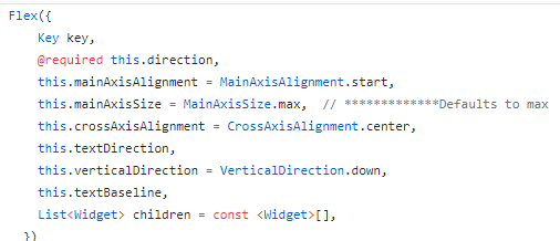
Ah yes, Rows and Columns. If you look at the constructor for the Flex class, you’ll see that mainAxisSize defaults to maximum:

This can cause you quite a few problems, in various situations. Over time, some have found they prefer to set the mainAxisSize to MainAxisSize.min as soon as they create a Row or Column, before they do anything else.
A Quick Primer on Flexibles
In order to avoid a lot of confusion, there are two terms you need to understand clearly… Else you’ll be seriously confused.
- Flex: The Superclass of Row and Column.
- flex: The strength/weight setting of a Flexible
I know, don’t get me started; because if you confuse the Flex with the flex then you’re going to be Fluxed.
A Flexible can be thought of as a balloon that gets bigger or smaller depending on a few different things. The flex of a Flexible is kind of like how much air pressure it has. If there are two balloons (Flexibles) and one has twice as much air in it (the flex parameter), then that one will use up twice as much space as the other. That’s how much space gets used for the Flexible’s child.
But what if there are other things in the Row or Column that aren’t wrapped in Flexibles? How much space do they get?
They get whatever height or width you set for them. In fact, they get “head of the line” privileges. Meaning the amount of space that Flexibles have available do them is what’s left over after non-Flexibles have already gotten what they want. Think of it this way, Flexibles are the dogs at dinner. They get whatever is left over after everyone else eats whatever they want.
Flexible is the Superclass of Expanded, which a Flutter developer uses all the time. And a Spacer uses an Expanded under the hood.
Image Auto-Resize Tip Using Expanded
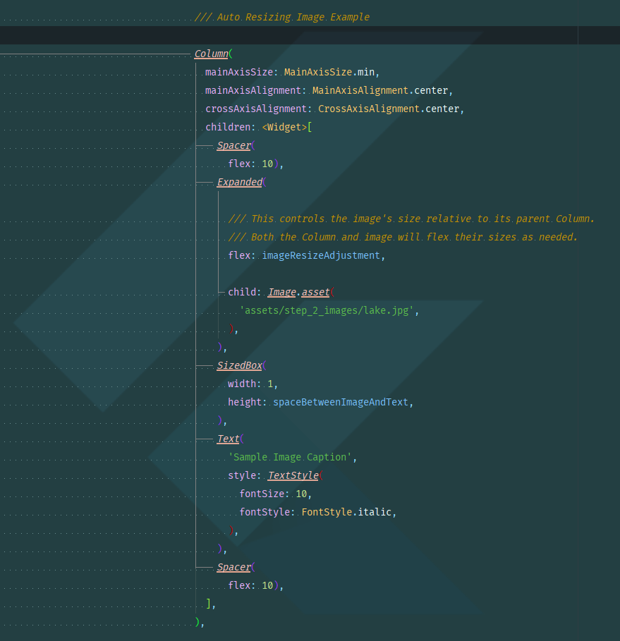
When you need an image to change its size relative to what’s going on around it, an easy way to do this is to wrap it in an expanded, which is then in a Row or Column. This way, the image will adapt to use whatever space is available. You control the size of the image by placing at least one Spacer or Expanded in the Row or Column and then controlling their relative sizes by adjusting their flex properties.
In this case, the Spacers are used to adjust the vertical placement of the Image inside the Column. Since Spacer uses Expanded under the hood, it has a flex, too.
So, basically we have three balloons, and one of them contains an Image. The caption and the SizedBox won’t change size, everything is controlled by adjusting the imageResizeAdjustment variable. If you make it small, the Image’s height will shrink and this causes the width to shrink as needed in order to maintain the Image’s aspect ratio. The same holds true for if you increase imageResizeAdjustment. Once this Image is full-width, it can’t get any larger.

Flutter Rows and Columns: What to do When it Goes Wrong
Dealing with the problems that come with Rows and Columns can be one of the most frustrating things in Flutter. Even people who have been working with Flutter since early Alpha occasionally still run into situations that leave them scratching their heads. Here are a couple of the main ones you might see, and what you can do about them:
“RenderFlex children have non-zero flex but incoming height constraints are unbounded.”
Some of us call this the Boogeyman of Flutter. It comes crawling out from under your bed and sometimes it will show up even when you thought you had done everything to prevent it. It means there’s an Expanded inside the Row or Column (child has a flex higher than 0) but there is nothing outside of it to keep it from expanding to infinity (there weren’t any Constraints passed down to it).
The reason some Rows and Columns don’t get Constraints passed in is because there are some situations where you want to let the children in the Row or Column decide how big it should be. You just add up the sizes of the children. This works fine as long as all of the children have specified sizes, but it explodes in a fireball if one of the children is trying to expand to infinity.
It can happen if you have a child that will try to be as big as possible; like another Row or Column nested inside of the one with the error, anything with its size along the main axis set to double.infinity or even an empty Container (remember, an empty Container tries to be as big as possible).
The quick fix is to change the mainAxisSize of your Flex to MainAxisSize.min (remember that from above?) and then wrap the offending child in an Expanded.
“BoxConstraints forces an infinite height (or width).”:
This is only a slightly different situation than the one above. One way this can happen is if your Row or Column has a grandchild (a child of a child) with its height/width to double.infinity and the child isn’t limiting the grandchild’s size.
If the problem is in the mainAxis, then you can fix it by putting the child (that owns the grandchild) inside of an Expanded.
But if the issue is along the crossAxis then you probably nested Rows and Columns inside of each other, so you need to put the nest**_ed _**Row or Column into an Expanded instead.
Wrapping Up
I know that might seem like a lot, but it is. Seriously though, this is just enough to get you going. If you really want to know more about Containers, Rows and Columns then I suggest you read a couple of my other articles over at Flutter Community Medium:
- Flutter’s Container: This ain’t your Daddy’s
- Flutter Deep Dive Part 1: “RenderFlex children have non-zero flex…”
The Deep Dive is a four-part series, don’t try to read it all in one day!
If you have any other questions, feel free to ask!
Happy Fluttering!
You can stalk the author on Twitter at @scottstoll2017, or LinkedIn.
Flutter From Scratch video tutorials:


