


Written by Souvik Biswas
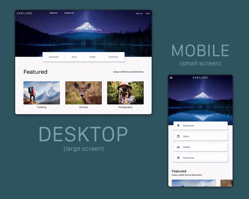
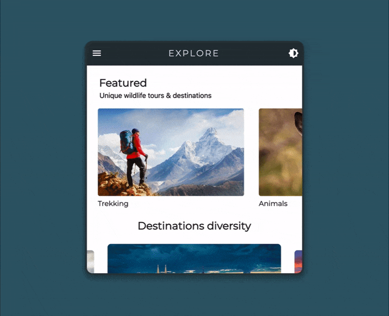
This is the second part of the Flutter web article series. In the previous article, we finished the basic UI design of the web app and also made it responsive. Now we will add some animations and a dark theme support to it as well. Just to refresh your memory, this is what we ended up with last time:
This article has been updated to Flutter 2 with null safety.
So, let’s get started and make it even better.

Web animations
We won’t be adding a ton of animations, just a few to make the UX of the web app better. We will add some animation to the top bar and the floating selector to cycle through the destinations.
Top bar
If you followed along the previous article, you might have noticed that towards the very end of the article, in the final demo the top bar has a nice color transition (from transparent to a shade of blue-gray) as the user scrolls along the webpage. I did not cover that part in the previous article.
So let’s see how you can achieve that effect.
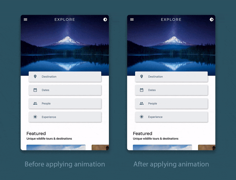
You can just vary the opacity of the backgroundColor of the AppBar according to the user scroll distance. Just follow the steps below:
Define a scroll controller and two more variables for storing the scroll position and opacity:
class _HomePageState extends State<HomePage> {
  late ScrollController _scrollController;
  double _scrollPosition = 0;
  double _opacity = 0;

  @override
  Widget build(BuildContext context) {
    // ...
  }
}
Define a method called
_scrollListener()as follows:class _HomePageState extends State<HomePage> { // ... _scrollListener() { setState(() { _scrollPosition = _scrollController.position.pixels; }); } @override Widget build(BuildContext context) { // ... } }Initialize the controller and attach the listener to it.
class _HomePageState extends State<HomePage> {
  // ...

  @override
  void initState() {
    _scrollController = ScrollController();
    _scrollController.addListener(_scrollListener);
    super.initState();
  }

  @override
  Widget build(BuildContext context) {
    // ...
  }
}
Inside the
buildmethod, calculate the opacity according to the scroll position that depends on the screen height. As we defined the top image with respect to the screen height, this will help you determine the precise position after which the opacity should be maximum.class _HomePageState extends State<HomePage> { // ... @override Widget build(BuildContext context) { var screenSize = MediaQuery.of(context).size; _opacity = _scrollPosition < screenSize.height * 0.40 ? _scrollPosition / (screenSize.height * 0.40) : 1; // ... } }Set the opacity to the
backgroundColorof the AppBar, and also pass it to thePreferredSizewidget, which is used for the large screen, to set the color similarly.class _HomePageState extends State<HomePage> { // ... @override Widget build(BuildContext context) { // ... return Scaffold( appBar: ResponsiveWidget.isSmallScreen(context) ? AppBar( backgroundColor: Colors.blueGrey.shade900.withOpacity(_opacity), // ... ) : PreferredSize( preferredSize: Size(screenSize.width, 1000), child: TopBarContents(_opacity), ), // ... ); } }
Floating selector
In the floating selector, we will add a subtle animation to the underline highlighting the selected destination, while transitioning between different destinations.
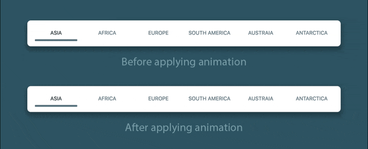
You can wrap the Container (used for the underline) with the AnimatedOpacity widget for creating the animation.
Visibility(
  maintainSize: true,
  maintainAnimation: true,
  maintainState: true,
  visible: _isSelected[i],
  // add this widget
  child: AnimatedOpacity(
    // animation duration
    duration: Duration(milliseconds: 400),
    // set opacity to the selected option
    opacity: _isSelected[i] ? 1 : 0,
    child: Container(
      height: 5,
      decoration: BoxDecoration(
        color: Colors.blueGrey,
        borderRadius: BorderRadius.all(
          Radius.circular(10),
        ),
      ),
      width: screenSize.width / 10,
    ),
  ),
)
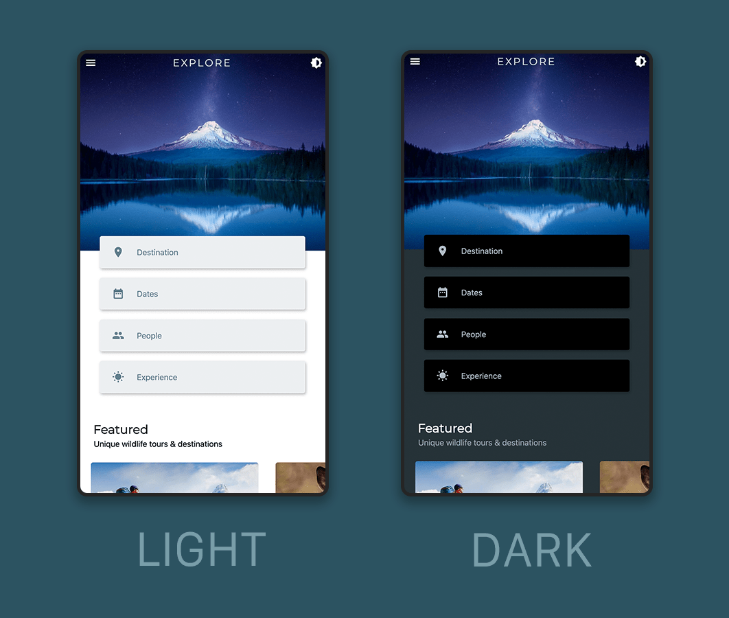
Dynamic theme
You can use a Flutter package called easy_dynamic_theme to add dynamic theme support to the web app and persist it.
Add the package to the
pubspec.yamlfile:easy_dynamic_theme: ^2.0.0Inside the
main.dartfile, wrap theMyAppwidget withEasyDynamicThemeWidget:void main() { runApp( EasyDynamicThemeWidget( child: MyApp(), ), ); }Modify the
MaterialAppwidget theme properties like this:class MyApp extends StatelessWidget { @override Widget build(BuildContext context) { return MaterialApp( title: 'Explore', theme: lightThemeData, darkTheme: darkThemeData, debugShowCheckedModeBanner: false, themeMode: EasyDynamicTheme.of(context).themeMode, home: HomePage(), ); } }Now, create a new file called
theme_data.dartwhere you can define the colors to use for light/dark theme:import 'package:flutter/material.dart'; var lightThemeData = ThemeData( primarySwatch: Colors.blueGrey, backgroundColor: Colors.white, cardColor: Colors.blueGrey.shade50, primaryTextTheme: TextTheme( button: TextStyle( color: Colors.blueGrey, decorationColor: Colors.blueGrey.shade300, ), subtitle2: TextStyle( color: Colors.blueGrey.shade900, ), subtitle1: TextStyle( color: Colors.black, ), headline1: TextStyle(color: Colors.blueGrey.shade800), ), bottomAppBarColor: Colors.blueGrey.shade900, iconTheme: IconThemeData(color: Colors.blueGrey), brightness: Brightness.light, ); var darkThemeData = ThemeData( primarySwatch: Colors.blueGrey, backgroundColor: Colors.blueGrey.shade900, cardColor: Colors.black, primaryTextTheme: TextTheme( button: TextStyle( color: Colors.blueGrey.shade200, decorationColor: Colors.blueGrey.shade50, ), subtitle2: TextStyle( color: Colors.white, ), subtitle1: TextStyle( color: Colors.blueGrey.shade300, ), headline1: TextStyle( color: Colors.white70, ), ), bottomAppBarColor: Colors.black, iconTheme: IconThemeData(color: Colors.blueGrey.shade200), brightness: Brightness.dark, );Set the theme of the different widgets according to the properties that you have defined within the
ThemeDatawidget. For example, you can set the background color of the AppBar like this:AppBar( backgroundColor: Theme.of(context).bottomAppBarColor.withOpacity(_opacity), // ... )I wanted the bottom bar color and the top bar color to be same, so I have defined the color according to the
bottomAppBarColorproperty of the ThemeData.
Almost done, but let’s also talk about a customizable scrollbar.
Customizable scrollbar
Flutter web now comes with a scrollbar by default but it isn’t draggable as in native webpages.
You can display a scrollbar, like you can do in normal mobile apps, by wrapping the whole scrollable content of the webpage with the Scrollbar widget. I thought this might fix the issue for some people, but not in our case.
Scrollbar widget might break.There’s a caveat in using the Scrollbar widget. It actually picks up every scroll event present in your app (including the nested scrollable widgets), not just the primary one as you might want for a normal webpage. And the widget doesn’t come with a property to specify the depth, which you could have used for restricting it only to the primary scroll event.
We have two nested scrollable widgets in our web app, one is the Row wrapped with a SingleChildScrollView (only for small screens) that displays the feature tiles and the CarouselSlider with the destinations. So the default Scrollbar would definitely not work as expected.
How to fix it? You can use the NotificationListener() widget for getting the depth of the scroll events and only update the Scrollbar if the depth is 0 (primary scroll event is indicated by 0).
Also, the default Scrollbar does not come with any good customization options, like changing the color, width and height of the scrollbar.
So, in order to fix all these issues, I have created a new widget called WebScrollbar.
It is a StatefulWidget and you can pass the following properties to it:
class WebScrollbar extends StatefulWidget {
  final Widget child;
  final ScrollController controller;
  final double heightFraction;
  final double width;
  final Color color;
  final Color backgroundColor;
  final bool isAlwaysShown;

  WebScrollbar({
    required this.child,
    required this.controller,
    this.heightFraction = 0.20,
    this.width = 8,
    this.color = Colors.black45,
    this.backgroundColor = Colors.black12,
    this.isAlwaysShown = false,
  }) : assert(heightFraction < 1.0 && heightFraction > 0.0);

  @override
  _WebScrollbarState createState() => _WebScrollbarState();
}
Let’s take a look at the main part to know how it is created.
First of all, I used the scroll controller, which is passed to this widget, and attached a listener to it.
class _WebScrollbarState extends State<WebScrollbar> {
  double _scrollPosition = 0;
  late bool _isUpdating;
  late Timer timer;

  _scrollListener() {
    setState(() {
      _scrollPosition = widget.controller.position.pixels;
    });
  }

  @override
  void initState() {
    widget.controller.addListener(_scrollListener);
    _isUpdating = false;
    super.initState();
  }

  @override
  Widget build(BuildContext context) {
    // ...
  }
}
Inside the build method, I have calculated the screen size that is used for setting the scrollbar height with respect to it.
In the _topMargin variable I calculated how much empty space should be above the scrollbar, basically for setting the position of it. Initially it is set to zero.
class _WebScrollbarState extends State<WebScrollbar> {
  // ...

  @override
  Widget build(BuildContext context) {
    var screenSize = MediaQuery.of(context).size;
    double _scrollerHeight = screenSize.height * widget.heightFraction;

    double _topMargin = widget.controller.hasClients
        ? ((screenSize.height *
                _scrollPosition /
                widget.controller.position.maxScrollExtent) -
            (_scrollerHeight *
                _scrollPosition /
                widget.controller.position.maxScrollExtent))
        : 0;

    // ...
  }
}
To display the scrollbar, I have used a Stack so that I could place it on top of the child passed to this widget.
Stack(
  children: [
    widget.child,
    AnimatedOpacity(
      opacity: widget.isAlwaysShown
          ? 1
          : widget.controller.hasClients ? _isUpdating ? 1 : 0 : 0,
      duration: Duration(milliseconds: 300),
      child: Container(
        alignment: Alignment.centerRight,
        height: MediaQuery.of(context).size.height,
        width: widget.width + 2,
        margin: EdgeInsets.only(
          left: MediaQuery.of(context).size.width - widget.width + 2,
        ),
        color: widget.backgroundColor,
        child: Align(
          alignment: Alignment.topCenter,
          child: GestureDetector(
            child: Container(
              height: _scrollerHeight,
              width: widget.width,
              margin: EdgeInsets.only(
                left: 1.0,
                right: 1.0,
                top: _topMargin,
              ),
              decoration: BoxDecoration(
                color: widget.color,
                borderRadius: BorderRadius.all(
                  Radius.circular(3.0),
                ),
              ),
            ),
          ),
        ),
      ),
    ),
  ],
),
For updating the scrollbar with respect to only the primary scroll event, you have to wrap the whole Stack widget with the NotificationListener() and check for the depth.
NotificationListener<ScrollNotification>(
  onNotification: (notification) {
    if (notification.depth == 0) {
      if (notification is ScrollUpdateNotification) {
        timer.cancel();
        setState(() {
          _isUpdating = true;
        });
      } else {
        timer = Timer(Duration(seconds: 5), () {
          setState(() {
            _isUpdating = false;
          });
        });
      }
    }
    return true;
  },
  child: Stack(
    // ...
  ),
);
You have to define onTapCancel, onTapDown and onVerticalDragUpdate properties of the GestureDetector widget in order to update the position of the scrollbar as it is dragged.
GestureDetector(
  child: Container(
    // ...
  ),
  onTapCancel: () {
    timer = Timer(Duration(seconds: 5), () {
      setState(() {
        _isUpdating = false;
      });
    });
  },
  onTapDown: (details) {
    timer.cancel();
    setState(() {
      _isUpdating = true;
    });
  },
  onVerticalDragUpdate: (dragUpdate) {
    widget.controller.position.moveTo(dragUpdate
            .globalPosition.dy +
        dragUpdate.globalPosition.dy *
            (_scrollPosition /
                widget.controller.position.maxScrollExtent) -
        (_scrollerHeight *
            _scrollPosition /
            widget.controller.position.maxScrollExtent));

    setState(() {
      if (dragUpdate.globalPosition.dy >= 0 &&
          _scrollPosition <=
              widget.controller.position.maxScrollExtent) {
        _scrollPosition = dragUpdate.globalPosition.dy +
            dragUpdate.globalPosition.dy *
                (_scrollPosition /
                    widget
                        .controller.position.maxScrollExtent) -
            (_scrollerHeight *
                _scrollPosition /
                widget.controller.position.maxScrollExtent);
      }
    });
  },
),
Now, just wrap the SingleChildScrollView widget, containing the whole webpage, with the WebScrollbar to display it.
WebScrollbar(
  color: Colors.blueGrey,
  backgroundColor: Colors.blueGrey.withOpacity(0.3),
  width: 10,
  heightFraction: 0.3,
  controller: _scrollController,
  child: SingleChildScrollView(
    // ...
  ),
),
So here you go, now you have a fully customizable scrollbar to use on your webpages.
The whole UI code for the WebScrollbar is available here.
Conclusion
In this article we covered animations and dynamic theming. In the next article of this series, you will learn how to integrate user registration and sign-in to your Flutter web app using Firebase Authentication.
Useful links and references
More articles about Flutter web
- Flutter web: Firebase Authentication and Google Sign-In
- Flutter web — getting started with responsive design
Souvik Biswas is a passionate Mobile App Developer (Android and Flutter). He has worked on a number of mobile apps throughout his journey. Loves open source contribution on GitHub. He is currently pursuing a B.Tech degree in Computer Science and Engineering from Indian Institute of Information Technology Kalyani. He also writes Flutter articles on Medium - Flutter Community.


