


Flutter web has been out there for quite some time, and it finally reached a stable version with the introduction of Flutter 2. It has received several improvements, and the plugin support for Flutter web is also improving fast. So if you haven’t yet had a chance to check it out, this is the perfect time to hop on and give it a try.
In this article, I will show you how to get started with a Flutter web project and make it responsive.
This article is written by Souvik Biswas and updated in March 2021

What is responsive web design?
In the simplest of terms, responsive web design (RWD) means that you are making sure that everything your development team is creating ends up looking just as good no matter the user’s device.
This means that your web design and the user interface of your webpage are reacting to the size of the screen of the user’s device. A website that is responsive is one that is flexible and is able to adjust according to the screen size with ease and fluidity.
The rise in the use and popularity of mobile devices over the last decade has made it incredibly important for people who design and build presentations on the web to pay special attention to responsive user interfaces in order to make sure everyone who is viewing their web design is getting a look at the best possible presentation you were able to provide.
And while developers can successfully create responsive web designs on a number of frameworks, **Flutter is special because it offers cross-platform support for just about any type of project you are working on.
Why responsive design is important
Responsive web design is no longer a trend, it’s a necessity. RWD helps you to reach your customers more easily. It makes measuring lead generation, sales, and conversions easier by creating a consistent user experience. And it makes analytics and reporting much more reliable as well.
It has also been proven that Google strongly favors websites that are responsive in nature, especially when it comes to content marketing. Having a responsive website will improve your visibility on most search engines and will improve your rankings for the specific keywords that you are targeting.
The current state of responsive design has been greatly influenced by the arrival of Flutter, which continuously expands its cross-platform support and now includes not just Web, but also Linux, Windows, and macOS, which is changing the way in which people are developing both software and webpages.
As technology advances, the number of devices that are available and the number of screen sizes and types that exist are always on the rise, which is why being able to create designs that look great on any and all of them is so paramount.
No matter what the platform, Flutter provides you with the functionalities and tools you need to be able to design and implement responsive web pages easily and effectively.
Flutter web architecture
Before getting started with the project, let’s take a look at the architecture of Flutter web.
If you are not familiar with the architecture of Flutter used in mobile apps, here is a quick overview:

The architecture of Flutter for mobile apps mainly consists of the following three layers:
Framework: This layer is purely written in Dart and consists of the core building blocks of Flutter.
Engine: This layer lies below the framework and is primarily written in C/C++. It provides low-level rendering support using Google’s Skia graphics library.
Embedder: This layer basically consists of all platform-specific dependencies.
Now, let’s take a look at the architecture of Flutter web and how it differs from this.

The Flutter web architecture is composed of just two layers:
Framework: consists of pure Dart code.
Browser: consists of C++ and JavaScript code.
As you can see, the top layer (Framework) contains almost the same type of components as the regular Flutter architecture.
The main difference is in the Browser layer. In Flutter web, the bottom two separate layers present in the mobile architecture are replaced with just one layer. Instead of the Skia Graphics Engine (which is not supported on browsers), it uses a JavaScript engine. Flutter web involves compiling Dart to JavaScript instead of the ARM machine code that is used for mobile apps. It uses a combination of DOM, Canvas and CSS to render Flutter components in the browser.

Getting started
We are using Flutter 2.0 in this project, which configures the app to run on the web by default.
Create a new Flutter project by using the following command:
flutter create explore
Here, explore is the name of the Flutter web app that we are going to create.
Open the project using your favorite IDE. To open it using VS Code, you can use this command:
code explore
Now, if you take a look at the directory structure, you will notice that there is a folder called web.
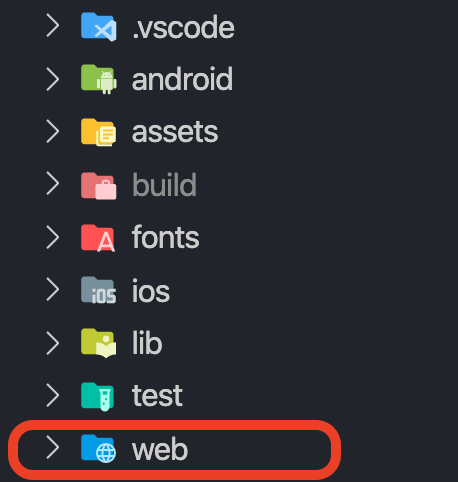
This means that your project is properly configured to run on browsers. Also, you will see that Chrome is available as one of the devices for running the Flutter app.
You will get the same Counter app as the starting project. To run it from VS Code, you can use F5, or you can use this command in the terminal:
flutter run -d chrome
The current state of affairs looks like this:

With the starter project set up, let’s start building our intended web app.
Web interface design
The web interface that we are going to create is inspired by Tubik’s example on Dribbble:
Go to lib > main.dart, and replace all of the code with the following:
// main.dart

void main() {
  runApp(MyApp());
}

class MyApp extends StatelessWidget {
  @override
  Widget build(BuildContext context) {
    return MaterialApp(
      title: 'Explore',
      theme: ThemeData(
        visualDensity: VisualDensity.adaptivePlatformDensity,
      ),
      home: HomePage(),
    );
  }
}

class HomePage extends StatefulWidget {
  @override
  _HomePageState createState() => _HomePageState();
}

class _HomePageState extends State<HomePage> {
  @override
  Widget build(BuildContext context) {
    var screenSize = MediaQuery.of(context).size;

    return Scaffold();
  }
}
Now, we have to define the HomePage widget, which will contain the UI of the app. You will understand in a bit why I have defined it as a stateful widget.
You might have noticed that I have used MediaQuery to get the size of the screen. I have done this because I will be sizing the widgets with respect to the size of the screen. This will make the widgets responsive and will prevent most overflow issues during resizing of the browser window.
Let’s add a top bar, which will look like this:

To do so, you will need the following code:
class _HomePageState extends State<HomePage> {
  @override
  Widget build(BuildContext context) {
    var screenSize = MediaQuery.of(context).size;

    return Scaffold(
      appBar: PreferredSize(
        preferredSize: Size(screenSize.width, 1000),
        child: Container(
          color: Colors.blue,
          child: Padding(
            padding: EdgeInsets.all(20),
            child: Row(
              children: [
                Text('EXPLORE'),
                Expanded(
                  child: Row(
                    mainAxisAlignment: MainAxisAlignment.center,
                    children: [
                      InkWell(
                        onTap: () {},
                        child: Text(
                          'Discover',
                          style: TextStyle(color: Colors.black),
                        ),
                      ),
                      SizedBox(width: screenSize.width / 20),
                      InkWell(
                        onTap: () {},
                        child: Text(
                          'Contact Us',
                          style: TextStyle(color: Colors.black),
                        ),
                      ),
                    ],
                  ),
                ),
                InkWell(
                  onTap: () {},
                  child: Text(
                    'Sign Up',
                    style: TextStyle(color: Colors.black),
                  ),
                ),
                SizedBox(
                  width: screenSize.width / 50,
                ),
                InkWell(
                  onTap: () {},
                  child: Text(
                    'Login',
                    style: TextStyle(color: Colors.black),
                  ),
                ),
              ],
            ),
          ),
        ),
      ),
      body: Container(),
    );
  }
}
You will notice immediately that something is wrong and that it doesn’t feel like a web UI. Where’s the hover effect?
Yeah, Flutter components don’t have the hover effect by default. But I will show you the easiest way to achieve this. Just so you know, after the hover effect is added, it will look like this:

The InkWell() widget has a property called onHover that you can use to track when the mouse pointer enters or leaves the boundary of the component.
Follow the steps below to get this effect:
Add a list of booleans that will be used to track the hover (the number of booleans is the number of components you want to apply the hover effect to):
List _isHovering = [false, false, false, false];Update the boolean value corresponding to the component, and set the text color (or make any other changes that you want to show during hover according to that boolean value):
InkWell(
  onHover: (value) {
    setState(() {
      _isHovering[0] = value;
    });
  },
  child: Column(
    mainAxisSize: MainAxisSize.min,
    children: [
      Text(
        'Discover',
        style: TextStyle(
          color: _isHovering[0]
              ? Colors.blue.shade200
              : Colors.white,
        ),
      ),
      SizedBox(height: 5),
      // For showing an underline on hover
      Visibility(
        maintainAnimation: true,
        maintainState: true,
        maintainSize: true,
        visible: _isHovering[0],
        child: Container(
          height: 2,
          width: 20,
          color: Colors.white,
        ),
      )
    ],
  ),
),
If we add the image inside the Scaffold body, it will start from under the top bar. But according to the design, the image should flow below the top bar.

Achieving this design is really simple. You just have to define one property of the Scaffold called extendBodyBehindAppBar and set it to true.
Scaffold(
  extendBodyBehindAppBar: true,
  appBar: PreferredSize(
    // ...
  ),

  // ...
);
You might have also noticed that I have added a quick access bar that sits on the top of the image in the bottom-center position.
To get a UI like this, use a Stack widget inside the body of the Scaffold.
Scaffold(
  // ...
  body: Stack(
    children: [
      Container( // image below the top bar
        child: SizedBox(
          height: screenSize.height * 0.45,
          width: screenSize.width,
          child: Image.asset(
            'assets/images/cover.jpg',
            fit: BoxFit.cover,
          ),
        ),
      ),
      Center(
        heightFactor: 1,
        child: Padding(
          padding: EdgeInsets.only(
            top: screenSize.height * 0.40,
            left: screenSize.width / 5,
            right: screenSize.width / 5,
          ),
          child: Card( // floating quick access bar
              // ...
          ),
        ),
      )
    ],
  ),
);
I am just including the code needed for explaining the structure of the UI. The complete UI code for this section is available here. There is a link to the whole project at the end of this article.
Now we will be adding a few more UI elements to the webpage. First of all, wrap the whole body of the Scaffold in a SingleChildScrollView widget to make it scrollable.
We will keep this website simple. So, let’s add just three more sections:
- Featured
- Destinations
- Bottom information
Featured section
This section will contain a heading and a row of three images with their labels. It will look like this:

The UI code for the heading and its description looks like this:
Row(
  mainAxisSize: MainAxisSize.max,
  mainAxisAlignment: MainAxisAlignment.start,
  children: [
    Text(
      'Featured',
      style: GoogleFonts.montserrat(
        fontSize: 40,
        fontWeight: FontWeight.w500,
      ),
    ),
    Expanded(
      child: Text(
        'Unique wildlife tours & destinations',
        textAlign: TextAlign.end,
      ),
    ),
  ],
),
The code for each image with its corresponding label is as follows:
Column(
  children: [
    SizedBox(
      height: screenSize.width / 6,
      width: screenSize.width / 3.8,
      child: ClipRRect(
        borderRadius: BorderRadius.circular(5.0),
        child: Image.asset(
          'assets/images/trekking.jpg',
          fit: BoxFit.cover,
        ),
      ),
    ),
    Padding(
      padding: EdgeInsets.only(
        top: screenSize.height / 70,
      ),
      child: Text(
        'Trekking',
        style: GoogleFonts.montserrat(
          fontSize: 16,
          fontWeight: FontWeight.w500,
        ),
      ),
    ),
  ],
),
If you try to resize the browser window now, you will find that it is already quite responsive:

Destinations section
In this section, we will be adding an image carousel with a floating selector of potential destinations called “Destinations diversity.” It will look like this:

For the carousel, you can use the Flutter package called carousel_slider.
Follow the steps below to build the carousel:
Define a list of images and the labels for them:
final List<String> images = [
  'assets/images/asia.jpg',
  'assets/images/africa.jpg',
  'assets/images/europe.jpg',
  'assets/images/south_america.jpg',
  'assets/images/australia.jpg',
  'assets/images/antarctica.jpg',
];

final List<String> places = [
  'ASIA',
  'AFRICA',
  'EUROPE',
  'SOUTH AMERICA',
  'AUSTRALIA',
  'ANTARCTICA',
];
Generate a list of Widgets to show in the carousel:
List<Widget> generateImageTiles(screenSize) {
  return images
      .map(
        (element) => ClipRRect(
          borderRadius: BorderRadius.circular(8.0),
          child: Image.asset(
            element,
            fit: BoxFit.cover,
          ),
        ),
      )
      .toList();
}
Inside the
buildmethod, store the list of widgets, and display them inside the carousel with their respective labels:@override Widget build(BuildContext context) { var screenSize = MediaQuery.of(context).size; var imageSliders = generateImageTiles(screenSize); return Stack( children: [ CarouselSlider( items: imageSliders, options: CarouselOptions( enlargeCenterPage: true, aspectRatio: 18 / 8, autoPlay: true, onPageChanged: (index, reason) { setState(() { _current = index; }); }), carouselController: _controller, ), AspectRatio( aspectRatio: 18 / 8, child: Center( child: Text( places[_current], style: GoogleFonts.electrolize( letterSpacing: 8, fontSize: screenSize.width / 25, color: Colors.white, ), ), ), ), ], ); }If you run the app, the carousel will look like this:

To add the floating selector, follow these steps:
Add two boolean lists:
List _isHovering = [false, false, false, false, false, false, false];
List _isSelected = [true, false, false, false, false, false, false];
Modify the
onPageChangedproperty of theCarouselOptionswidget.CarouselOptions( // ... onPageChanged: (index, reason) { setState(() { _current = index; // add the following for (int i = 0; i < imageSliders.length; i++) { if (i == index) { _isSelected[i] = true; } else { _isSelected[i] = false; } } }); }, )Display the row of widgets inside a
Cardcontaining the text, and show an underline to highlight the option that is selected. The highlighter can be created like this:Visibility( maintainSize: true, maintainAnimation: true, maintainState: true, visible: _isSelected[i], child: Container( height: 5, decoration: BoxDecoration( color: Colors.blueGrey, borderRadius: BorderRadius.all( Radius.circular(10), ), ), width: screenSize.width / 10, ), )The floating selector will look like this:

Bottom information section
This is just a simple information section that will look like this:

The UI code for this part is available here.
Improve responsiveness
Although the web app is quite responsive, you will still notice some overflows. Also, the UI design is not convenient for the smaller screens of mobile devices. To fix this, we will use a responsive layout to build and resize the widgets in accordance with the device screen size.
We will set some breakpoints for smallScreen, mediumScreen and largeScreen to rebuild the widgets with the new layout as each breakpoint is reached. You can use the code below to achieve this:
import 'package:flutter/material.dart';

class ResponsiveWidget extends StatelessWidget {
  final Widget largeScreen;
  final Widget? mediumScreen;
  final Widget? smallScreen;

  const ResponsiveWidget({
    Key? key,
    required this.largeScreen,
    this.mediumScreen,
    this.smallScreen,
  }) : super(key: key);

  static bool isSmallScreen(BuildContext context) {
    return MediaQuery.of(context).size.width < 800;
  }

  static bool isLargeScreen(BuildContext context) {
    return MediaQuery.of(context).size.width > 1200;
  }

  static bool isMediumScreen(BuildContext context) {
    return MediaQuery.of(context).size.width >= 800 &&
        MediaQuery.of(context).size.width <= 1200;
  }

  @override
  Widget build(BuildContext context) {
    return LayoutBuilder(
      builder: (context, constraints) {
        if (constraints.maxWidth > 1200) {
          return largeScreen;
        } else if (constraints.maxWidth <= 1200 &&
            constraints.maxWidth >= 800) {
          return mediumScreen ?? largeScreen;
        } else {
          return smallScreen ?? largeScreen;
        }
      },
    );
  }
}
Now you can define different widget layouts for different screen sizes. For smaller screens, it is preferable to show a drawer with the top bar options. For this, we will be using a different AppBar widget. The hamburger icon will be visible by default on the app bar if we define it in the drawer property of the Scaffold.
Scaffold(
  appBar: ResponsiveWidget.isSmallScreen(context)
      ? AppBar( // for smaller screen sizes
          backgroundColor: Colors.transparent,
          elevation: 0,
          title: Text(
            'EXPLORE',
            style: TextStyle(
              color: Colors.blueGrey.shade100,
              fontSize: 20,
              fontFamily: 'Montserrat',
              fontWeight: FontWeight.w400,
              letterSpacing: 3,
            ),
          ),
        )
      : PreferredSize( // for larger & medium screen sizes
          preferredSize: Size(screenSize.width, 1000),
          child: TopBarContents(_opacity),
        ),
  drawer: ExploreDrawer(), // The drawer widget

  // ...

);
The UI for the drawer will look like this:
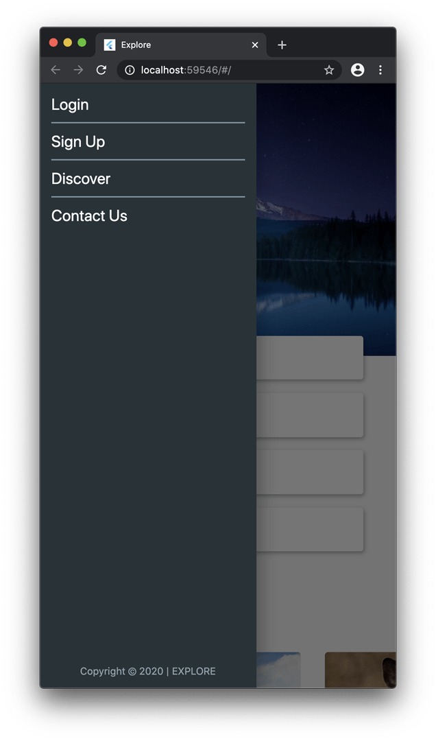
The UI code for the drawer is here.
In this way, you can define different layouts for varying screen sizes.
The final version will look like this on desktop and mobile browsers:

Conclusion
Hopefully, this article will help you get started with Flutter web. In the next part of the Flutter web series, we will try to improve this UI by adding some animations and theming.
Did this article help you to get started with Flutter web? 🤔 Leave your comment HERE.
Useful links and references
More articles about Flutter web
Souvik Biswas is a passionate Mobile App Developer (Android and Flutter). He has worked on a number of mobile apps throughout his journey. He loves open-source contribution on GitHub. He is currently pursuing a B.Tech degree in Computer Science and Engineering from Indian Institute of Information Technology Kalyani. He also writes Flutter articles on Medium - Flutter Community.


