


This post is written by Godwin Alexander Ekainu
Flutter is an open-source tool designed to build fast and beautiful applications across multiple platforms. The Flutter SDK has been widely adopted for developing mobile applications, and many developers are learning Flutter every day. It is important to create content that can help them do this, and that’s the aim of this blog post! So, we’ve prepared a simple cheat sheet of different Flutter widgets (and in Flutter, everything is a widget!), which you can use to build your Flutter apps.
We’ve grouped the widgets into several categories:
- Interaction widgets. These help make your Flutter app interactive.
- Input widgets. These widgets are used to handle user input.
- Alignment and layout widgets. You use these widgets everywhere to position other widgets on the screen relative to one another and organize them into structures.
- Scrollable widgets. These widgets come in handy when you need to create scrollable lists and galleries.
- Structure widgets. These are the foundational widgets for your app.
- Paint widgets. These widgets allow you to customize the design of your app.
- Button widgets. These are, as you might have guessed, for creating buttons.
- Basic navigation. To navigate between screens, you’ll need navigation. We’ll provide a basic example of navigation in this article.
If you don’t understand the concept of widgets, you can refer to our Flutter From Scratch video on this topic.
How do you use this Flutter widgets cheat sheet? Just copy-paste the code for the widgets you want to use in your app, and modify it to incorporate the logic you need. Let’s get started!

1. Interaction widgets
Interaction widgets make your application dynamic and provide a good user experience, so it’s essential to understand how to use them.
GestureDetector
GestureDetector is a widget that responds to events or gestures that correspond to its non-callbacks.
onTaponTapUponTapDownonLongPressonDoubleTaponHorizontalDragStartonVerticalDragDownonPanDownonScaleStart

You can use this gesture detector to create custom buttons or clickable text or pictures.
To add a gesture detector, use the code below:
    GestureDetector(

      onTap: () {
        const snackBar = SnackBar(content: Text('Tap'));

        ScaffoldMessenger.of(context).showSnackBar(snackBar);
      },
      // The custom button
      child: Container(
        padding: const EdgeInsets.all(12.0),
        decoration: BoxDecoration(
          color: Colors.lightBlue,
          borderRadius: BorderRadius.circular(8.0),
        ),
        child: const Text('My Button'),
      ),
    )
AlertDialog
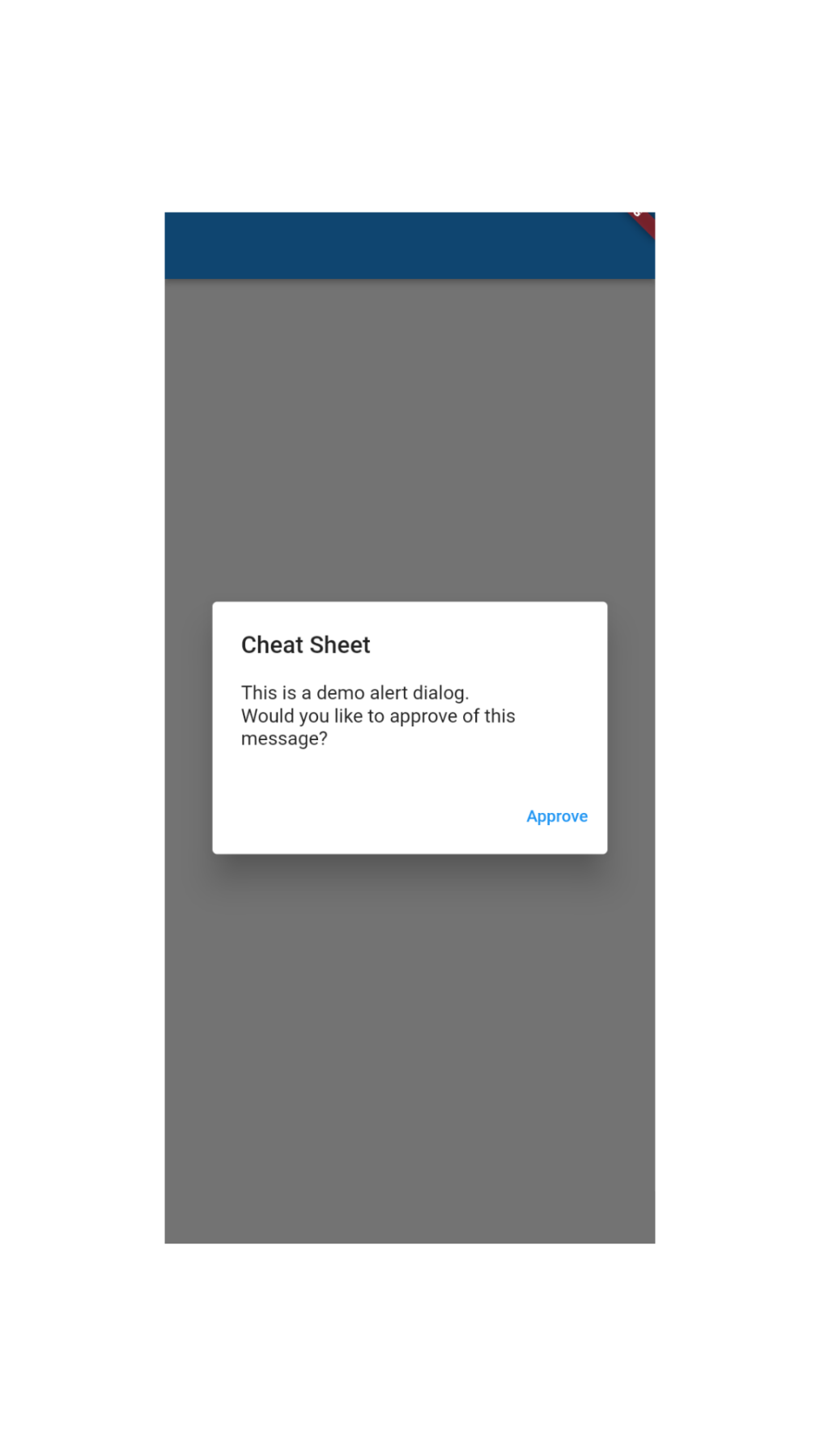
The AlertDialog widget creates a window to display crucial information with options that allow the user to make decisions.
To add an alert dialog to your app, you can use the following code:
     Future<void> _showMyDialog() async {
      return showDialog<void>(
        context: context,
        barrierDismissible: false, // user must tap button!
        builder: (BuildContext context) {
          return AlertDialog(
            title: const Text('Cheat Sheet'),
            content: SingleChildScrollView(
              child: ListBody(
                children: const <Widget>[
                  Text('This is a demo alert dialog.'),
                  Text('Would you like to approve of this message?'),
                ],
              ),
            ),
            actions: <Widget>[
              TextButton(
                child: const Text('Approve'),
                onPressed: () {
                  Navigator.of(context).pop();
                },
              ),
            ],
          );
        },
      );
    }
SnackBar
The SnackBar widget is used to briefly tell a user that an action has taken place. For example, you can delete an item that triggers a snackbar, which tells the user that an item has just been deleted.
To add a snackbar to your application, use the code below:
    Center(
            child: ElevatedButton(
              onPressed: () {
              final snackBar =  SnackBar(
                content: const Text('Yay! A SnackBar!'),
                action: SnackBarAction(
                  label: 'Undo',
                  onPressed: () {
                   Text('data');
                  },
                ),
              );
                  ScaffoldMessenger.of(context).showSnackBar(snackBar);
              },
              child: const Text('Show snackbar'),
            ),
          ),
Dismissible
You can use a Dismissible widget to remove or dismiss items from a list. You can swipe left or right to remove any item.
Use the code below to implement this feature:
    List<String> items = <String>[
        'banana',
        'strawberry',
        'apple'
        'orange'
        'cat'
        'bobcat'
      ];
    ListView.builder(
              itemCount: items.length,
              padding: const EdgeInsets.symmetric(vertical: 16),
              itemBuilder: (BuildContext context, index) {
                return Dismissible(
                  background: Container(
                    color: Colors.green,
                  ),
                  key: Key(items[index]),
                  onDismissed: (DismissDirection direction) {
                    setState(() {
                      items.removeAt(index);
                    });
                  },
                  child: ListTile(
                    title: Text(
                      'Item ${items[index]}',
                    ),
                  ),
                );
              },
            ),
InteractiveViewer
If you have a big picture that doesn’t fit on the screen, you can use the InteractiveViewer widget to enable it to fit on the screen by allowing the user to zoom in and out of the picture.
    InteractiveViewer(
            boundaryMargin: const EdgeInsets.all(20.0),
            child: Container(
              decoration: const BoxDecoration(
                gradient: LinearGradient(
                  begin: Alignment.topCenter,
                  end: Alignment.bottomCenter,
                  colors: <Color>[Colors.blue, Colors.yellow],
                  stops: <double>[0.0, 1.0],
                ),
              ),
            ),
          ),
2. Input widgets
Input widgets are a very important part of modern-day Flutter applications. For example, they are used to create an account, log in, or even perform a simple search.
Flutter forms
You can create a login and signup form using these widgets.

Try creating a form using the Forms widget and TextFormFields widget:
      class MyApp extends StatelessWidget {
      const MyApp({Key? key}) : super(key: key);
      @override
      Widget build(BuildContext context) {
        const appTitle = 'Flutter Form Demo';
        return MaterialApp(
          title: appTitle,
          home: Scaffold(
            appBar: AppBar(
              title: const Text(appTitle),
            ),
            body: const MyCustomForm(),
          ),
        );
      }
    }
    // Create a Form widget
    class MyCustomForm extends StatefulWidget {
      const MyCustomForm({Key? key}) : super(key: key);
      @override
      MyCustomFormState createState() {
        return MyCustomFormState();
      }
    }
    class MyCustomFormState extends State<MyCustomForm> {
      final formKey = GlobalKey<FormState>();
      @override
      Widget build(BuildContext context) {
        // Build a Form widget using the formKey created above
        return Form(
          key: formKey,
          child: Column(
            crossAxisAlignment: CrossAxisAlignment.start,
            children: <Widget>[
              TextFormField(
                decoration: const InputDecoration(
                  icon:  Icon(Icons.person),
                  hintText: 'Enter your name',
                  labelText: 'Name',
                ),
              ),
              TextFormField(
                decoration: const InputDecoration(
                  icon: Icon(Icons.calendar_today),
                  hintText: 'Enter your date of birth',
                  labelText: 'Dob',
                ),
              ),
              const ElevatedButton(
                child:  Text('Submit'),
                onPressed: null,
              ),
            ],
          ),
        );
      }
    }
Autocomplete
This widget can come in handy in search boxes.
To add autocomplete to your Flutter application, you can use the following code snippet. The options to be displayed are determined by the optionsBuilder and rendered by the optionsViewBuilder.
    // have a list of words or names from a remote source or package
    const List<String> _kOptions = <String>[
        'aardvark',
        'bobcat',
        'chameleon',
      ];
    // use the Autocomplete widget to make selections
    Autocomplete<String>(
          optionsBuilder: (TextEditingValue textEditingValue) {
            if (textEditingValue.text == '') {
              return const Iterable<String>.empty();
            }
            return _kOptions.where((String option) {
              return option.contains(textEditingValue.text.toLowerCase());
            });
          },
          onSelected: (String selection) {
            debugPrint('You just selected $selection');
          },
        );
TextField
TextField is one of the most fundamental and commonly used widgets for keyboard input.
    TextField(
      obscureText: true,
      decoration: InputDecoration(
        border: OutlineInputBorder(),
        labelText: 'Password',
      ),
    )
3. Alignment and layout widgets cheat sheet
These widgets are very important for building UIs in Flutter.
Center
This widget centers a child within itself.
Center( child: Text('Center me'))
Expanded
The Expanded widget expands the child of a Row or Column to fill any available space.
For example, you can use it to build a UI that fills the screen with just three containers or pictures. Theoretically, we can just specify their heights, but remember that there are different screen sizes for different devices, including tablets such as iPad devices. The expanded widget can help you create a more responsive design that can easily fit all screen sizes.
    Row(
              children: <Widget>[
                Expanded(
                  flex: 2,
                  child: Container(
                    color: Colors.amber,
                    height: 100,
                  ),
                ),
                Container(
                  color: Colors.blue,
                  height: 100,
                  width: 50,
                ),
                Expanded(
                  child: Container(
                    color: Colors.amber,
                    height: 100,
                  ),
                ),
              ],
            ),
Align
The Align widget aligns its child within itself. This widget is very flexible and can take the size of its child.
The child can be placed at different points within its parent widget using the alignment property, as shown below:
    Container(
        height: 120.0,
        width: 120.0,
        color: Colors.blue[50],
        child: const Align(
          alignment: Alignment.topRight,
          child: FlutterLogo(
            size: 60,
          ),
        ),
      ),
Row
The Row widget takes a list of widgets and arranges them horizontally. You will likely use this widget a lot when making layouts in your code.
    Row(
            children: [
              ElevatedButton(
                child: const Text('Widget 1'),
                onPressed: () => Navigator.pushNamed(context, '/second'),
              ),
               ElevatedButton(
                child: const Text('Widget 2'),
                onPressed: () => Navigator.pushNamed(context, '/third'),
              ),
               ElevatedButton(
                child: const Text('Widget 3'),
                onPressed: () => Navigator.pushNamed(context, '/fourth'),
              ),
            ],
          ),
Column
The Column widget allows you to arrange a list of widgets vertically, similar to how the Row widget aligns them horizontally.
    Column(
      children: const <Widget>[
        Text('Deliver features faster'),
        Text('Craft beautiful UIs'),
        Expanded(
          child: FittedBox(
            fit: BoxFit.contain,
            child: FlutterLogo(),
          ),
        ),
      ],
    )
SizedBox
Use SizedBox to give a specific size to its child widget or provide some white space between widgets.
    const SizedBox(
      width: 200.0,
      height: 300.0,
      child: Card(child: Text('Size me!')),
    )
BaseLine

Use the BaseLine widget to position the child widget according to the starting point of the parent widget.
    Center(
          child: Container(
                  width: 100,
                  height: 100,
                  color: Colors.green,
                  child: Baseline(
                    baseline: 50,
                    baselineType: TextBaseline.ideographic,
                    child: Container(
                      width: 50,
                      height: 50,
                      color: Colors.purple,
                    ),
                  ),
                ),
        );
LimitedBox
Use this widget to assign a default size to a list of widgets that are unconstrained.
    LimitedBox(
             maxHeight: 150,
             maxWidth: 150,
             child: Container(
             color: Colors.red,
            )
           )
Padding
Use the Padding widget to provide space around its child. The padding widget adds space around its child using the abstract EdgeInsetsGeometry class.
The padding property of the padding widget accepts the EdgeInsets object, which allows you to add different types of padding, including padding only in certain places using EdgeInsets.only or from different angles using EdgeInsets.fromLTRB.
    const Card(
      child: Padding(
        padding: EdgeInsets.all(16.0),
        child: Text('Hello World!'),
      ),
    )
4. Scrollable widgets
ListView Builder
ListView Builder is the most used scrollable widget. It displays its children in the scroll direction one after the other. For example, if you have a long list that is dynamically created, you can use Listview.builder to display it.
Use the following code to get started:
    final List<String> entries = <String>['A', 'B', 'C'];
    ListView.builder(
      padding: const EdgeInsets.all(8),
      itemCount: entries.length,
      itemBuilder: (BuildContext context, int index) {
        return Container(
          height: 50,
          color: Colors.amber[colorCodes[index]],
          child: Center(child: Text('Entry ${entries[index]}')),
        );
      }
SingleChildScrollView
The SingleChildScrollView widget will come in handy if you have a list of items that you initially didn’t intend for the user to scroll through, but the requirements change upon implementation. In this case, you can quickly wrap the parent widget with a SingleChildScrollView to make it scrollable.
    SingleChildScrollView(
          child: Column(
            mainAxisSize: MainAxisSize.min,
            mainAxisAlignment: MainAxisAlignment.spaceAround,
            children: <Widget>[
              Container(
                color:  Colors.red,
                height: 300.0,
                alignment: Alignment.center,
                child: const Text('Fixed Height Content'),
              ),
              Container(
                color: Colors.blue,
                height: 250.0,
                alignment: Alignment.center,
                child: const Text('Fixed Height Content'),
              ),
              Container(
                color: Colors.green,
                height: 250.0,
                alignment: Alignment.center,
                child: const Text('Fixed Height Content'),
              ),
              Container(
                color: Colors.purple,
                height: 250.0,
                alignment: Alignment.center,
                child: const Text('Fixed Height Content'),
              ),
            ],
          ),
        );
5. Structure widgets
These are the widgets that compose your app. In this Flutter widget cheat sheet, we will only be highlighting two of them: Scaffold and Loader.
Scaffold
Use Scaffold widgets for all your application layers.
    Scaffold(
          appBar: AppBar(),
          body: Row(
            children: [
              ElevatedButton(
                child: const Text('Widget 1'),
                onPressed: () => Navigator.pushNamed(context, '/second'),
              ),
          ),
Adding Loader
Create Loaders for your app when making an API request.
    class SomeWidget extends StatefulWidget {
      @override
      _SomeWidgetState createState() => _SomeWidgetState();
    }
    class _SomeWidgetState extends State<SomeWidget> {
      late Future future;
      @override
      void initState() {
        future = Future.delayed(const Duration(seconds: 8));
        super.initState();
      }
      @override
      Widget build(BuildContext context) {
        return FutureBuilder(
          future: future,
          builder: (context, snapshot) {
            return snapshot.connectionState == ConnectionState.done
                ? const Text('Loaded')
                : const CircularProgressIndicator();
          },
        );
      }
    }
6. Paint widgets
Painting effects can give a finished look to your app’s design.
InkWell
With the InkWell widget, you can create ink splash effects on images or custom buttons when you click on them.
    class _SomeWidgetState extends State<SomeWidget> {
      @override
      Widget build(BuildContext context) {
        Image img = Image.network(
            'https://images.unsplash.com/photo-1592194996308-7b43878e84a6?ixlib=rb-1.2.1&ixid=MnwxMjA3fDB8MHxwaG90by1wYWdlfHx8fGVufDB8fHx8&auto=format&fit=crop&w=687&q=80');
        return Material(
          child: Ink.image(
            fit: BoxFit.fill,
            width: 300,
            height: 300,
            image: img.image,
            child: InkWell(
              onTap: () {
                print('image');
              },
              child: const Align(
                child: Padding(
                  padding: EdgeInsets.all(10.0),
                  child: Text(
                    'PUFFIN',
                    style: TextStyle(
                      fontWeight: FontWeight.w900,
                      color: Colors.white,
                    ),
                  ),
                ),
              ),
            ),
          ),
        );
      }
    }
DecoratedBox
DecoratedBox, together with BoxDecoration, helps you add more styling to your container widget.
    Container(
          decoration: const BoxDecoration(
            borderRadius: BorderRadius.all(
              Radius.circular(12),
            ),
            gradient:RadialGradient(
          center: Alignment(-0.5, -0.6),
          radius: 0.15,
          colors: <Color>[
            Color(0xFFEEEEEE),
            Color(0xFF111133),
          ],
          stops: <double>[0.9, 1.0],
        )));
ClipRect
Use ClipRect to clip the child within different shapes.
    class DecorateContainer extends StatelessWidget {
       const DecorateContainer(Key? key, this.image) : super(key: key);
     final Image image;
      @override
      Widget build(BuildContext context) {
        return ClipRect(
      child: Container(
        child: Align(
          alignment: Alignment.center,
            widthFactor: 0.4,
            heightFactor: 1.0,
            child: image
        ),
      ),
    );
      }
    }
ClipPath
With the ClipPath widget, you can give any shape to the child widget. This means you can use it to draw any shape of your choice or according to your UI requirements with less code.
     // body of your app
    ClipPath(
            child: Container(
              width: MediaQuery.of(context).size.width,
              height: 250,
              color: Colors.red,
            ),
            clipper: CustomClipPath(),
          ),

    // custom class
     class CustomClipPath extends CustomClipper<Path> {
      var radius=5.0;
      @override
      Path getClip(Size size) {
        Path path = Path();
        path.lineTo(size.width / 2, size.height);
        path.lineTo(size.width, 0.0);
        return path;
      }
      @override
      bool shouldReclip(CustomClipper<Path> oldClipper) => false;
    }
7. Buttons
There are many types of buttons in Flutter, so we’ll only suggest the most useful ones in this cheat sheet.
TextButton
This is a Material button with text that has no borders.
     TextButton(
                      style: TextButton.styleFrom(
                        padding: const EdgeInsets.all(16.0),
                        primary: Colors.white,
                        textStyle: const TextStyle(fontSize: 20),
                      ),
                      onPressed: () {},
                      child: const Text('Gradient'),
                    ),
ElevatedButton
ElevatedButton is a Material button that elevates when pressed. Avoid using elevated buttons on widgets that are already elevated, like dialogs.
    ElevatedButton(
                style: ElevatedButton.styleFrom(),
                onPressed: () {},
                child: const Text('Enabled'),
              ),
FloatingActionButton
Use FloatingActionButton to create a primary action on the screen.
    Scaffold(
          appBar: AppBar(
            title: const Text('Floating Action Button'),
          ),
          body: const Center(child: Text('Press the button below!')),
          floatingActionButton: FloatingActionButton(
            onPressed: () {
              // on pressed
            },
            backgroundColor: Colors.green,
            child: const Icon(Icons.navigation),
          ),
        );
8. Basic navigation
Named routing can be used for small to medium-sized projects. Alternatively, you can use the Navigator API, which provides various routing functions.
Flutter provides named routing to enable users to navigate your application:
    void main() {
      runApp(MaterialApp(
        initialRoute: '/',
        routes: {
          '/' : ((context) => const FirstScreen()),
          '/second':(context) => const SecondScreen()
        },
        home: const MyApp()));
    }
    class MyApp extends StatelessWidget {
      const MyApp({Key? key}) : super(key: key);
      @override
      Widget build(BuildContext context) {
        return Scaffold(
            appBar: AppBar(
              title: const Text('Navigation'),
            ),
            body:const FirstScreen()

        );
      }
    }

    class FirstScreen extends StatelessWidget {
      const FirstScreen({Key? key}) : super(key: key);
      @override
      Widget build(BuildContext context) {
        return Center(
          child: ElevatedButton(
            child: const Text('Go to SecondScreen'),
            onPressed: () => Navigator.pushNamed(context, '/second'),
          ),
        );
      }
    }
    // can add this in a new file
    class SecondScreen extends StatelessWidget {
      const SecondScreen({Key? key}) : super(key: key);

      @override
      Widget build(BuildContext context) {
        return ElevatedButton(
          child:const Text('Go back!'),
          onPressed: () => Navigator.pop(context),
        );
      }
    }
To learn more about Flutter Navigator 2.0, read this article.
Conclusion
We have created this list of Flutter widgets as a quick reference for you while you build your Flutter app. We hope you have learned something new about these widgets that can help you improve the functionality of your Flutter application.
We have an ebook that covers a list of libraries commonly used by Flutter developers, including networking, state management, and more. You can also watch our Flutter From Scratch tutorial, which goes into detail about how to use these libraries and widgets.
This article is written by Godwin Alexander Ekainu, a Nigerian-based software developer who is keen on sharing his knowledge and explaining complex topics to help other developers learn. You can find him on Twitter and LinkedIn.


