


Written by Muhammed Salih Güler
As time goes by, technologies evolve and companies try to offer a better experience to developers for developing their applications. For example, in the earlier stages of Android, it was pretty common to use EventBus to send data through the app, and Mosby to implement the Model-View-Presenter pattern. Nowadays, they are far from being the most common way to develop applications. It is more common to use the MVVM pattern using AndroidX libraries implemented and recommended by the Android team.
The Android team not only presents and suggests logical patterns, but they are also working on how you implement the UI for the application as well. Right now, Android is heavily leaning towards the imperative UI pattern by using XML (Extensible Markup Language) files. Reaching the UI elements is possible by using findViewById() method. Once the view is retrieved, you can update the properties of it or invoke its methods.
This approach is great and loved by a lot of developers but as Android development shifted towards a more reactive programming approach, the benefits of the imperative approach started to shrink. Therefore the Android team decided to use a different pattern called declarative UI pattern. With declarative UI, developers are declaring what the UI looks like by describing the views and their properties. The UI has a state and each time the state changes, the UI updates and recreates its UI elements.
Jetpack Compose
After they decided to use the declarative UI pattern, the Android team wanted to avoid a mistake they had made before. The UI implementation was finding its place next to the Android platform code. That meant, the releases were less frequent and when an error happened it required a bigger release on the Android OS. That’s why the Android team decided to release this new UI approach as a library.
The Android team was working on a set of libraries called Jetpack, which is a suite of libraries to help developers follow best practices, reduce boilerplate code, and write code that works consistently across all Android versions. Including this new UI library as well was the best decision they could make. And this is how Jetpack Compose was born.
Jetpack Compose is Android’s modern toolkit for building native Android applications. It simplifies and accelerates UI development on Android. It does more with less code and avoids entire classes of bugs, so code is simple and easy to maintain. Every time the state changes, the UI automatically gets updated. It is compatible with your existing code so you can adopt it whenever you want.
Getting started with Jetpack Compose
Jetpack Compose is a preview feature, and support for Compose is included only in Canary versions of Android Studio and you need to download it. At this date, the latest version of Android Studio is version
4.2 Canary 5and Jetpack Compose version is0.1.0-dev14.
After you have downloaded Android Studio’s Canary version, just follow the instruction steps from the installer to be able to install Android Studio. I am not going to describe the Android Studio installation process here but if you are feeling lost, please refer to this document.
Popular Movies app
Today you will be creating a simple Popular Movies application. The application will have some information provided locally by the TMDb API for Popular Movies. The app will show these movies as a list in the application.
Creating the Jetpack Compose project
For creating a Jetpack Compose project, you can start by clicking on Create New Project button in the dialog box. Once you click on it, you will see a window like below.
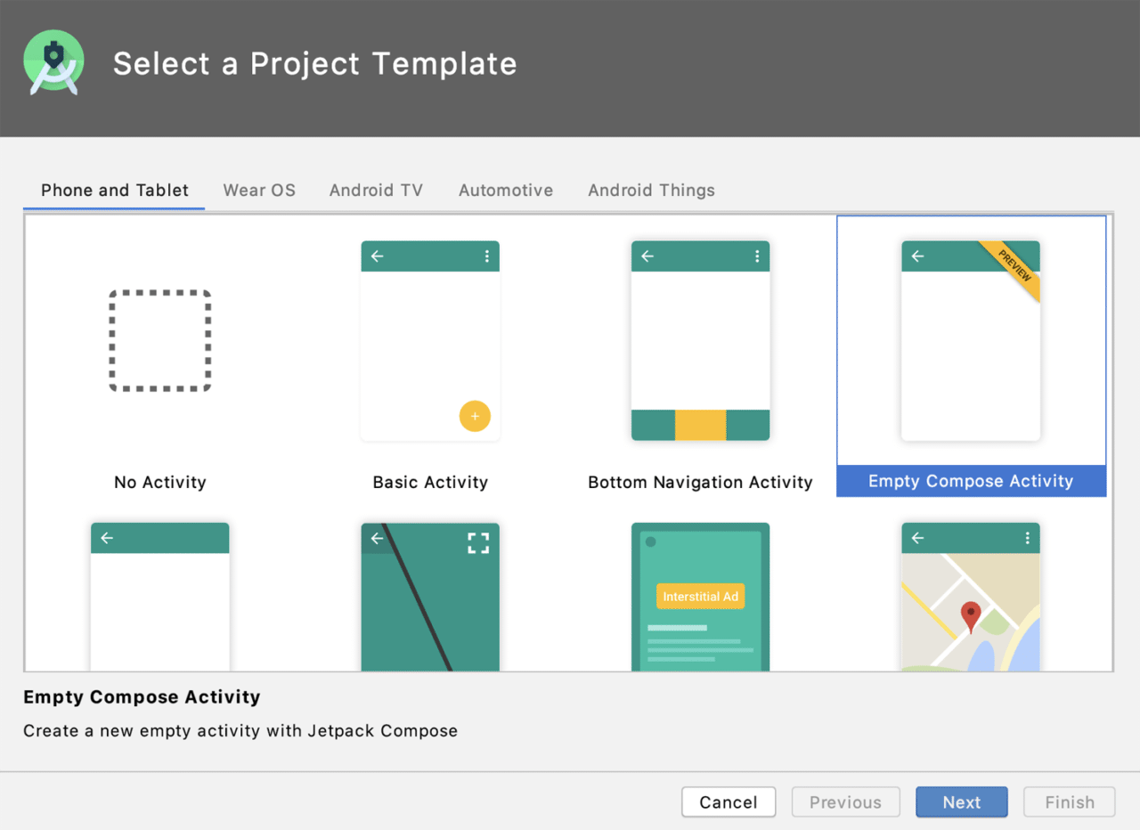
As you see from the picture above, you can see multiple project templates. Whatever project type you need for any Android-based OS, you can find a template for it. For our project pick Empty Compose Activity and move to the next window.
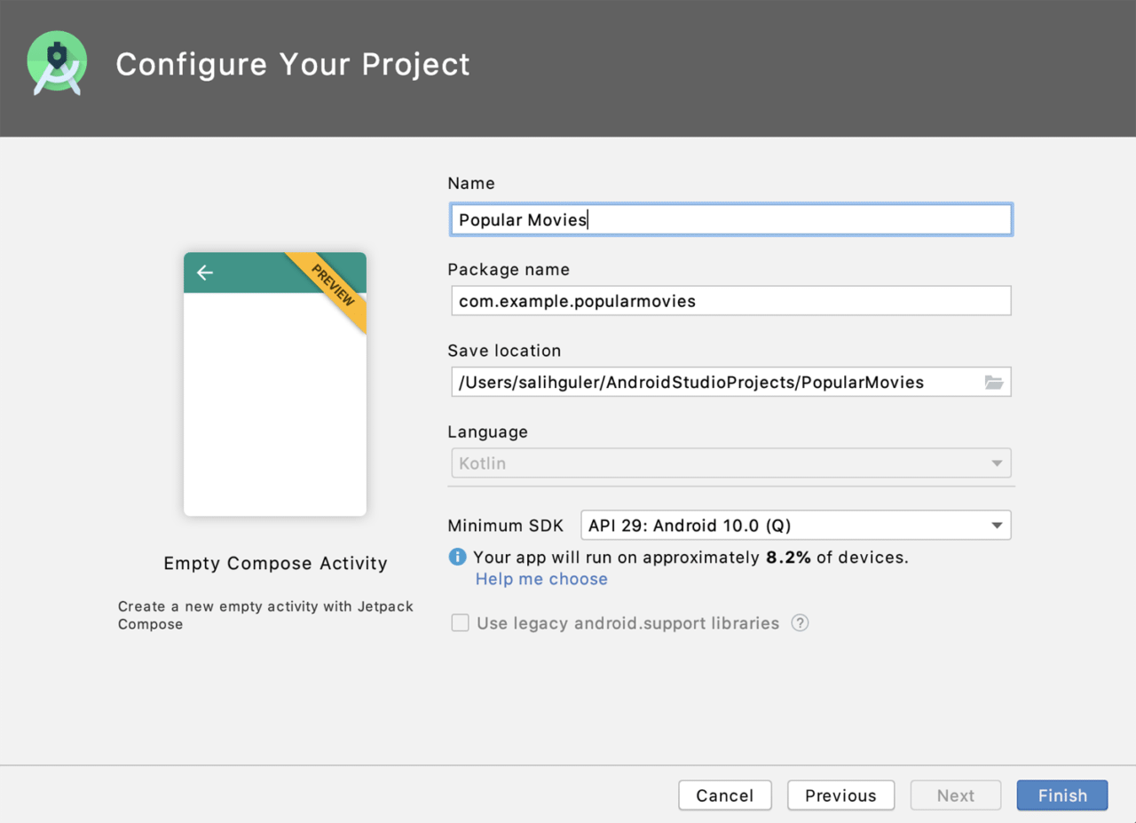
In the window above, you will be asked to add some information about your application. Let’s go over the field one by one:
- Name: name of the application.
- Package name: unique identifier for your application. Mainly a domain name for your company and the name of the application.
- Save location: location of the app directory.
- Language: programming language to be used in the application. In the classic approach, you can have either Java or Kotlin but with Compose, you need to use Kotlin.
- Minimum SDK: minimum SDK version supported by the application.
Once you input and select the correct information, click on the Finish button to set up your application. After the setup, you will see the main project window like below.
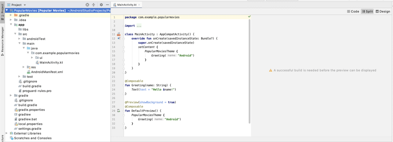
Project window in Jetpack Compose
The project window that you see above will be your main workplace. You can see three main project windows. Let’s learn about the most important ones in detail.
Project pane
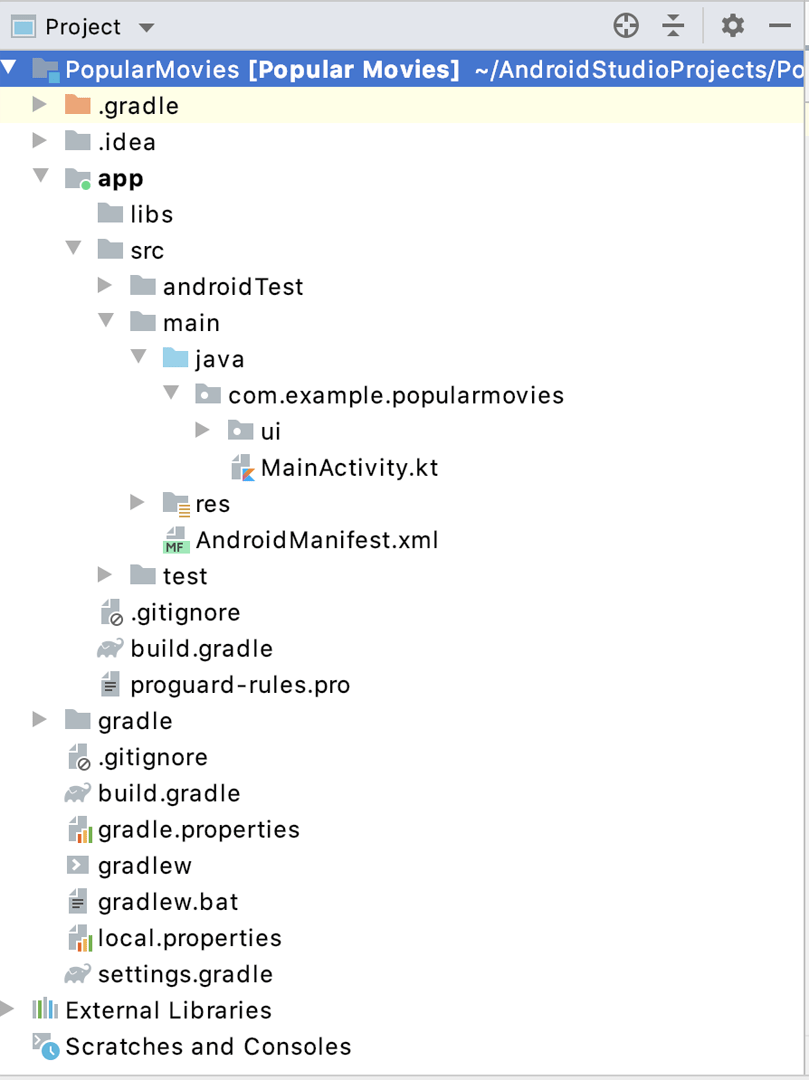
Your main focus area will be under the app folder. app/build.gradle is your project’s Gradle file. This file is used to define information about your application and to declare the libraries you are going to use. The application’s source code will be mainly located in the app/src/ folder.
app/src/androidTest and app/src/test folders will be the folders dedicated for testing. Your application will be lying under app/src/main/ folder. Your resources will be under the res folder and your code will be under java/your_app_identifier.
Code pane
Code pane will be the view that you will be working most of the time. The code you are writing will be shown there. You will learn the code part in detail soon.
Live Preview
With the classical Android approach, you were mostly able to see your layout in the layout view. This gave you a chance to see your changes directly. Jetpack Compose came with a great tool called Live Preview to give you the same feeling.
Once you create your application, you need to run your application at least once. After you run it, the Live Preview will be ready for use.
Whenever you make a change, your changes will be built and drawn into Live Preview. When you make a lot of changes, you might need to restart your Live Preview but it won’t take a long time.
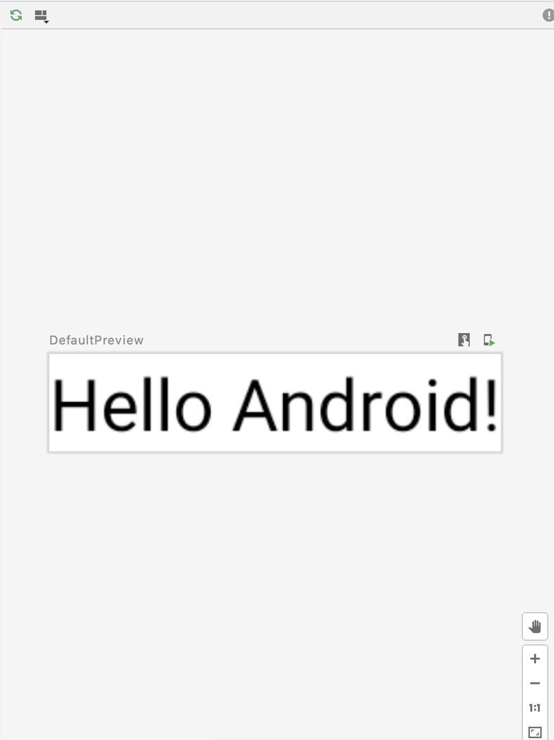
After you see the live preview, you will see some buttons. Those buttons will help you to do multiple operations, e.g. deploying changes to device, enabling Live Preview to be clickable, and many more.
Now that you got to know your IDE, it’s time to dive deep into code.
Let’s see the code: setContent method, Composable functions and Live Preview
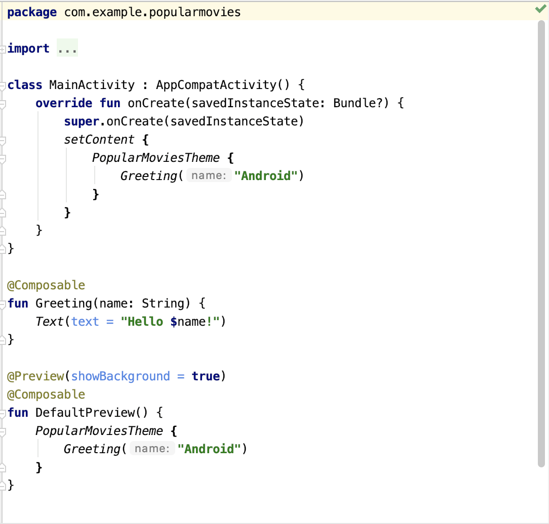
When you create the application, it will create a simple project for you.
class MainActivity : AppCompatActivity() {
    override fun onCreate(savedInstanceState: Bundle?) {
        super.onCreate(savedInstanceState)
        setContent {
            PopularMoviesTheme {
                Greeting("Android")
            }
        }
    }
}
Activity creation and its life cycle elements are created as it was before. In the classic Android development approach, you should have called setContentView to get the reference to the view. With Jetpack Compose, you need to use the setContent method to compose your application.
In Jetpack Compose, each function that is defined to create a UI content is a Composable. Composable functions are the fundamental building blocks of an application built with Compose. You can use either existing Composable functions or create your Composable functions by combining multiple Composable functions by using @Composable annotation.
@Composable
fun PopularMoviesTheme(darkTheme: Boolean = isSystemInDarkTheme(), content: @Composable() () -> Unit) {
    val colors = if (darkTheme) {
        DarkColorPalette
    } else {
        LightColorPalette
    }

    MaterialTheme(
        colors = colors,
        typography = typography,
        shapes = shapes,
        content = content
    )
}
PopularMoviesTheme above is the top-level Composable function that keeps the theme information. Just like the other UI elements, the theme information is also a Composable function. It decides on the color palette according to system information. The function also accepts a Composable function as a child element.
@Composable
fun Greeting(name: String) {
    Text(text = "Hello $name!")
}
Greeting is your content to be shown on the screen. It is also a Composable function. It uses one of the many out-of-box Composable functions from the library.
@Preview(showBackground = true)
@Composable
fun DefaultPreview() {
    PopularMoviesTheme {
        Greeting("Android")
    }
}
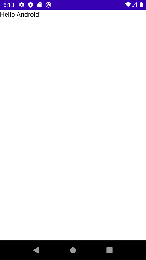
You learned about Live Preview, but you haven’t seen any sign of it yet. To use Live Preview, you need to add the @Preview annotation to your Composable function. You can modify the attributes of the @Preview annotation. e.g. showBackground will show a background filling.
If you run the app on an emulator, now you can see the view below:
Working on the popular movies application
Building the basics
As first step, you will remove the Greeting and DefaultPreview functions and create your Composable function.
@Preview(showBackground = true)
@Composable
fun PopularMoviesMainPage() {
    Column {
        TopAppBar(title = { Text(text = "Popular Movies") })
        AdapterList(data = List(100) { it }) {
            Text(text = it.toString())
        }
    }
}
With the code above, you will create PopularMoviesMainPage the UI elements on the page. As the base UI element, you will use a Composable function called Column. Column is used for placing its children in a vertical sequence. If you want to go for a horizontal sequence, you should use Row. For both of them, you can just put one element after another by writing one Composable function after another.
Column {
    // Multiple Composable functions
}
The next step is to create an app bar on the top of the screen. For that, you need to use a Composable function called TopAppBar. TopAppBar displays information and actions relating to the current screen and is placed at the top of the screen. It has multiple attributes that you can use to change the look of the app bar. You can define backgroundColor, contentColor, navigationIcon and many more other attributes for the TopAppBar.
TopAppBar(title = { Text(text = "Popular Movies") })
The final step for this part is to generate a list of 100 elements to just demonstrate the scrollable view. For this purpose, you will be using a Composable function called AdapterList. It is a vertically scrolling list that only composes and lays out the currently visible items. It will ask you to provide a list of data to represent on the screen.
AdapterList(data = List(100) { it }) {
    Text(text = it.toString())
}
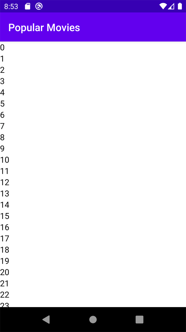
If you put them together, as below, you will see the desired screen as follows.
Column {
    TopAppBar(title = { Text(text = "Popular Movies") })
    AdapterList(data = List(100) { it }) {
        Text(text = it.toString())
    }
}
Creating a movie list and showing basic information
To create a movie list, you will download the information from TMDb and store them locally. Since this is a bit on the beginner side, network communications will be handled in the other articles.
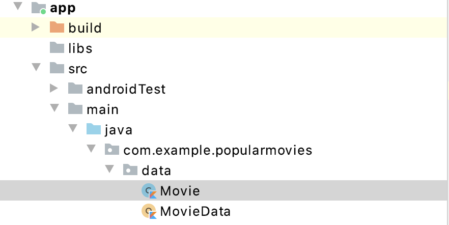
To store the information about movies, you will create a Kotlin data class called Movie. To do so, right-click on the app/src/main/java/your_package_name/ and create a new folder called data. Under data, create a new Kotlin file, call it Movie.kt and paste the code from below.
data class Movie(
    val title: String,
    val releaseDate: String,
    val overview: String,
    val voteAverage: Double,
    val image: Int
)
The code above is a simple data class keeping information about the movie. All the fields will keep information with the related type of data, only exception is image. image will keep the id reference of the resource in your project. Now that you have the movie data holder, let’s feed some information into it.
Under the same folder, create a file called MovieData.kt. In this file, you will be creating your movie information.
For feeding the movie information, paste the code below.
object MovieData {
val list = listOf(
Movie(
title = "Palm Springs",
releaseDate = "2020-01-26",
overview = "When carefree Nyles and reluctant maid of honor Sarah have a chance encounter at a Palm Springs wedding, things get complicated when they find themselves unable to escape the venue, themselves, or each other.",
voteAverage = 7.7,
image = R.mipmap.palm_springs
),
Movie(
title = "The Old Guard",
releaseDate = "2020-07-10",
overview = "Four undying warriors who've secretly protected humanity for centuries become targeted for their mysterious powers just as they discover a new immortal.",
voteAverage = 7.4,
image = R.mipmap.the_old_guard
),
Movie(
title = "Greyhound",
releaseDate = "2020-07-10",
overview = "A first-time captain leads a convoy of allied ships carrying thousands of soldiers across the treacherous waters of the “Black Pit” to the front lines of WW2. With no air cover protection for 5 days, the captain and his convoy must battle the surrounding enemy Nazi U-boats in order to give the allies a chance to win the war.",
voteAverage = 7.5,
image = R.mipmap.greyhound
),
Movie(
title = "Ad Astra",
releaseDate = "2019-09-17",
overview = "Four undying warriors who've secretly protected humanity for centuries become targeted for their mysterious powers just as they discover a new immortal.",
voteAverage = 6.1,
image = R.mipmap.ad_astra
),
Movie(
title = "Fatal Affair",
releaseDate = "2020-07-16",
overview = "Ellie tries to mend her marriage with her husband Marcus after a brief encounter with an old friend, David, only to find that David is more dangerous and unstable than she'd realized.",
voteAverage = 5.0,
image = R.mipmap.fatal_affair
),
Movie(
title = "Joker",
releaseDate = "2019-10-02",
overview = "During the 1980s, a failed stand-up comedian is driven insane and turns to a life of crime and chaos in Gotham City while becoming an infamous psychopathic crime figure.",
voteAverage = 8.2,
image = R.mipmap.joker
),
Movie(
title = "Birds of Prey (And the Fantabulous Emancipation of One Harley Quinn)",
releaseDate = "2020-02-05",
overview = "Harley Quinn joins forces with a singer, an assassin and a police detective to help a young girl who had a hit placed on her after she stole a rare diamond from a crime lord.",
voteAverage = 7.2,
image = R.mipmap.birds_of_prey
),
Movie(
title = "Interstellar",
releaseDate = "2014-11-05",
overview = "The adventures of a group of explorers who make use of a newly discovered wormhole to surpass the limitations on human space travel and conquer the vast distances involved in an interstellar voyage.",
voteAverage = 8.3,
image = R.mipmap.interstellar
),
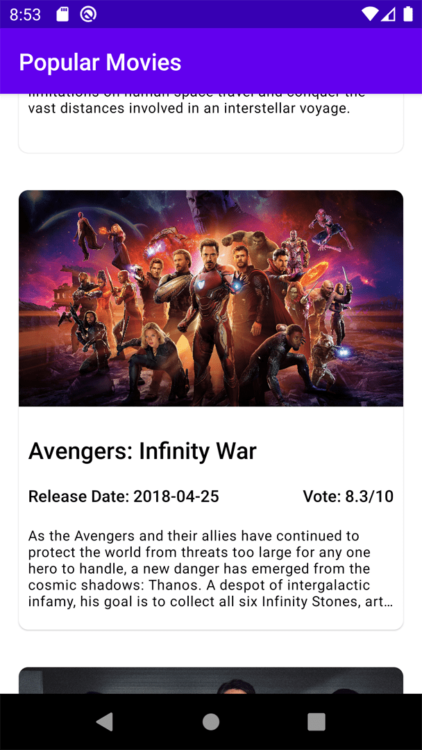
Movie(
title = "Avengers: Infinity War",
releaseDate = "2018-04-25",
overview = "As the Avengers and their allies have continued to protect the world from threats too large for any one hero to handle, a new danger has emerged from the cosmic shadows: Thanos. A despot of intergalactic infamy, his goal is to collect all six Infinity Stones, artifacts of unimaginable power, and use them to inflict his twisted will on all of reality. Everything the Avengers have fought for has led up to this moment - the fate of Earth and existence itself has never been more uncertain.",
voteAverage = 8.3,
image = R.mipmap.avengers
),
Movie(
title = "Parasite",
releaseDate = "2019-05-30",
overview = "All unemployed, Ki-taek's family takes peculiar interest in the wealthy and glamorous Parks for their livelihood until they get entangled in an unexpected incident.",
voteAverage = 8.5,
image = R.mipmap.parasite
)
)
}
The MovieData is an object that helps us reach out to the movie related data. list variable in the object is keeping the information about the movies. To use this list, you can simply write MovieData.list.
Now let’s go back to MainActivity.kt file and update your Composable functions.
First of all, let’s change the following part:
AdapterList(data = List(100) { it }) {
    Text(text = it.toString())
}
We will substitute it with the following:
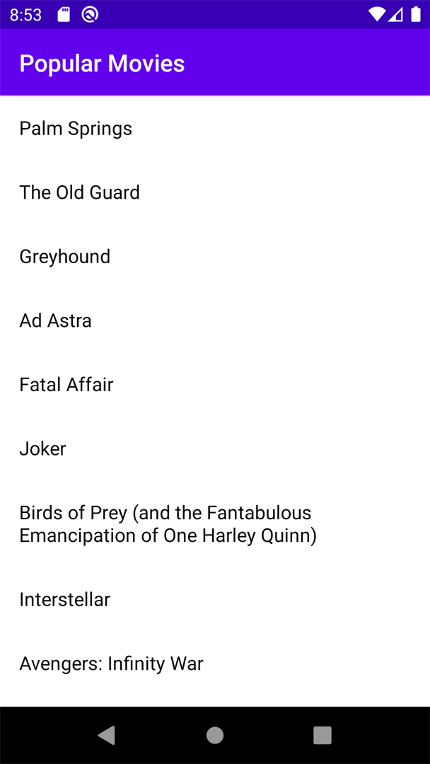
AdapterList(data = MovieData.list) {
    PopularMoviesListItem(it)
}
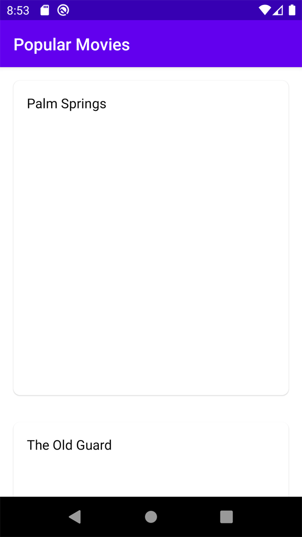
Once you do that, you will see that the compiler is complaining about PopularMoviesListItem since you have not created it yet. This will be your new Composable function to show movie information.
You can satisfy the compiler by adding the following code.
@Composable
fun PopularMoviesListItem(movie: Movie) {
    Text(text = movie.title, modifier = Modifier.padding(all = 16.dp))
}
With the code above, you are just adding the movie title to a text. You will also use modifier to add some padding. But, what exactly is a modifier? A modifier is an ordered, immutable collection of elements that decorate or add behavior to Compose UI elements like backgrounds, padding, click event listeners, and many more.
If you run the application now, you will see the following in your emulator.
Create beautiful list items
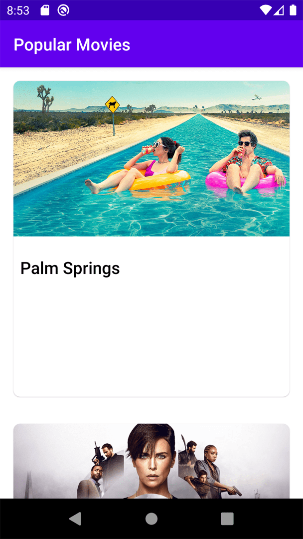
So far, you have implemented the data and the information you can use to create a movie list. But unfortunately, your list items don’t look that amazing. Don’t worry, we will solve this issue.
For the list item, you will be only working on the PopularMoviesListItem you created. First of all, let’s start by wrapping the title with a Card. A Card will give the user a more independent feeling about the item and you can encapsulate all movie information per item.
Card(
    shape = RoundedCornerShape(8.dp),
    modifier = Modifier
        .padding(all = 16.dp)
        .fillMaxWidth()
        .height(height = 375.dp)
) {
    Text(text = movie.title, modifier = Modifier.padding(all = 16.dp))
}
Card has a lot of attributes that you can use. To have a rounded shape (or any other shape), you can use the shape attribute. For the card’s general UI specifications you will use the modifier attribute. This way you will handle padding, width, and height for the card.
Card will accept one child under it to show information. You will move your Text inside it as shown above. If you run the app now, you will see the following:
But we have a problem. You want to show multiple information on the card — but as we learned, Card accepts only one child. Thus you have to use the Column.
Column {
    Text(text = movie.title, modifier = Modifier.padding(all = 16.dp))
}
As the next step, you will add the movie image to the list. To add an image, you will use the Composable function called Image. Image is a Composable that lays out a given image asset. The asset property is used to provide an image resource. imageResource function will accept the ID of the image and provide the ImageAsset for the view. Image also has a lot more properties for scaling, aligning, and changing the UI representation of the image. With your example, you will set the height to a specific height. You will also use the contentScale property to make sure the width is equal to the height. To align the image, the alignment property is used. The default alignment is centered, but you will move the image to the top.
To have a nicer UI, you will change the size of the text for the movie title. To do so, you will use the style property and use the typography that has been provided by the MaterialTheme.
If you update your Column as shown in the following code snippet, the image and movie title will look a lot better.
Column {
    Image(
        asset = imageResource(id = movie.image),
        contentScale = ContentScale.FillWidth,
        modifier = Modifier.preferredHeight(height = 200.dp),
        alignment = Alignment.TopCenter
    )
    Text(
        text = movie.title,
        modifier = Modifier.padding(all = 8.dp),
        style = MaterialTheme.typography.h6
    )
}
Your app now looks like this:
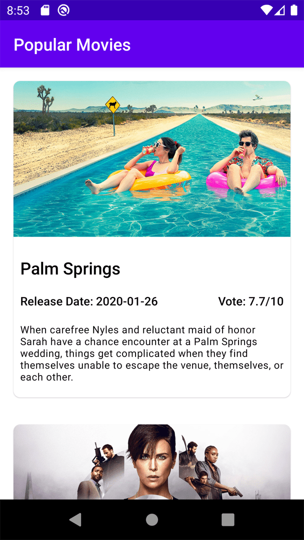
Last but not least, let’s add the rest of the movie information to the screen. Let’s continue with adding the release date and vote for the movies. You will add them in the same horizontal direction using Row.
Row(
    modifier = Modifier.padding(all = 8.dp).fillMaxWidth(),
    horizontalArrangement = Arrangement.SpaceBetween
) {
    Text(
        text = "Release Date: ${movie.releaseDate}",
        style = MaterialTheme.typography.subtitle2
    )
    Text(
        text = "Vote: ${movie.voteAverage}/10",
        style = MaterialTheme.typography.subtitle2
    )
}
If you see the code above, the only new and shiny part is the horizontalArrangement property for Row. horizontalArrangment is the horizontal arrangement of the layout’s children. You can have the children aligned with equal gaps, put the child elements around the whole horizontal UI component, or simply put them so that the child elements can share the same space in the horizontal UI component.
Finally, let’s add the overview information for the movie and wrap it up.
Text(
    text = movie.overview,
    modifier = Modifier.padding(all = 8.dp),
    maxLines = 5,
    overflow = TextOverflow.Ellipsis,
    style = MaterialTheme.typography.caption
)
The Composable function Text has a lot of useful properties. Since the overview can be longer for some movies, it makes sense to limit the maximum lines of texts. For that, you will be using the maxLines property. But when you limit the lines, you don’t want to just cut off the text. It makes more sense to show the … at the end of the displayed text, so that users know what is going on. To do so, you will be using the overflow property and change it to TextOverflow.Ellipses. Once you are done with it, let’s run it and see what your app looks like!

Continuous integration and continuous delivery for your Jetpack Compose project
codemagic.yaml file makes it easy to build native Android apps on Codemagic CI/CD. Since the introduction of the codemagic.yaml file, it has been a lot easier to keep your build configurations more organized and manage all your workflows with just a single file.
Though Codemagic does not come with support for building native Android apps directly from the UI, you can easily configure the codemagic.yaml file for building native apps.
Conclusion
Jetpack Compose is still fairly new and actively developed. Therefore, a lot can change along the way. But if you are into declarative UI patterns, it is something you might want to try out.
Jetpack Compose resources
- Jetpack Compose home page
- Jetpack Compose on Android Studio
- Jetpack Compose Tutorial from Google
- Jetpack Compose Codelab from Google
- JetNews: A Jetpack Compose app from Google
- Compose Release Notes
Videos of Jetpack Compose
- What’s New in Jetpack Compose (Android Dev Summit ‘19)
- Understanding Compose (Android Dev Summit ‘19)
Project files
Click here to download the whole project as a zipped folder.
Salih is a Senior Mobile Engineer based in Berlin. He is a Google Developer Expert for Flutter and Dart. Salih likes sharing his knowledge with others by mentoring aspiring developers, blogging and talking at conferences.
You can contact him over Twitter (@salihgueler) or via email (muhammedsalihguler@gmail.com).


