


Written by Ifeanyi Dike
UI design for native Android and iOS applications can be complex and demanding. However, the importance of sleek and responsive UI cannot be overstated. With the introduction of the Material Design concept in 2014, Google established a standard for mobile and web development that makes life easier for developers and UI designers.
As one of the most popular frameworks for building native Android and iOS applications, React Native ships with a lot of libraries for Material Design. With over 46,000 downloads per week, Paper is the most popular React Native library based entirely on Material UI. A fast library, Paper makes the UI design process easy, seamless and efficient.
Here is a synopsis of what we will cover:
- Setting up React Native app using the expo CLI
- Installing React Native Paper and other dependencies
- Creating custom themes in React Native Paper
- Using custom themes in React Native Paper
- Using Material icons in React Native
- Material UI-based components in React Native paper (eg. cards, bottom navigation, etc)
Let’s get started.
Create a new React Native project
If you don’t have the expo CLI, install it globally in your computer using the following command:
npm install -g expo-cli
Then, install a blank React Native (expo) project:
expo init --template bare-minimum
Open the project in your favorite editor. To open it in Visual Studio Code, navigate to the project root and enter the following command:
code .
The project structure will look like this:
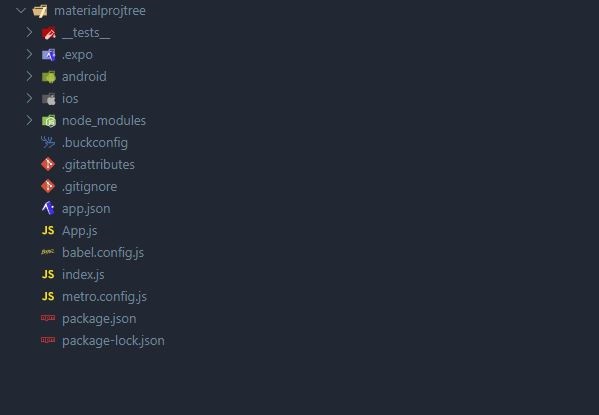
Setting up the project
When working on a React or React Native application, it is natural to separate each element of the page or screen into reusable components, thus ensuring code reusability.
To achieve this, we’ll create three folders, namely Components, CustomProperties and Screens. Navigate to the application’s root directory in your terminal and type the following commands.
mkdir Components CustomProperties Screens
With the command above, we created three folders at the same time. We can then proceed to install the necessary libraries and jump into the code.
Installing libraries and dependencies
Once again, navigate to the application’s root directory in your terminal and enter the following command:
npm install react-native-paper
This command installs React Native Paper, the Material UI library we’ll use to build the React Native UI.
It is also recommended to install the React Native vector icon alongside React Native Paper to add Material icons to the application.
Enter the following command in your terminal:
npm install react-native-vector-icons
Setting up and using React Native Paper
To make use of any React Native library, dependency, or component, we need to import them into our application.
Open App.js in your code editor and enter the following code:
import React from "react";
import { StyleSheet } from "react-native";
import { Provider as PaperProvider } from "react-native-paper";
Although we could import Provider without an alias from React Native Paper, it is advisable to import it as PaperProvider to avoid name conflicts when using Redux.
To begin using React Native Paper, we need to wrap our entire application with the PaperProvider. This ensures that the necessary props are passed down the tree of your application.
This is shown below:
export default function App() {
  return (
    <PaperProvider>
      <TopBar />

      <MainScreen />
    </PaperProvider>
  );
}
Theme customization with React Native Paper
Theming is extremely important in every app development. Since most companies have their custom themes, colors, and font, you will need to customize the React Native Paper or any other Material UI library to use those themes.
If no prop is supplied to the PaperProvider as shown above, the default theme will be applied.
To change this, we need to add a theme prop to the PaperProvider as shown below:
export default function App() {
  return (
    <PaperProvider theme={theme}>
      <TopBar />

      <MainScreen />
    </PaperProvider>
  );
}
However, we also need to define the theme prop. To do this, create two new files (Themes.js and Fonts.js) in the CustomProperties folder with the following command:
touch Theme.js Fonts.js
Let’s define the following font properties in Font.js:
const fontConfig = {
  default: {
    regular: {
      fontFamily: "sans-serif",
      fontWeight: "normal",
    },
    medium: {
      fontFamily: "sans-serif-medium",
      fontWeight: "normal",
    },
    light: {
      fontFamily: "sans-serif-light",
      fontWeight: "normal",
    },
    thin: {
      fontFamily: "sans-serif-thin",
      fontWeight: "normal",
    },
  },
};
export default fontConfig;
These fonts will be used in configuring the themes in the Themes.js file. You can define any font family, weight, and style you want.
Add the following code to the Theme.js file to configure the theme for the entire application:
import React from "react";
import { configureFonts, DefaultTheme } from "react-native-paper";
import customFonts from "./Fonts";

const theme = {
  ...DefaultTheme,
  fonts: configureFonts(customFonts),
  roundness: 30,
  colors: {
    ...DefaultTheme.colors,
    primary: "#4169E1",
    accent: "#f1c40f",
  },
};

export default theme;
Here, we used the ES6 spread operator to add the default theme props to the custom themes. Then, we changed the fonts, primary, and accent colors. The primary color is the main (or defining) color for an application. This is where you might want to set the brand color.
We can even use color names instead of codes like this:
primary: "blue",
So far, we have been able to change the values of the primary and accent colors that come with React Native Paper. However, we can also define our custom colors as shown below.
  colors: {
    ...DefaultTheme.colors,
    primary: "#4169E1",
    accent: "#f1c40f",
    favorite: "#BADA55",
    cancelButton: "#a4c639",
    iconColor: "#808080",
  },
Using custom themes in React Native
There’s no use defining custom themes if you aren’t going to use them. The two major ways of using the custom themes in your components are withTheme higher-order component (HOC) and the useTheme hook.
The withTheme higher-order component can be used as follows:
import * as React from 'react';
import { withTheme } from 'react-native-paper';

function MyComponent(props) {
  const { colors } = props.theme;
  return <Text style={{ color: colors.primary }}>Hello World!</Text>;
}

export default withTheme(MyComponent);
The example below shows how to use the useTheme hook:
import * as React from 'react';
import { useTheme } from 'react-native-paper';

function MyComponent(props) {
  const { colors } = useTheme();
  return <Text style={{ color: colors.primary }}>Hello World!</Text>;
}
Furthermore, the custom themes can also be defined and used directly in a component or element. For instance, we can change the roundness and font family of a button element as shown below:
import * as React from 'react';
import { Button } from 'react-native-paper';

export default function ButtonExample() {
  return (
    <Button raised
      theme={{
        roundness: 3,
        fonts: { medium: 'Open Sans' }
      }}
      {...props}
    >
      Press me
    </Button>
  );
}
Building a custom UI with React Native Paper
To have a better grasp of Material UI in React Native, we will create a simple application using some React Native Paper components. Our application can be separated into several components namely, the TopBar component, MainScreen, and Bottom navigation. The main screen will comprise a search bar and cards. Each card will be made up of a thumbnail, title, content, cover image, and icons, as shown above.
App Bar component
As the name implies, App Bar can be used to create the top and bottom bars of your application. It accepts several props such as style, dark, theme, and children. It also comprises some static properties such as BackAction, Header, Action, and Content.
Card component
The React Native Paper card component comprises several sub-components such as Card.Title, Card.Content, Card.Cover, and Card.Actions. These can be used to define the card title, content, cover image, and action button.
This is shown in the example below:
import * as React from 'react';
import { Button, Card, Title, Paragraph } from 'react-native-paper';


const MyComponent = () => (
  <Card>
    <Card.Title title="Card Title" subtitle="Card Subtitle" />
    <Card.Content>
      <Title>Card title</Title>
      <Paragraph>Card content</Paragraph>
    </Card.Content>
    <Card.Cover source={{ uri: 'https://picsum.photos/700' }} />
    <Card.Actions>
      <Button>Cancel</Button>
      <Button>Ok</Button>
    </Card.Actions>
  </Card>
);

export default MyComponent;
Using React Native icons
React Native icons can be used with React Native Paper and other React Native libraries such as the React Native Elements library. It ships with a lot of Material UI-based icon libraries such as AntDesign, Octicons, MaterialIcons, MaterialCommunityIcons, Ionicons, etc.
Click here for a list of the React Native icon libraries and their icons.
Each of these icons can be used in the same way. To use any of them, you first have to import the icon component from your library of choice. If you are using expo in your project, the syntax would be as follows:
import Icon from "@expo/vector-icons/MaterialCommunityIcons";
With the vanilla React Native, we have the following syntax:
import Icon from "react-native-vector-icons/MaterialCommunityIcons";
To use the Icon component, we will specify the icon name, size, and style. While the name prop is required, the size and style props are optional. This is shown in the code below:
import * as React from "react";
import { View } from "react-native";
import Icon from "@expo/vector-icons/MaterialCommunityIcons";

const CustomIcon = (props) => {
  return (
    <View>
      <Icon
        name={props.name}
        size={props.size}
        style={{
          backgroundColor: `${props.bcolor}`,
          color: `${props.color}`,
          paddingLeft: props.pLeft,
          borderRadius: props.rad,
          padding: props.pad,
        }}
      />
    </View>
  );
};

export default CustomIcon;
The search bar component
Rather than building a search bar component from scratch, we can use the search bar that comes out of the box with React Native Paper.
The search bar component accepts several props such as placeholder, value, icon, style, and so forth. This allows us to easily customize the search bar using the Material UI library.
The bottom navigation component
Navigation in React Native can be achieved in several ways such as the StackNavigation, DrawerNavigation, TabNavigation, to mention a few. However, React Native Paper also provides the BottomNavigation.
The advantage of the BottomNavigation is that it makes use of the Material Design concept.
The React Native Paper has several props which include activeColor, style, SceneMap, renderScene, onIndexChange, navigationState, etc. Some of these props such as navigationState, onIndexChange, and renderScene are required while the rest are optional.
The code below shows how to create bottom navigation containing three routes, namely Feeds, Albums and Recents:
import React, { useState } from "react";
import FeedRoute from "./FeedScreen";
import AlbumRoute from "./AlbumScreen";
import RecentRoute from "./RecentScreen";
import { BottomNavigation } from "react-native-paper";

const Screen = () => {
  const [index, setIndex] = useState(0);
  const [routes] = useState([
    { key: "feeds", title: "Feeds", icon: "message", color: "#3F51B5" },
    { key: "albums", title: "Albums", icon: "album", color: "#009688" },
    { key: "recents", title: "Recents", icon: "history", color: "#795548" },
  ]);

  const renderScene = BottomNavigation.SceneMap({
    feeds: FeedRoute,
    albums: AlbumRoute,
    recents: RecentRoute,
  });

  return (
    <BottomNavigation
      navigationState={{ index, routes }}
      onIndexChange={setIndex}
      renderScene={renderScene}
    />
  );
};

export default Screen;
Conclusion
I hope this article has helped you understand the basics for building React Native UI using one of the most popular Material UI libraries, React Native Paper. You can apply these basics to create your custom Material UI designs in React Native.
Most of these concepts such as theming, React Native icons and even components, such as cards, also apply to other mMaterial UI libraries and even other React libraries.
The complete source code is available on GitHub here.
More articles about React Native
- React Native continuous integration and delivery (CI/CD) with Codemagic
- Step-by-step guide to kick off your first React native project
- Flutter vs React Native: A developer’s perspective
Ifeanyi Dike is a software developer in Abuja, Nigeria. He started coding with Microsoft Visual Basic in 2005 but soon after delved into Python and Javascript.
He’s been actively developing software for over seven years now and has used several webs and mobile frameworks like ReactJS, React Native, Express and Flutter. You can reach him on Twitter @deepinsideai.


