This post is written by Taha Tesser
At Google I/O 2021, Google announced the next evolution of Material Design, Material You, along with Android 12. The Material Design system’s biggest overhaul yet brought redesigned components, new colors, a wide range of shapes, simplified typography, new elevation, better accessibility, and many other tweaks. With this update, Flutter apps can have a consistent design across multiple platforms. Material Design 3 (the technical name for Material You) is sometimes referred to as Material 3 or simply M3 for the sake of brevity, similarly to how Material 2 is referred to as M2.
In this article, we will discuss everything that you, as a Flutter developer, should know about migrating your Flutter app to Material 3.
How to enable Material 3 in Flutter
Since the announcement of Material 3, Flutter has received a bunch of updates to support it, including support for new typography, shapes, elevation, updated widgets, and new M3 widgets. Most of the M3 components are available in Flutter. You can track the few remaining widgets that are yet to receive Material 3 support and the progress of the Material 3 implementations in Flutter for them in the Bring Material 3 to Flutter issue.
Currently, Material 3 changes are only available when opting in, so you’ll need to use the useMaterial3 flag on ThemeData to enable Material 3 support. (This might change in the future, so be sure to check out the Flutter website for updated documentation. We’ll also update this article soon after the change takes place.)
To use Material 3 in Flutter instead of Material 2, specify the following:
theme: ThemeData(
  useMaterial3: true,
),
What’s new in Material Design 3 for Flutter?
Material 3 updates brought revamped typography, an improved ColorScheme (including the ability to generate a full ColorScheme from a given seed color), updated elevation, a beautiful Android 12 overscroll stretch effect, and a new ink ripple. A bunch of Material widgets, such as AppBar, FloatingActionButton (FAB), ElevatedButton, OutlinedButton, IconButton, and Card, have been updated to support Material 3 design. There are also new Material 3 widgets, such as NavigationBar, NavigationDrawer, andSegmentedButton, some new M3-style buttons, such as FilledButton and FilledButton.tonal, and a whole lot more.
If you simply migrate the Flutter starter app to Material 3, you’ll already notice some changes: The AppBar has no elevation or background color, and the FAB has a rounded rectangular shape instead of the more familiar circular shape.
For a complete overview of M3 in Flutter, check out the official Material 3 Demo.
In the following sections, I’ll explain some of the key changes and tweaks you might want to make in your app to support Material 3.
The key changes in Material 3 are:
- Dynamic color
- Typography
- Shapes
- Elevation
Let’s go through each of them in detail.
Dynamic color
Let’s start with Dynamic color, which enables you to apply consistent colors across your app. It contains some key colors and neutral colors related to separate tonal palettes. Colors from these tonal palettes are applied across the UI. Use the Material Theme Builder web app or the Figma plugin to visualize the dynamic color for your app and create a custom color scheme.
Flutter uses a low-level material_color_utilities package that contains algorithms to create a Material Design 3 color system. You can create color schemes for your apps using dynamic_color based on a platform’s implementation of dynamic color.
The easiest way to create an M3 ColorScheme is by providing a seedColor color in the app’s theme.
For instance, add colorSchemeSeed: Colors.green to the starter app. Notice that the FAB is now using a lighter green color instead of the light purple from the default color scheme.
Adding
colorSchemeSeedwhenprimarySwatchis present will throwassertion:'package:flutter/src/material/theme_data.dart': Failed assertion: line 477 pos 12: 'colorSchemeSeed == null || primarySwatch == null': is not true.
To fix this, remove primarySwatch: Colors.blue, from the starter app’s theme.
	///...
	primarySwatch: Colors.blue,
  useMaterial3: true,
  colorSchemeSeed: Colors.green,
),

Here, I’ve created an example that shows all the colors from the M3 ColorScheme. On the left, we have the default ColorScheme, which is available when setting the useMaterial flag to true. And on the right, we’re using the custom ColorScheme, generated using the colorSchemeSeed parameter, which takes a seed color or key color to generate a full Material 3 ColorScheme.
Default M3 ColorScheme | Custom M3 ColorScheme |
|---|---|
 |  |
You can take this to the next level using both flex_seed_scheme, which allows you to create a more flexible version of Flutter’s ColorScheme.fromSeed, and flex_color_scheme, which ensures UI components get themed completely by the color schemes and custom colors you provide.
Typography
Material 3 simplified the typography naming by splitting the typescales into five key groups:
- Display
- Headline
- Title
- Body
- Label
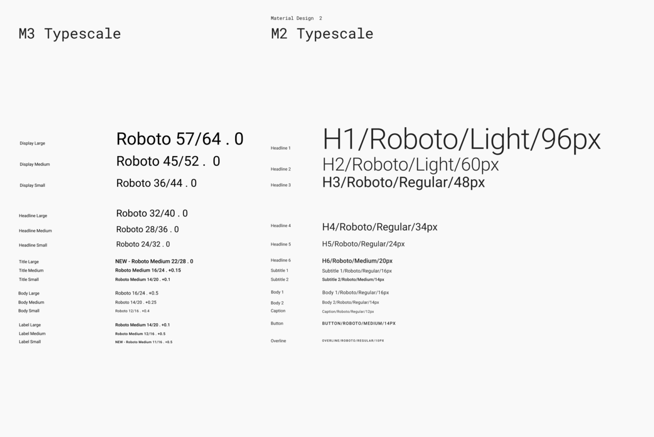
The role of each key group is more descriptive, and it’s much easier to use different sizes in a particular typography group, e.g., BodyLarge, BodyMedium, and BodySmall instead of bodyText1, bodyText2, and caption. This helps when implementing typography for devices with different screen sizes.
The scaling of the typography has become consistent across the groups. Here is a comparison between the M3 and M2 typescales:
Elevation
In Material 2, each elevated component gets a shadow. The higher the elevation, the bigger the shadow. Going even further, Material 3 introduces a new surfaceTintColor color property. When applied to elevated components, the surface of the elevated components gets this color, and its intensity depends on the elevation value.
 Source: https://m3.material.io/styles/elevation/overview
The surfaceTintColor property is added to all the elevated widgets in Flutter, along with the elevation and shadow properties.
Try out this Material elevation demo: Turn off shadows by tapping on the icon button in the top right and switch between M2 and M3. Notice that elevated surfaces take on the surfaceTintColor color, which makes them visible even when no shadow is provided.
When comparing the M2 AppBar with the M3 AppBar in the starter app, you’ll notice that the AppBar doesn’t have a default elevation value, surfaceTintColor color, or shadow color.
M2 AppBar | M3 AppBar |
|---|---|
 |  |
Providing a custom elevation value shows the default surfaceTintColor color in effect and applies the theme’s shadow color to the AppBar so that the AppBar casts a shadow as well.
Note: This
AppBar.elevationproperty is different from the newAppBar.scrolledUnderElevationproperty, which is only in effect when the content is scrolled underneath theAppBar. Learn more about this further below.
  appBar: AppBar(
    title: Text(widget.title),
    elevation: 4,
  ),

  appBar: AppBar(
    title: Text(widget.title),
    elevation: 4,
    shadowColor: Theme.of(context).shadowColor,
  ),

Shapes
Material 3 offers a wider range of shapes, including squared, rounded, and rounded rectangular shapes. The FAB, which was previously circled, now has a rounded rectangular shape, and material buttons went from rounded rectangular to pill shaped. Widgets like Card, Dialog, and BottomSheet are also more rounded in M3.


Migrating from Material 2 to Material 3
Here, I’ll walk you through the process of migrating a Material 2 demo app to Material 3.
This demo app contains some Material 2 Flutter widgets. Some of them will be updated when enabling M3, and some of the M2 widgets can be replaced with new M3-style widgets. For example, ElevatedButton can be replaced with the new FilledButton to preserve the visual design, and BottomNavigationBar can be replaced with the new M3-style NavigationBar widget. The demo app also contains some customization needed in an M2 app for some widgets to stack well. For instance, InputDecorationTheme applies a custom fillColor so that the TextField is visible when placed in the AppBar in an M2 app.
  theme: ThemeData(
    colorScheme: const ColorScheme.light().copyWith(
      primary: Colors.green[700],
      secondary: Colors.green[700],
    ),
    inputDecorationTheme: InputDecorationTheme(
      filled: true,
      fillColor: Theme.of(context).colorScheme.onPrimary,
      hintStyle: TextStyle(
        color: Colors.green[700],
      ),
    ),
    floatingActionButtonTheme: const FloatingActionButtonThemeData(
      foregroundColor: Colors.white,
    ),
  ),


One of the best things about Material 3 is that widgets use consistent colors, and the overall theming experience has also been improved. For example, in the demo, we used a custom InputDecorationTheme to make the TextField visible in the dark green AppBar. But when migrating to M3, we can remove this, and the TextField will be visible without any customization.
In the demo, remove the existing colorScheme property, inputDecorationTheme, and floatingActionButtonTheme. Then add the following lines:
	theme: ThemeData(
    useMaterial3: true,
    colorSchemeSeed: Colors.green[700]
  ),
We now have a new beautiful ColorScheme that’s applied to all the components in the demo app. Each UI component is using specific tonal palette colors. TextField uses an appropriate fillColor, and cards have the default greenish surfaceTintColor.

IconButton now supports the ButtonStyle property, which you can use to customize the IconButton to get an M3 visual and a new selected state. Let’s update the IconButton from the AppBar in the demo app to an M3 filled-style icon button.
![]()
Check out https://api.flutter.dev/flutter/material/IconButton-class.html and https://m3.material.io/components/icon-buttons/overview to learn more.
Here’s my favorite part: When you scroll through the content, the AppBar’s default scrollUnderElevation kicks in. Notice that the surfaceTintColor intensified when we’re scrolling, and as a result, the AppBar changes color. This is because the AppBar is elevated based on the scrollUnderElevation value when the content is scrolled underneath. List views send scroll notifications to the AppBar that they’re being scrolled beneath.
You can implement
AppBar.notificationPredicateand listen to scroll notifications from a nested list view for more complex layouts.
The Material 3 AppBar is elevated when content is scrolled underneath the AppBar. You can adjust this elevation using the new scrolledUnderElevation property.
Check out the official scrolledUnderElevation code sample I’ve added in the AppBar docs.
Execute flutter create --sample=material.AppBar.2 mysample to create a local project with this code sample.
The migration process for our demo app isn’t complete yet. It still uses the M2-style BottomNavigationBar, so let’s replace it with the new M3-style NavigationBar widget. It’s taller and easier to interact with, and it isn’t elevated.
M2-style BottomNavigationBar | M3-style NavigationBar |
|---|---|
 |  |
Check out the documentation for the NavigationBar class for more details.
Tapping on the FAB on the home screen opens a dialog with a rounded rectangular shape. Since the dialog is elevated by default, we can see that the default surfaceTintColor has been applied and the content padding has been slightly modified, as it has an optional icon property.

Check out the documentation for the showDialog function for more details.
Now, navigate to the details page by tapping on one of the list items. This page contains a SliverAppBar with expandedHeight and flexibleSpace to make the app bar title large and the SliverAppBar collapsable. This can be replaced with the new SliverAppBar.large, which supports large titles and is also collapsable. When doing so, we can remove expandedHeight and flexibleSpace.
	SliverAppBar.large(
    title: const Text('Lorem Ipsum'),
  ),
For the new M3 AppBar variants, which support medium and large titles, use the new SliverAppBar.medium and SliverAppBar.large.
Check out the documentation for the SilverAppBar.medium constructor and SilverAppBar.large constructor for more details.
Here are the screenshots of the final M3 demo.


The source code for all the demos is available on GitHub.
Conclusion
Material 3 makes it possible to create beautiful, personalized, and accessible designs. When combining Material 3 with Flutter, you can create a consistent and unified UI experience across mobile, web, and desktop platforms. It makes it much easier to create complex algorithmic color schemes and scale typography for devices with varying screen sizes. Furthermore, accessibility has been improved, and visual feedback is clearer.
The Flutter team has been working hard on adding full support for Material 3 to Flutter. As demonstrated above, you can already migrate your existing Material 2 app to Material 3. If you use some widgets that are yet to receive Material 3 support, you can track their progress in the Material 3 issue.
Taha Tesser is one of the top Flutter contributors. His main focus is fixing issues and adding new features to Material Design and Cupertino Design in the framework. He has also added and updated dozens of official examples and documentation pages. You can reach out to him on Twitter and follow him on GitHub.
